

Giving Myself More Work
Giving Myself More Work
Trying to reinvent picture book layouts like an idiot

Hello my beloved Cool Kids.
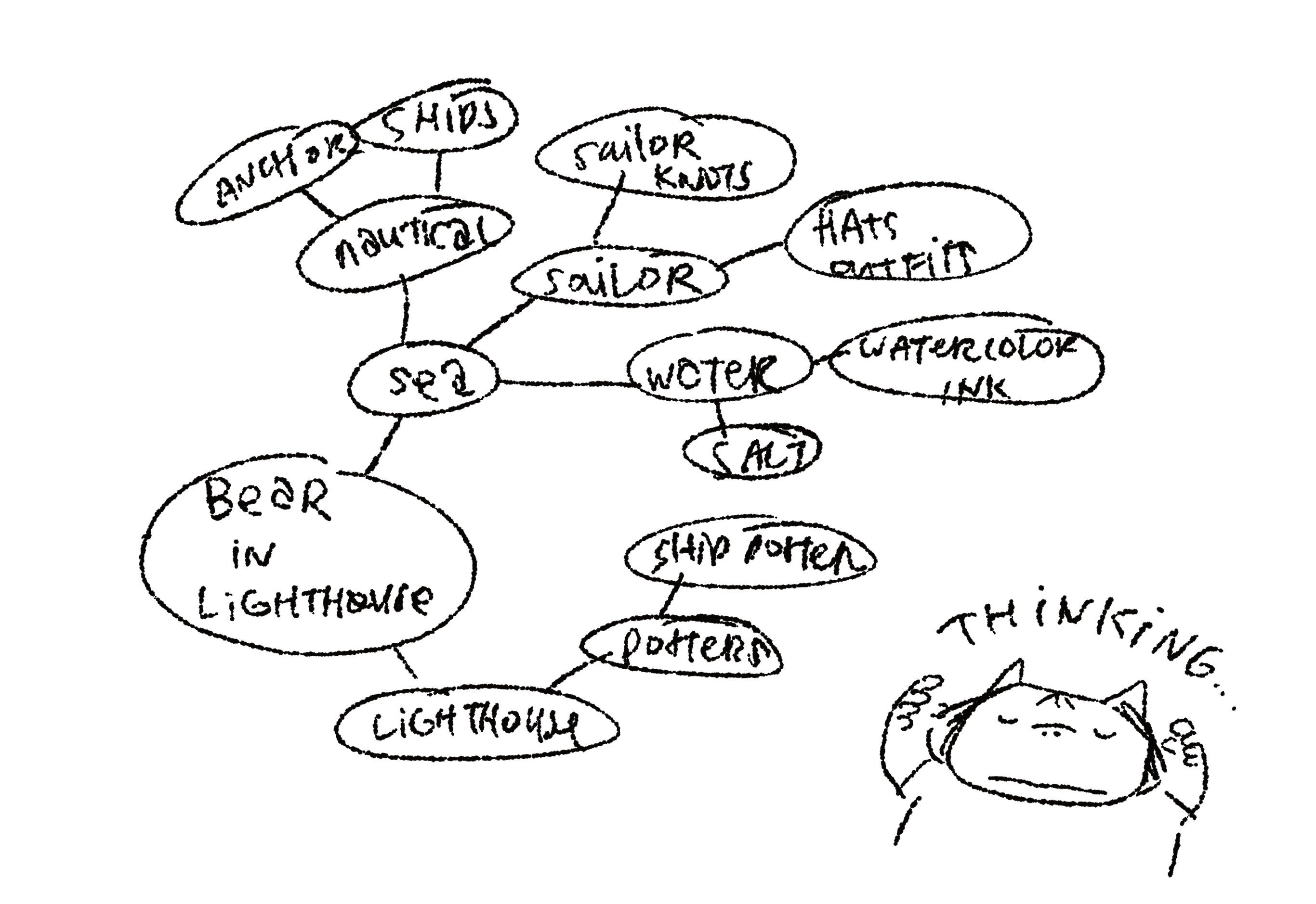
Today we’re taking a look at the process of developing the ~vibes~ and visual language for a book. ICYMI, I’m currently working on a book about a Bear in a lighthouse which I’ve been referring to as “the Bear book".”
Anyways, here is a little brainstorm of visual themes related to this book:
Here is what my intial pinterest board vibes were like:
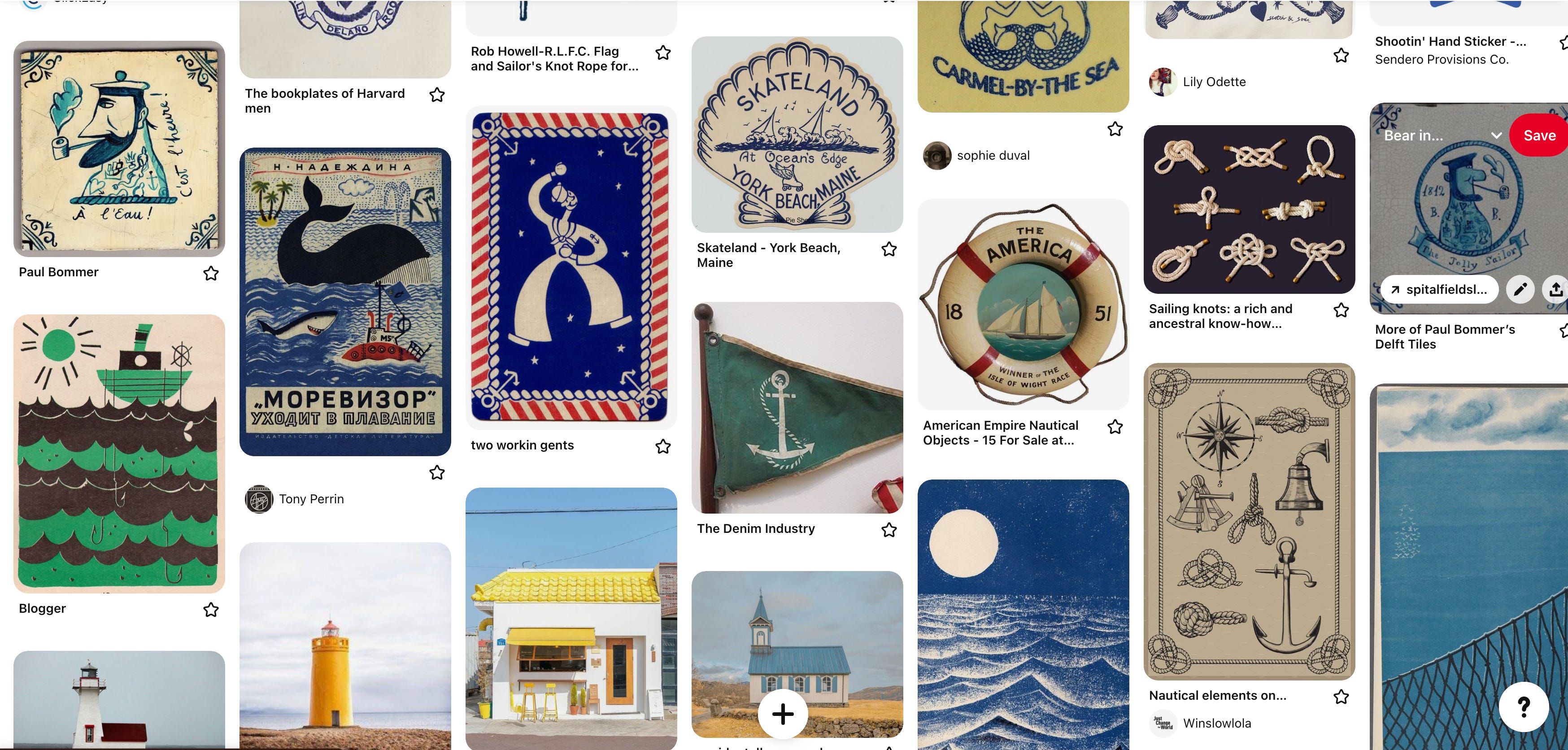
I was looking at nautical posters and thought that would be the general vibes that I would take the book but when it came time to actually start sketching the book, I found that I was struggling to nail down the look of the book.
The problem was that I wanted to be INVENTIVE, to be DARING, and to PuSh BounDARies! I was stuck approaching the book with the same approaches that I had done every other book before, especially when it came to the layout of the spreads.
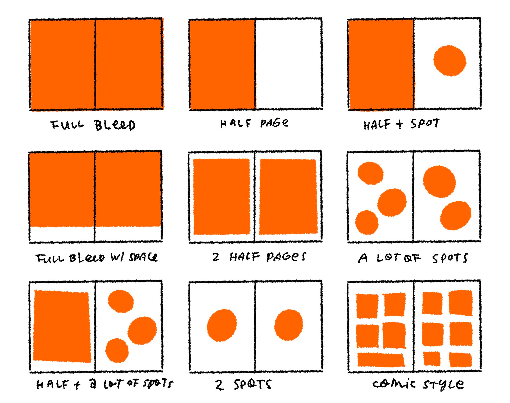
When it comes to creating a picture book, I generally like to define the “rules" of the visual storytelling early. If every page of the book employs a different layout, it can be confusing to follow. My general rule when designing book layouts is that if I do a special layout, it has to be repeated at least twice in the book to feel intentional.
Here are some tried and true ways for laying out a picture book spread that I’ve stuck with for most of my other books:
For my upcoming Pig book, I decided that I wanted to try to be a bit more inventive with the layouts of the spreads. Recently, there’s been a revival of elaborate borders in illustrations and I wanted to find a way to make it my own.


Enter Tomie De Paola’s Mother Goose.
Found at a thrift store near my old apartment, I unearthed the illustrated 200 Mother Goose nursery rhymes and found a treasure trove of inventive layouts. There was one particular layout that caught my eye:
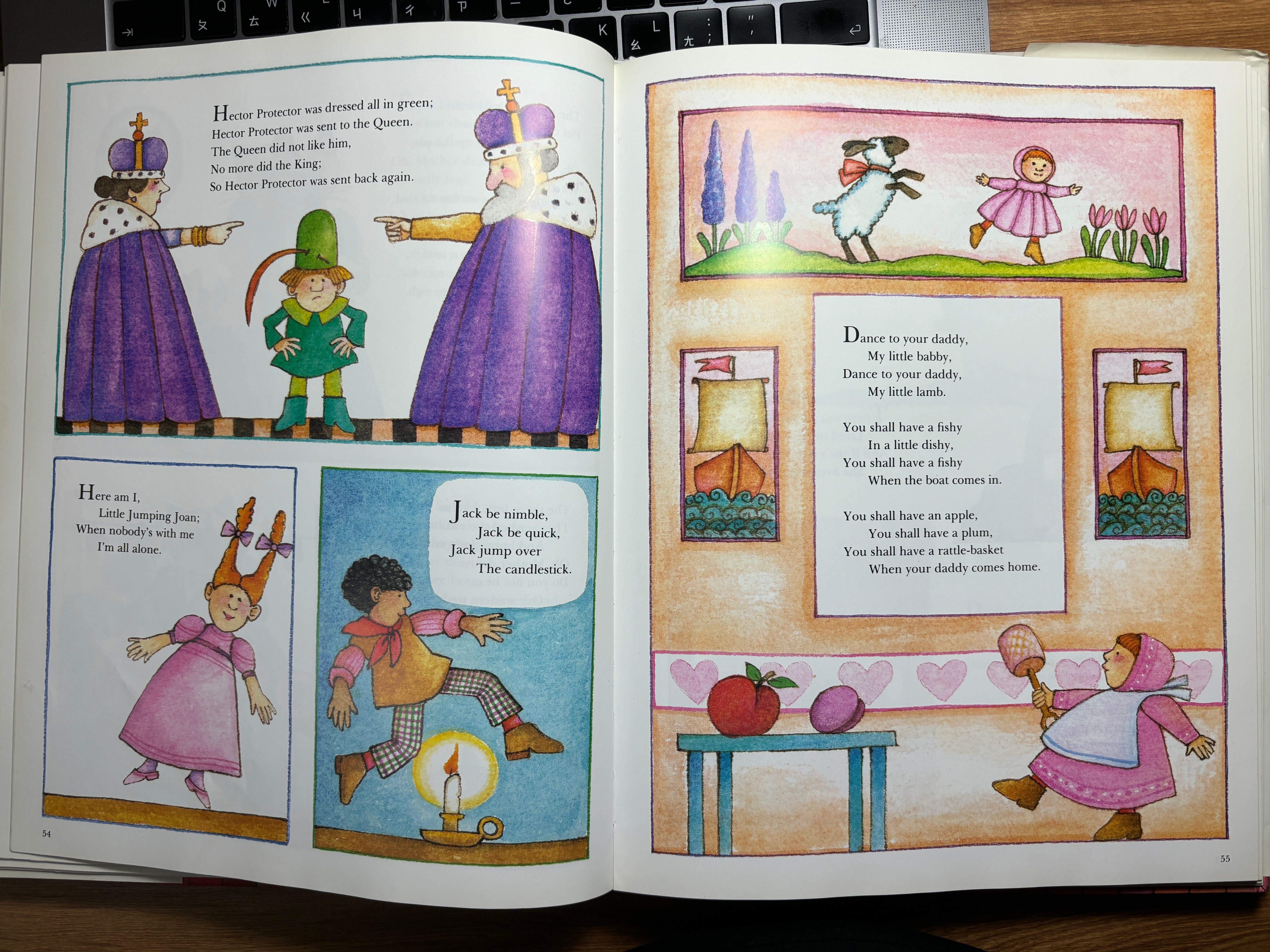
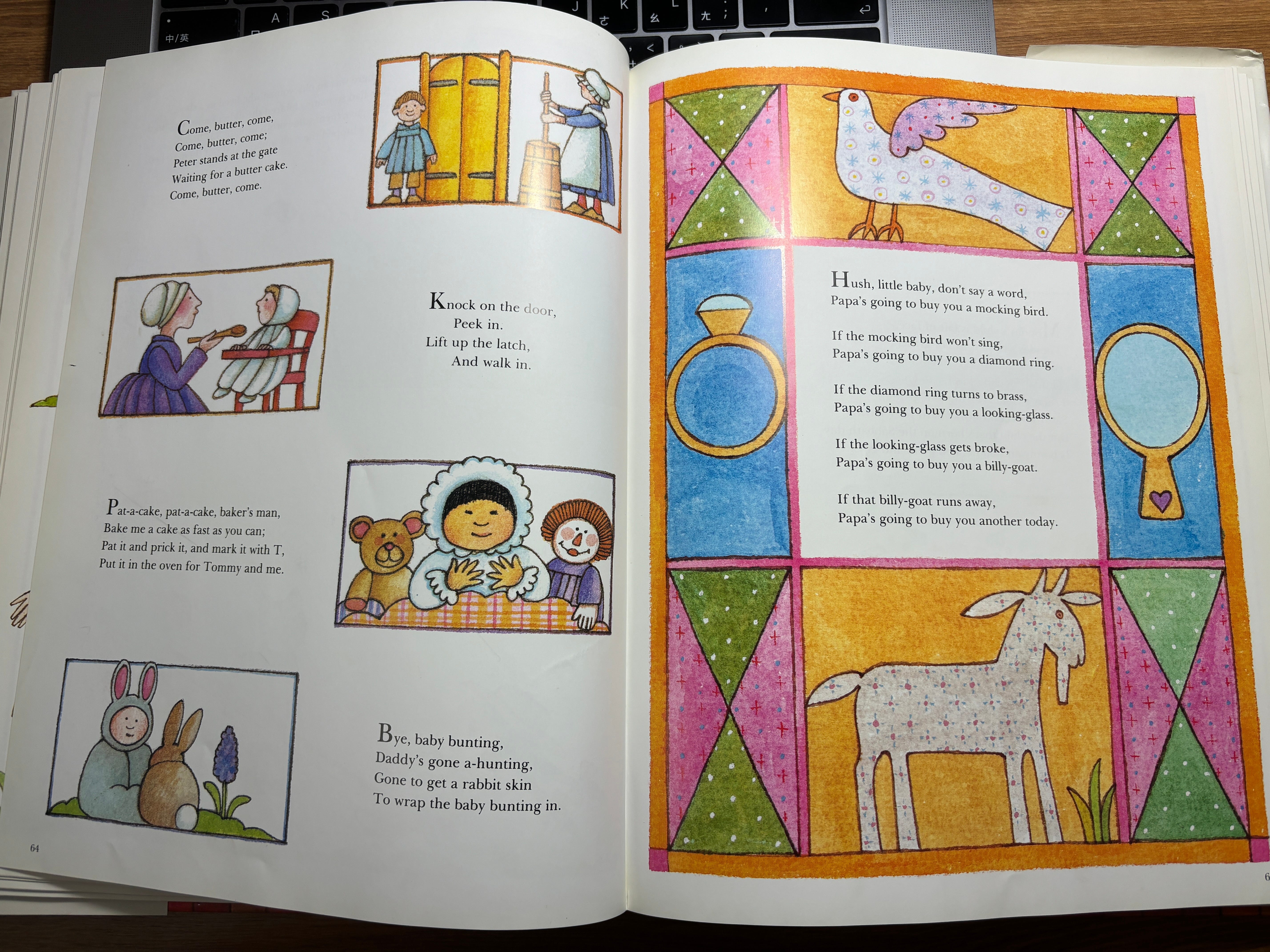
How fun to have the text be in the middle of the border! At first I left the book, thinking I didn’t need another book for my already overloaded bookshelf. But after mulling over it all night I raced back the next day to buy it. Anyways, I’m happy I did because now I get to show you guys that I’m just one big layout thief! There’s the evidence!
This border style intrigued me because in more recent illustrations, borders have a tendency to just be purely decorative. Tomie De Paola’s layout inspired me to try putting the action in the border and leaving the middle empty for text. Here’s how that turned out: