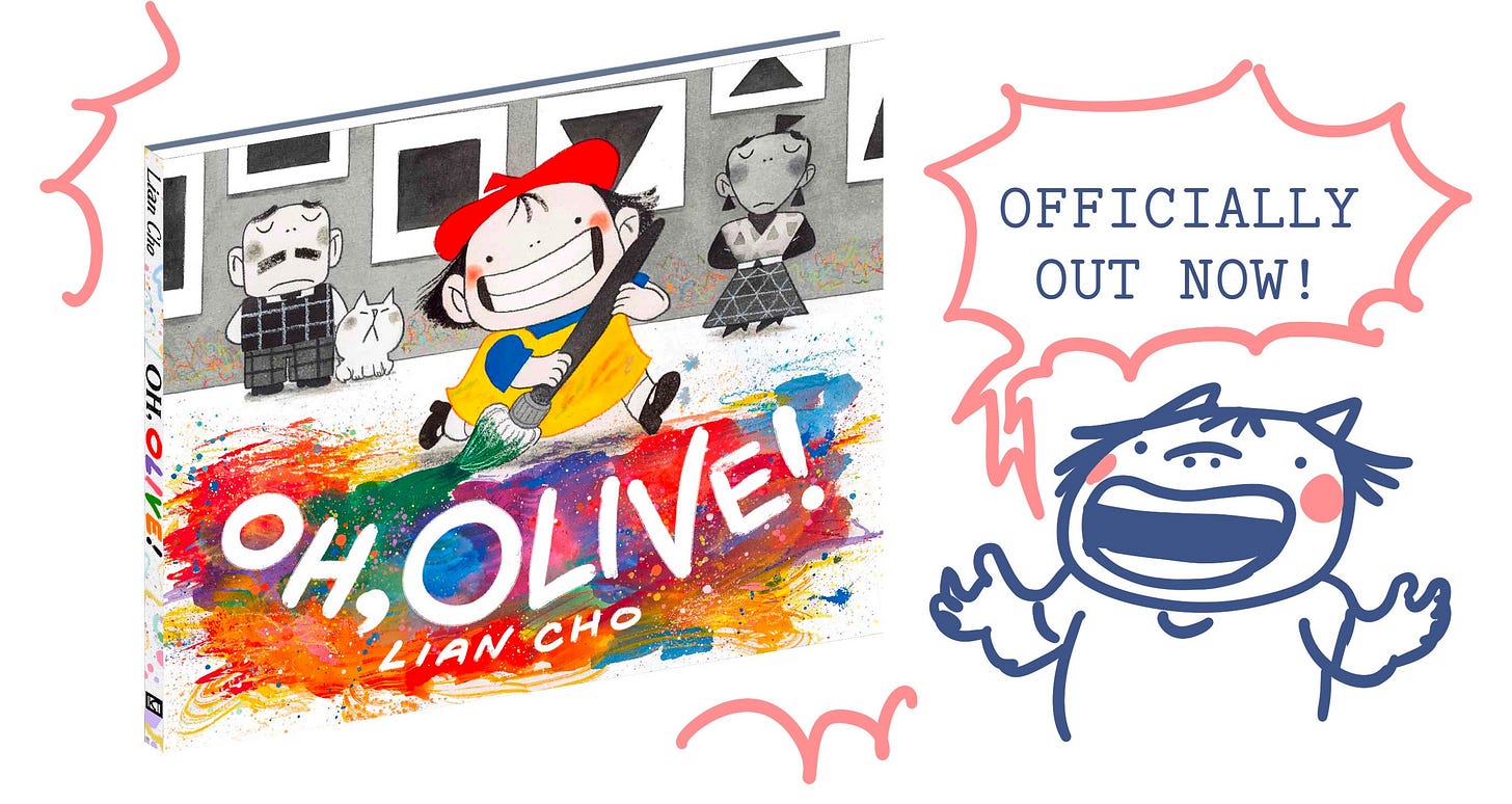
Last week, my debut author/illustrator book Oh, Olive! was released!
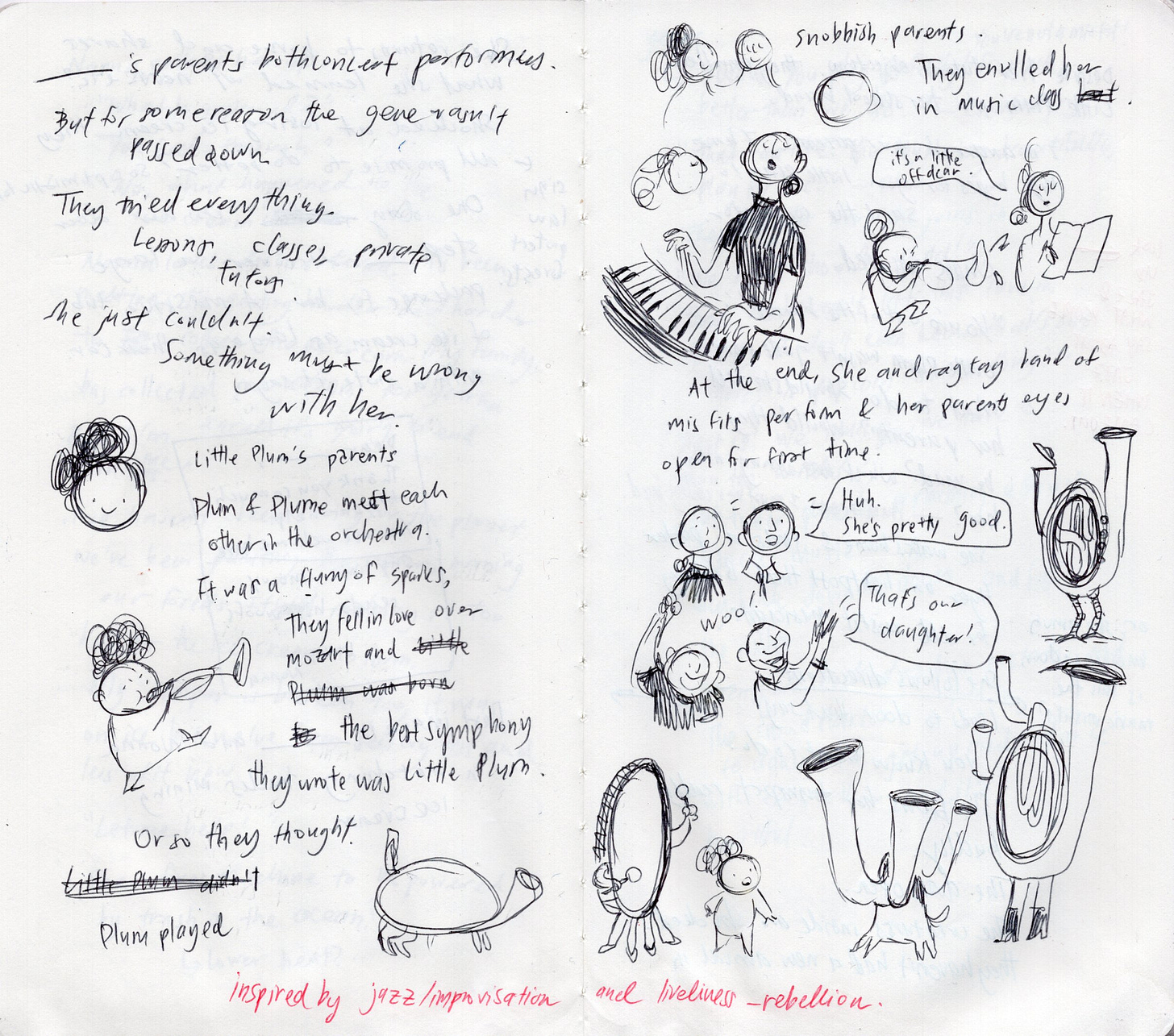
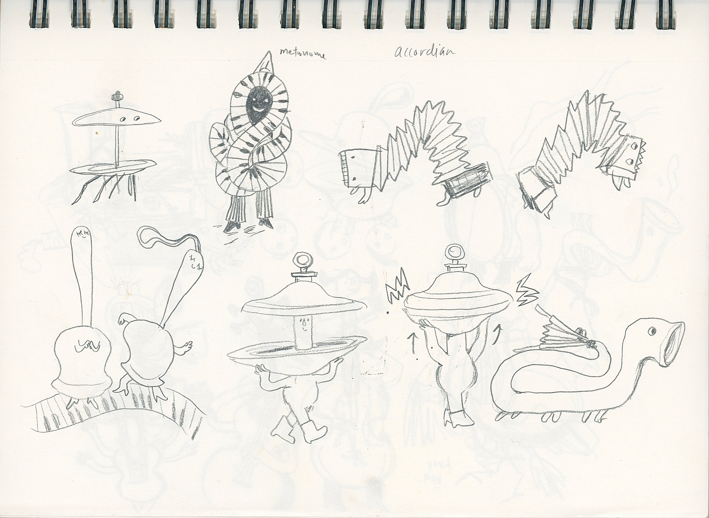
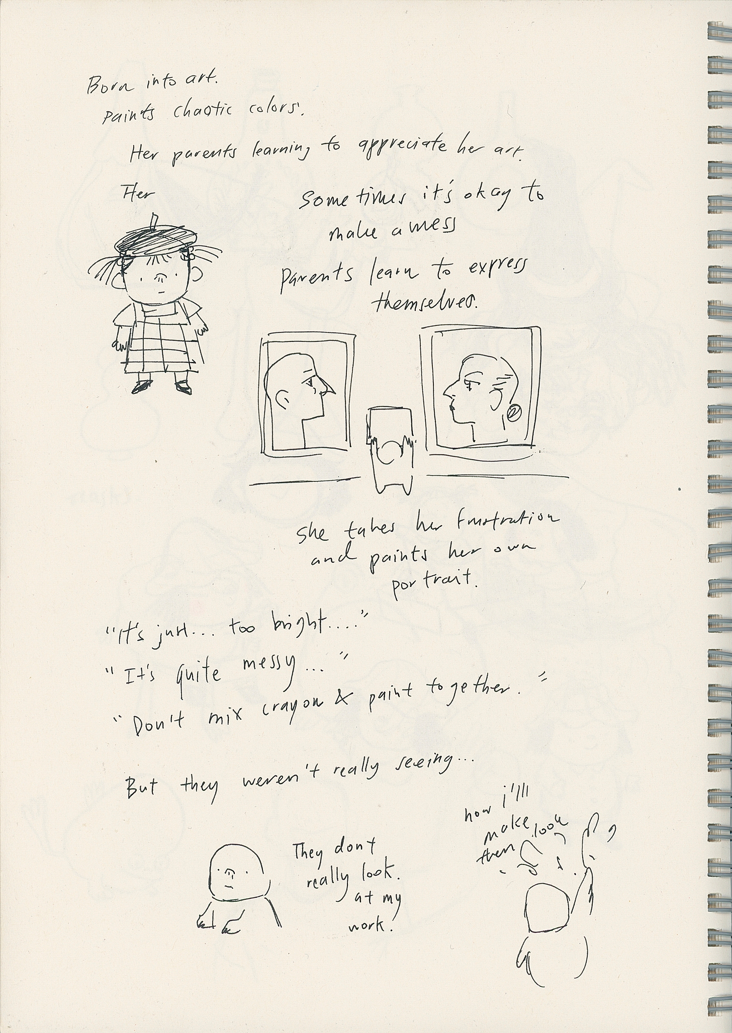
I made a short little post on the day it came out and I showed this scan of my sketchbook as the origins for the story:
Here’s the thing though, I lied. *Gasp!*
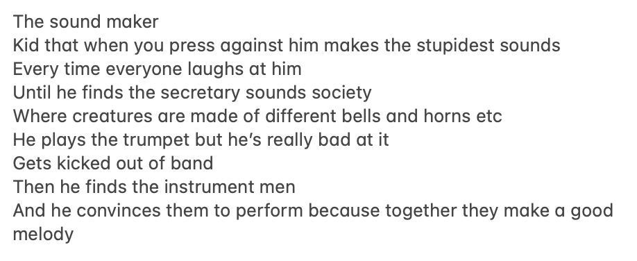
This sketch was not where the story first originated. The first traces of this story can be found in my Notes app on my phone in a note aptly titled “picture book ideas.” Below is a screenshot:
It’s pretty different from what the final book became. Here’s my journey of making this book. Strap in folks, it’s about to be a doozy…
Part One: Overconfidence.
As I workshopped the story more, I came up with an idea that the main character, Olive, would have serious parents who played boring classical music whereas she would play bright and colorful jazz.
After getting kicked out of school band for being rowdy, Olive wanders the streets and finds herself discovering a magical world filled with instrument creatures who were all shunned from society for playing weird music. Olive then becomes their leader and they parade through the streets and crash her parent’s concert.
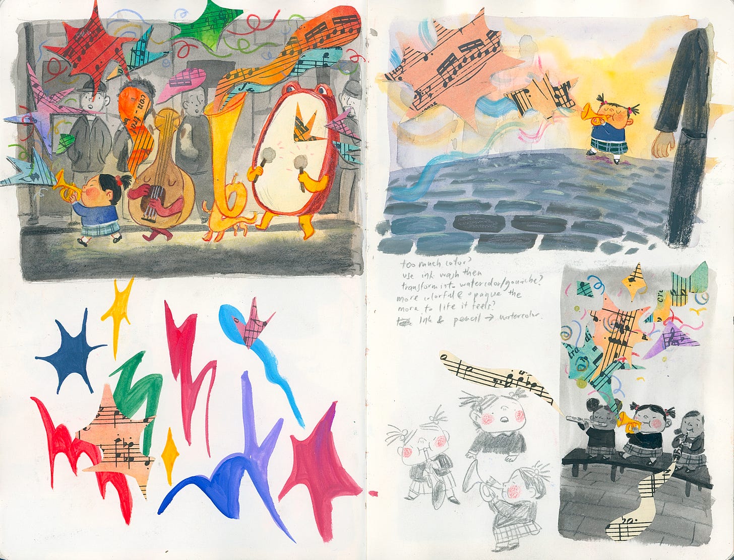
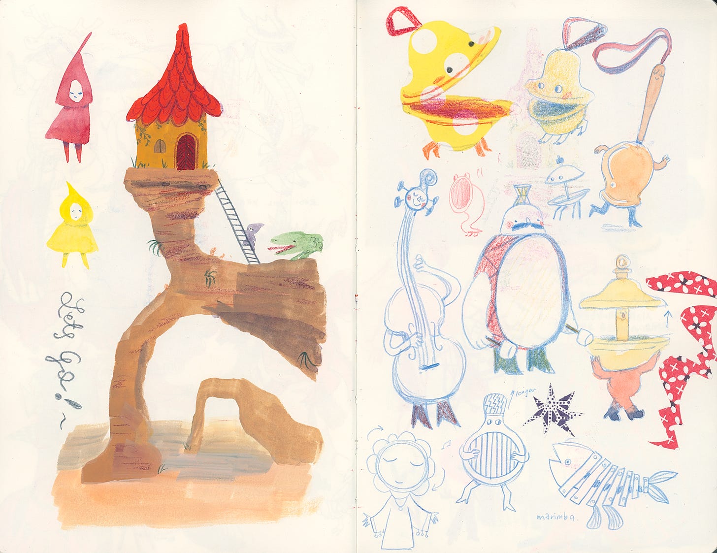
With this plot in mind, I set to working on a loose story as well as a bunch of art samples such as the one below:
After a couple months, I eventually worked up enough courage to press send on the pitch to my agent that I titled:
Part Two: Oh, to be humbled.
I was very very nervous as it was my first ever pitch to my agent. She replied back with 5 pages of notes (bless her soul) which I very anxiously pored through. There were a lot of suggestions on ways to improve character development and relationships but the most important part that stuck out was this:
At first I was in denial. My idea was perfect and there was no point in editing perfection. It wasn’t THAT similar to my other book was it?
Crap. It totally was similar and being typecast as an illustrator who only works on music books was not my intention.
So after nursing my ego for the next hour, I accepted that unfortunately, my agent was right. So back to the drawing board it was. I decided to listen to her suggestion of changing the subject matter to something else, like art.
Part Three: Okay, fine, I’ll do it again.
Here is the second draft, again crafted in the trusty Notes app:
At first, her parents painted fancy realistic portraits and Olive painted wild swirls and Jackson Pollock-esque splatters:
But something felt wrong. I felt like it may be hard for readers to grasp the difference in art styles between Olive and her parents and I needed a more elegant solution.
Then one day, I was taking a nap. As I was about to fall asleep I suddenly had an epiphany: What if Olive’s parents painted shapes instead? And so in a sleepy haze, I quickly type this out in my notes app (I love my notes app) and then promptly fell back asleep:
When I woke up 20 minutes later, I knew that I hit the jackpot.
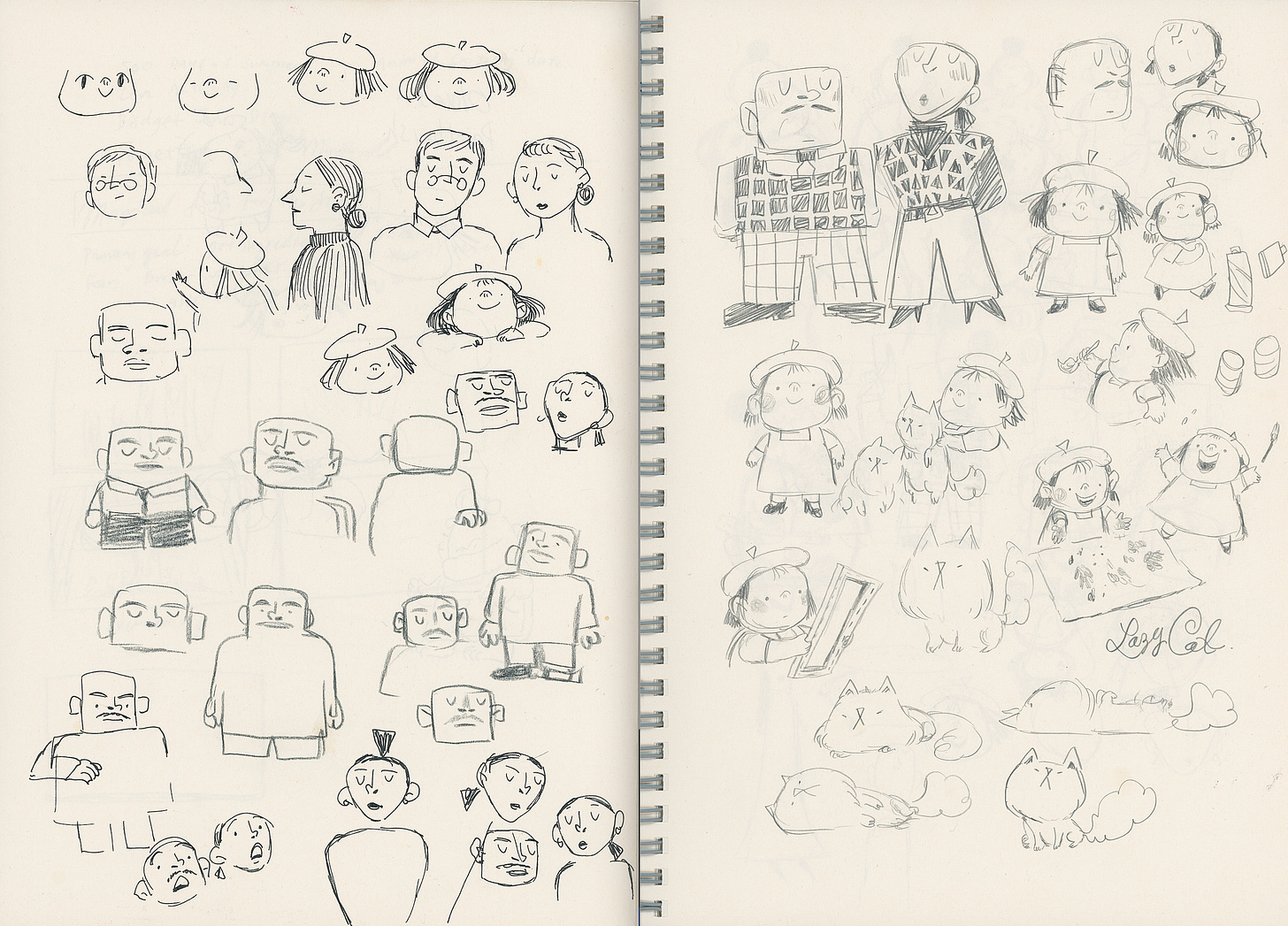
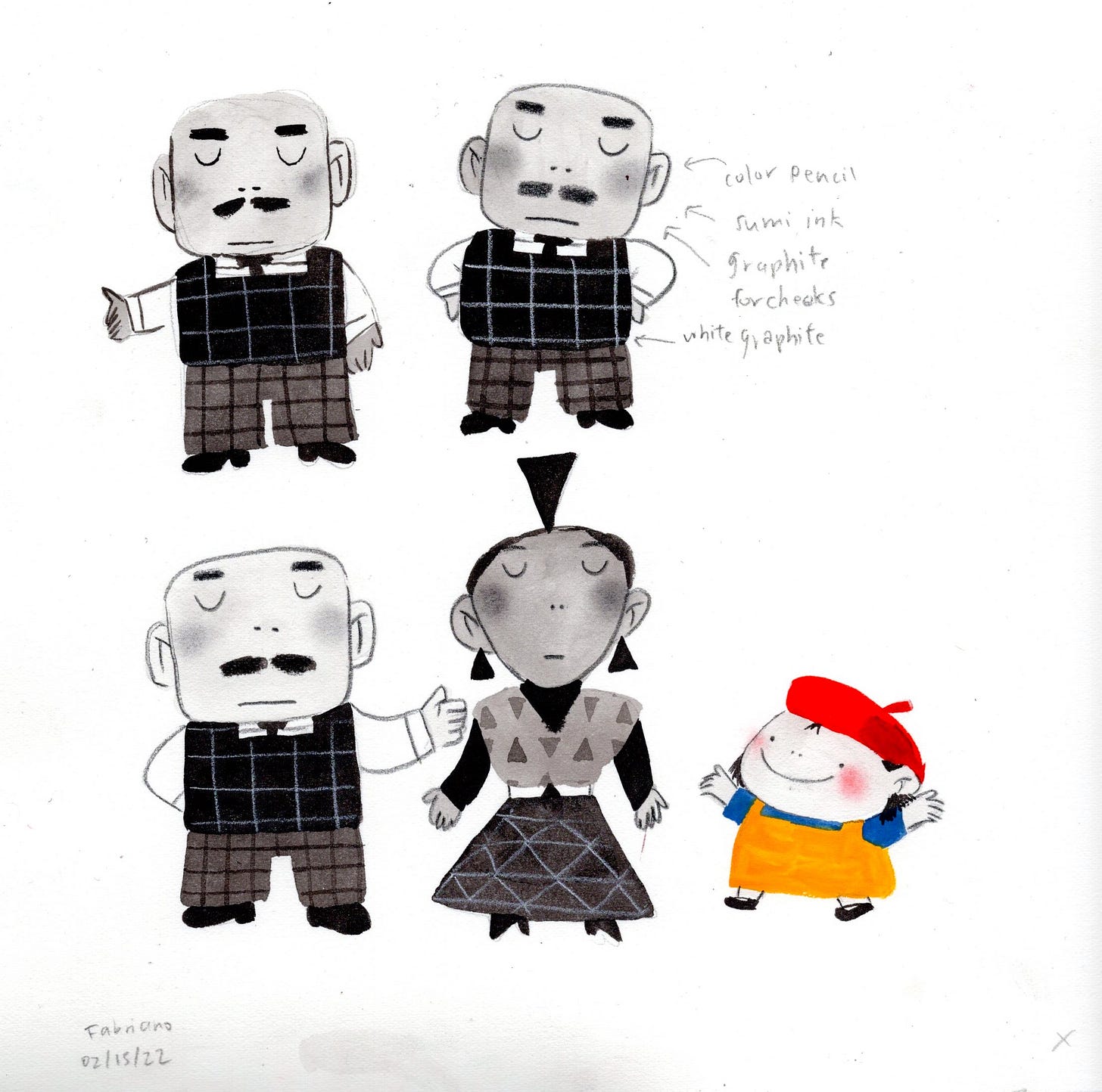
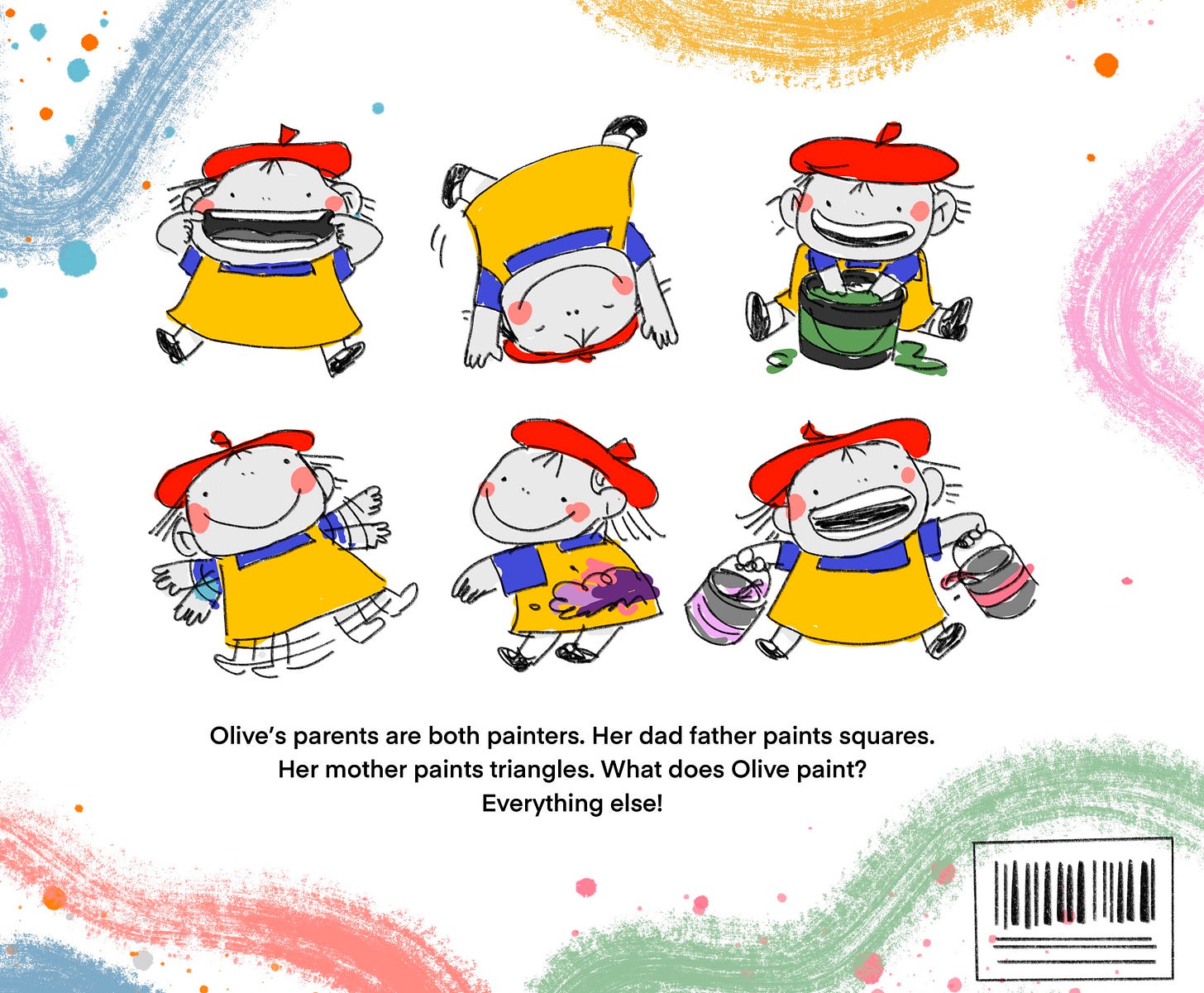
From there, designing the characters became fun and interesting. The characters would look like the shapes they painted and surrounded themselves with. Olive’s dad would be made up of squares and Olive’s mom would be made up of triangles.
I didn’t look at too much reference for these character designs because I just wanted to explore and be creative on my own. But I will admit that a heavy inspiration for the dad’s design is Anger from Pixar’s Inside Out. He’s just a bunch of squares which I loved:
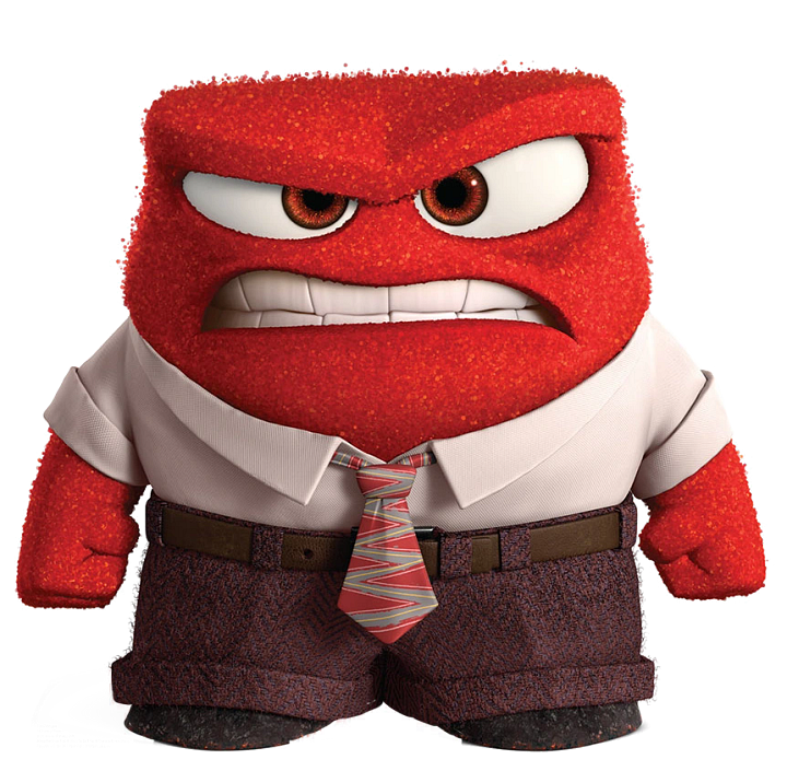
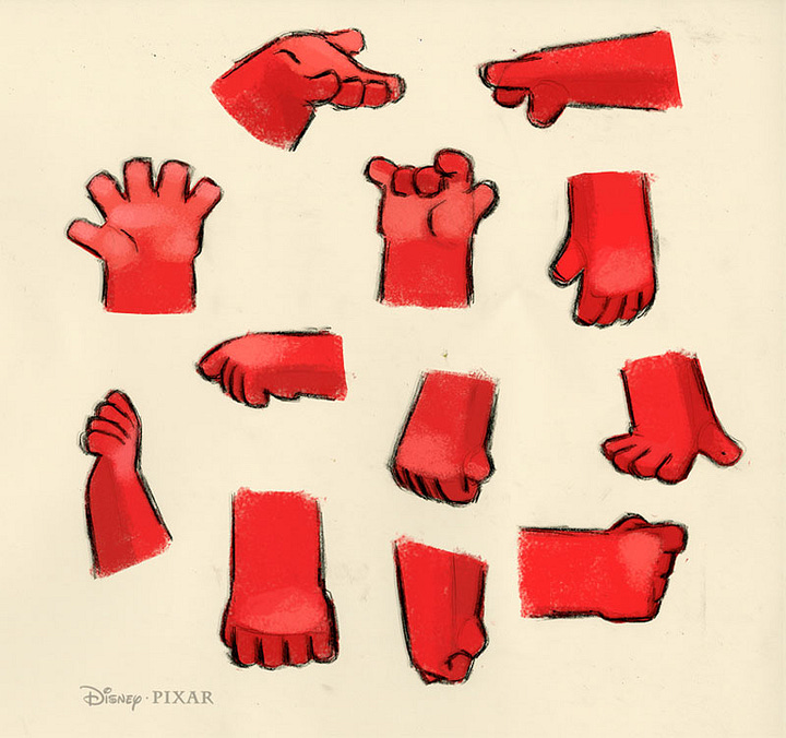
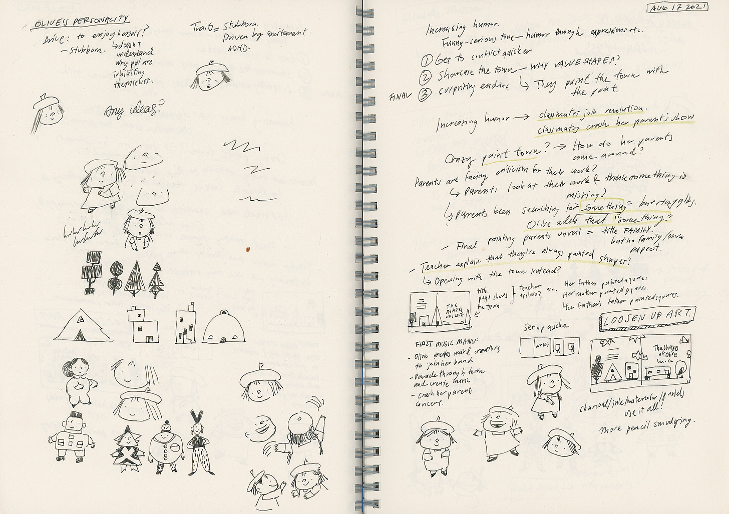
Anyways, onto more sketches from my sketchbook:

Part Four: Wait, I have to paint this?
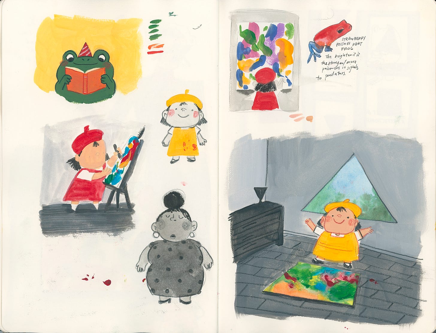
After I had settled more on the look of the characters (which usually just involved a lot of squishing them down more and more until they are as squishy as possible), it was time to figure out what materials I wanted to use for the art. At first I started out with gouache because I had just bought a new gouache set, but it just wasn’t right:
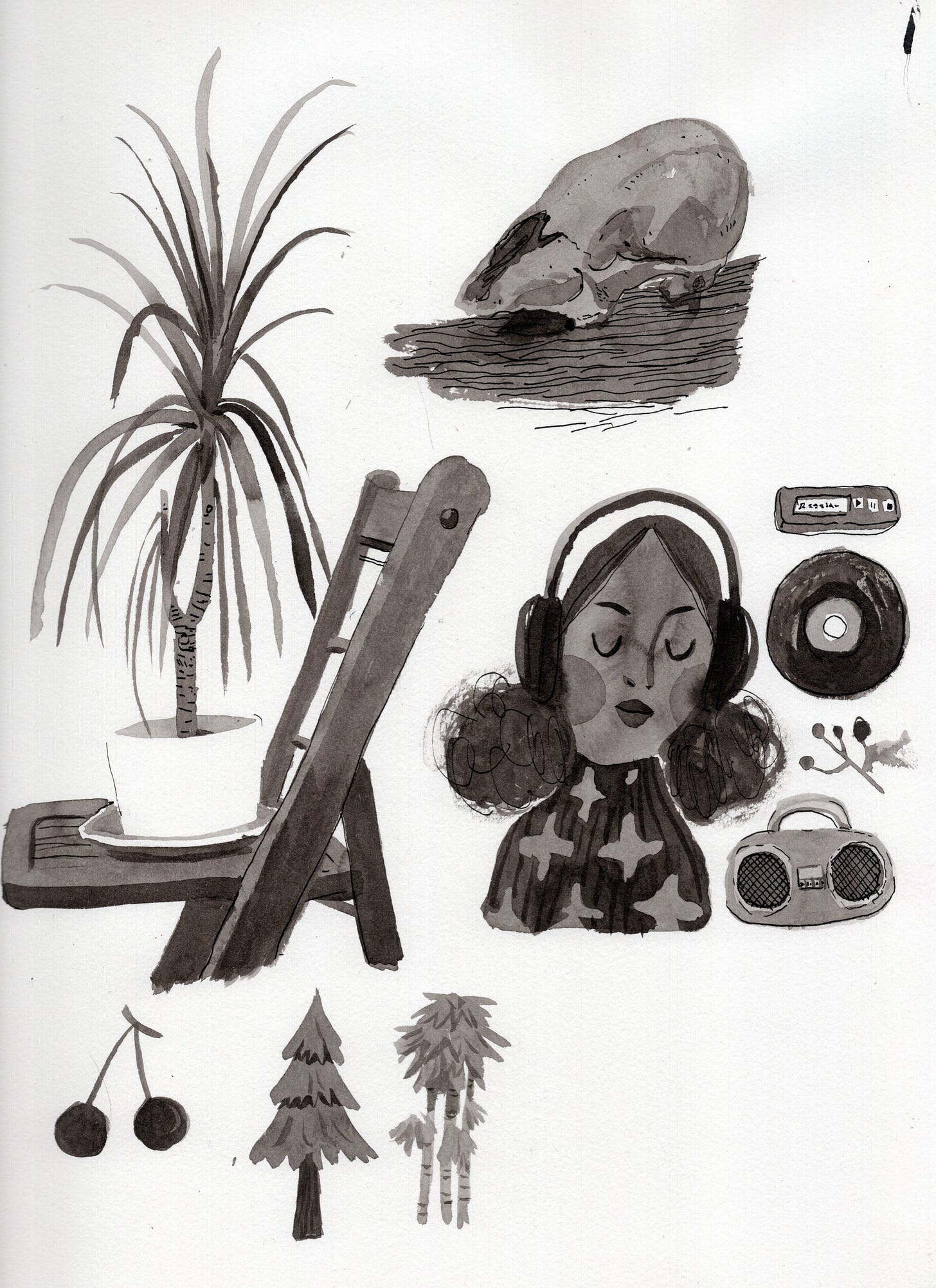
After the gouache didn’t come out the way I wanted it to, I decided to pivot to sumi ink with a mixture of pencil:
That character on the left (above) has absolutely nothing to do with the story but as you can see it did help inspire the expression for the dad. And on the right is an early test which really inspired the look for the book.
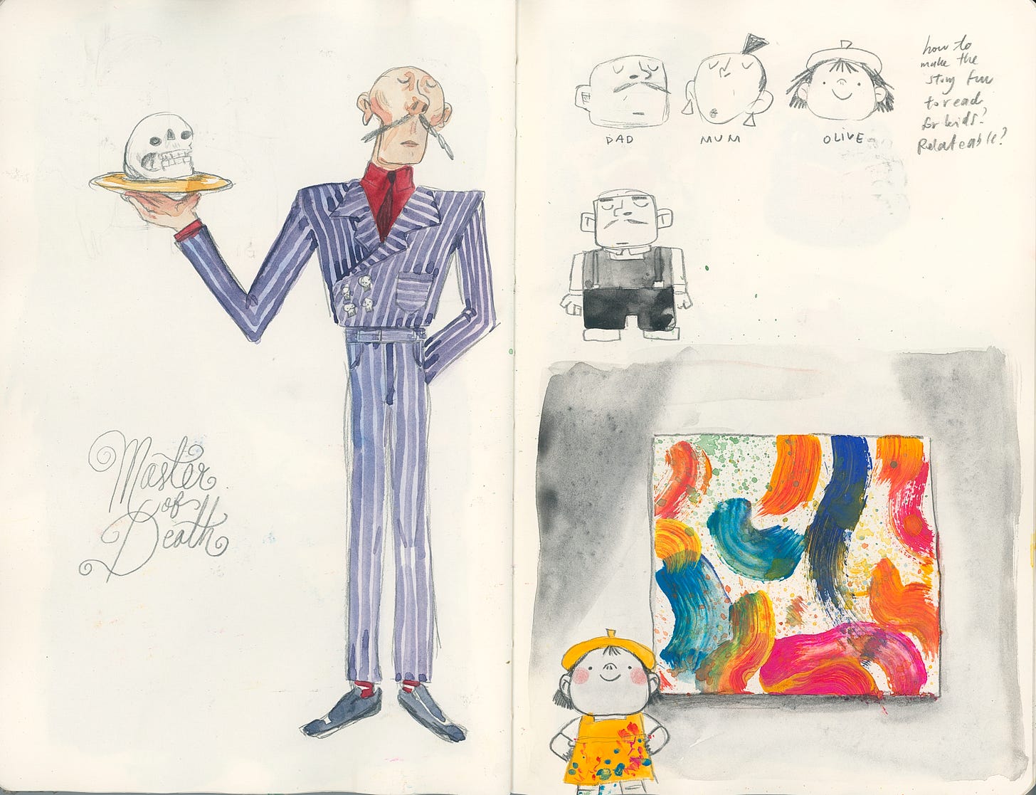
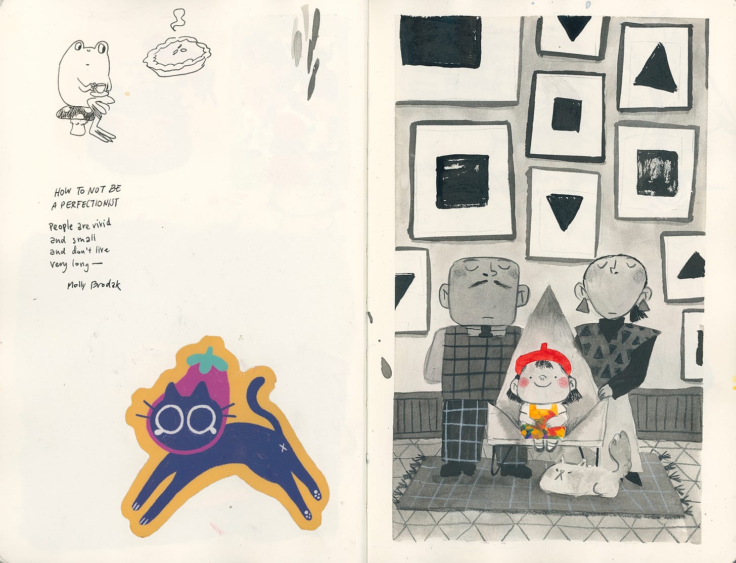
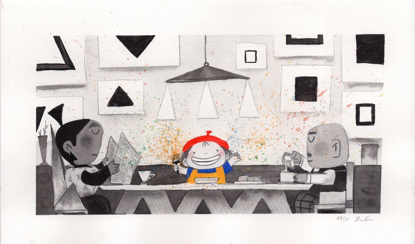
After all that, it finally led to this painting in my sketchbook where I felt like I finally nailed the look of the book:
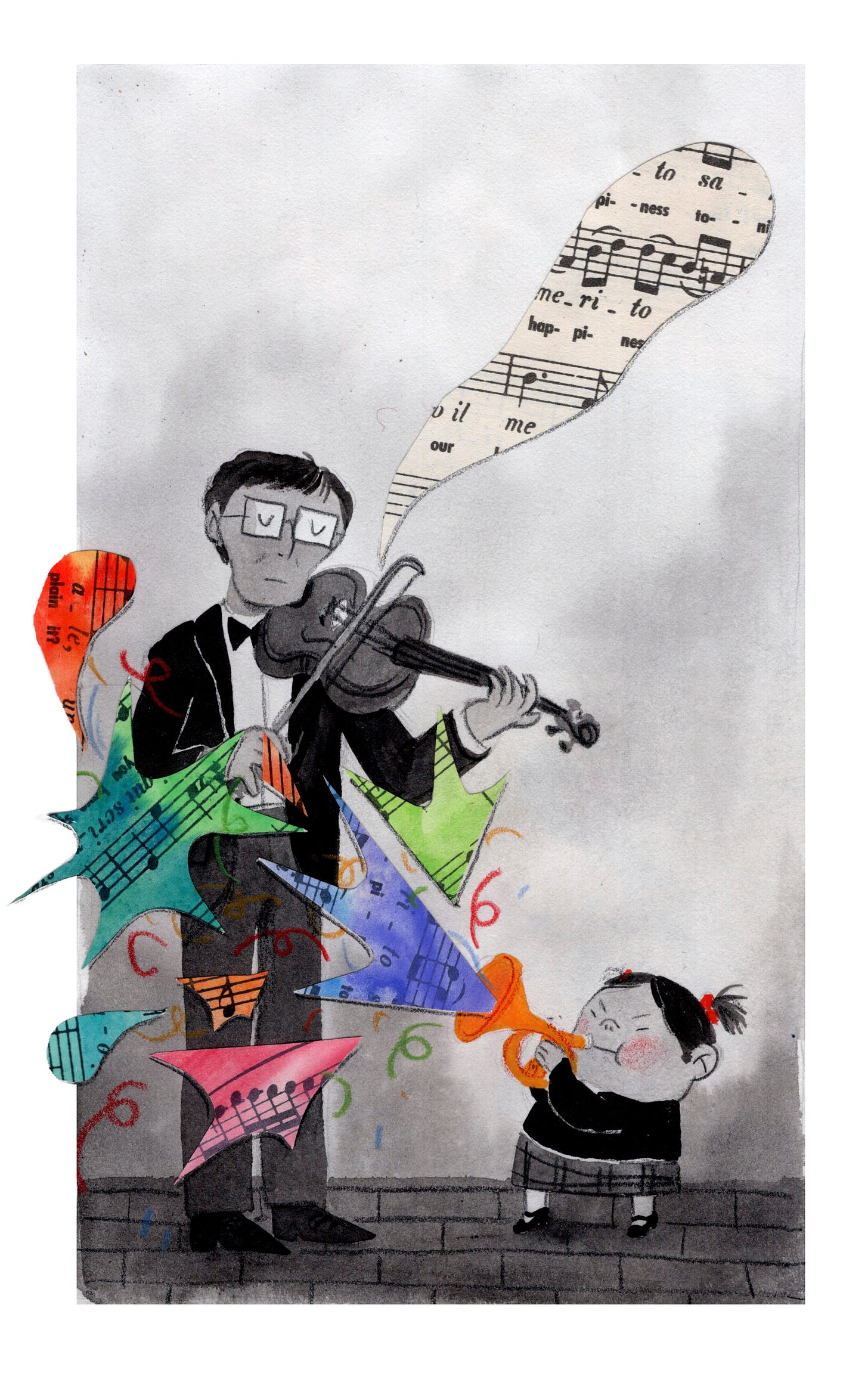
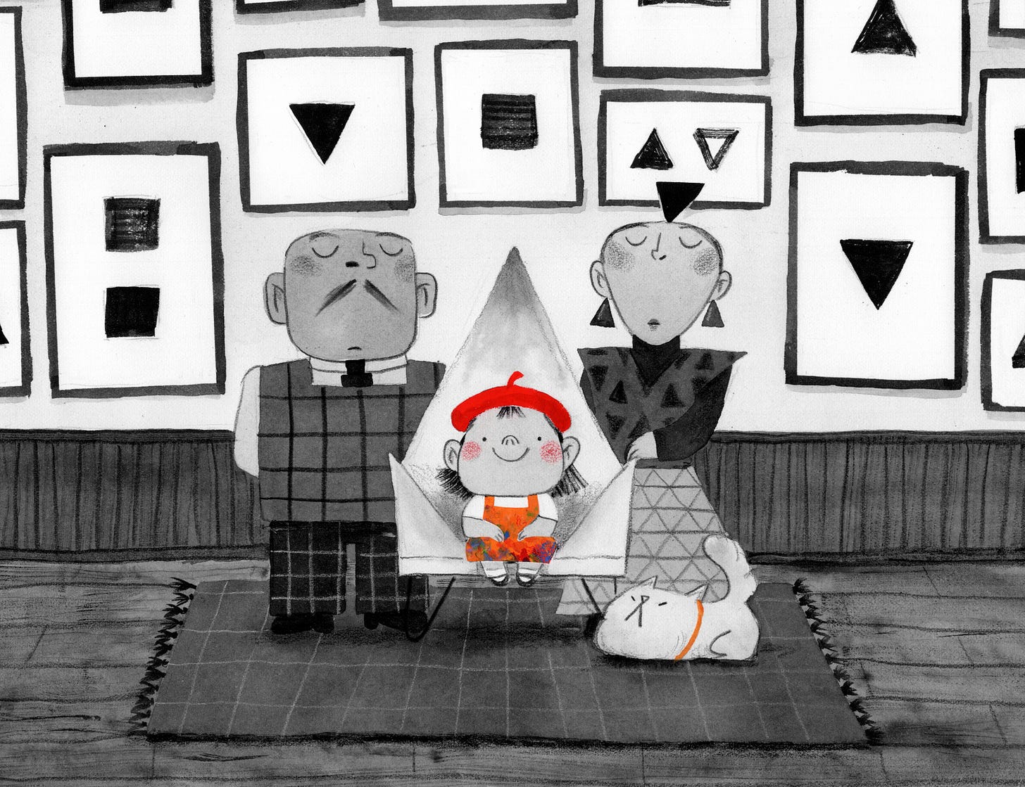
From that small painting in my sketchbook, I made a bigger and more finished version which would guide the look of the book for the upcoming months!
Part Five: Phew, that was hard! Good thing that’s over (it was not over)
From there, I put together ANOTHER pitch to send to my agent. This time, it was titled:
Here are the first two pages of the dummy I sent over to my agent:
After a couple weeks of back and forth with my agent and lots of changes and cleaning up sketches, here is the final dummy we ended up with:
Part Five: Let’s GOOOOOO!
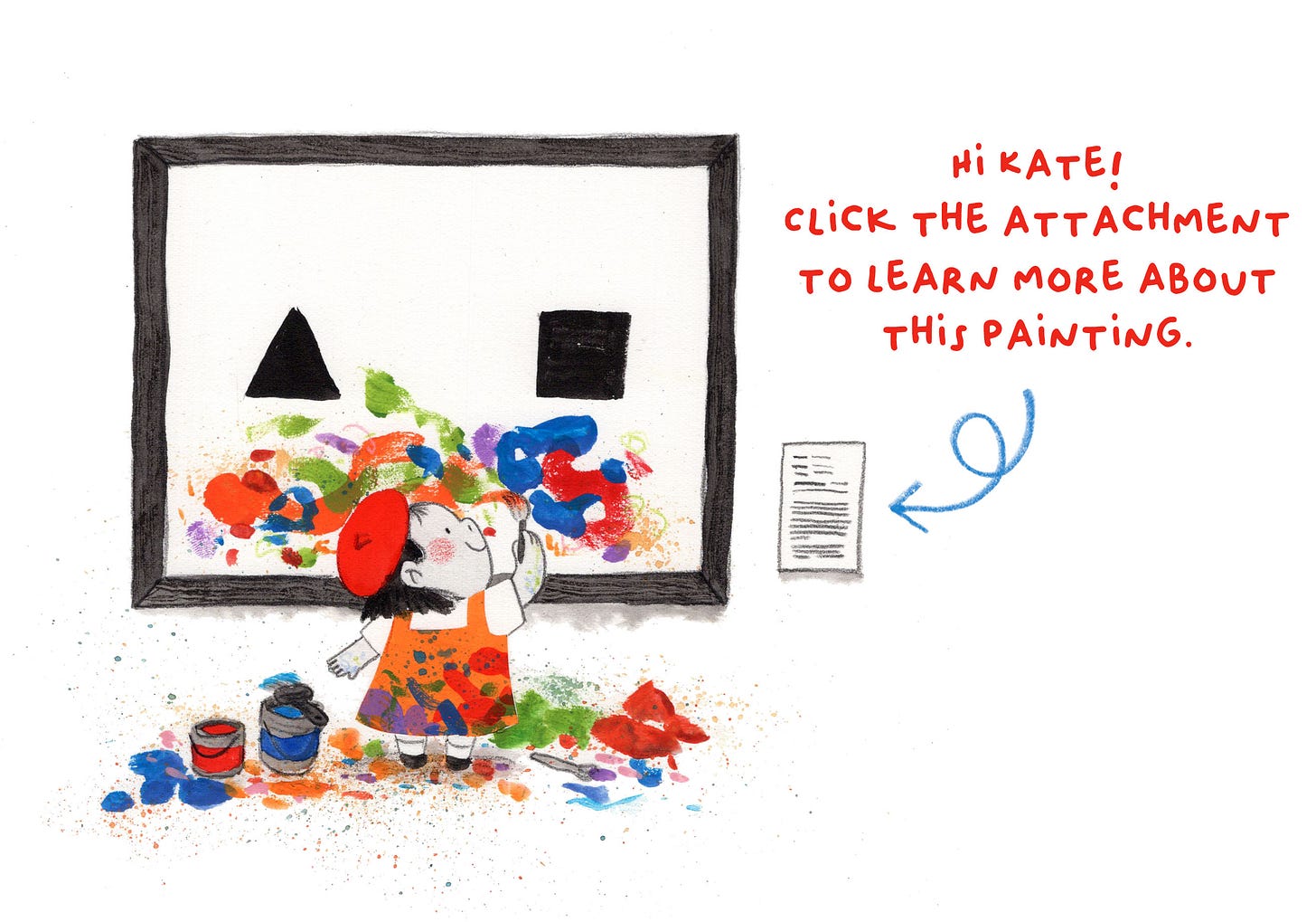
Then it was time to send Olive out to editors! All this hard work and finally we were throwing this Olive sized bait out to sea and seeing who would bite. To make sure that my pitch stood out more amongst all the others, my agent set up a fun interaction element where editors could click on Olive’s painting to open up the pitch:
She also included a very flattering letter addressed to each editor as an introduction to my book:
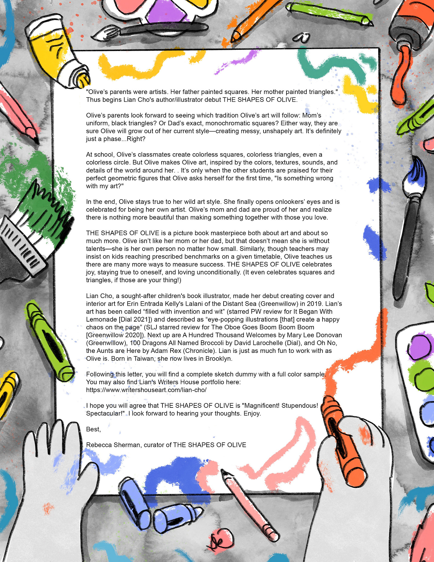
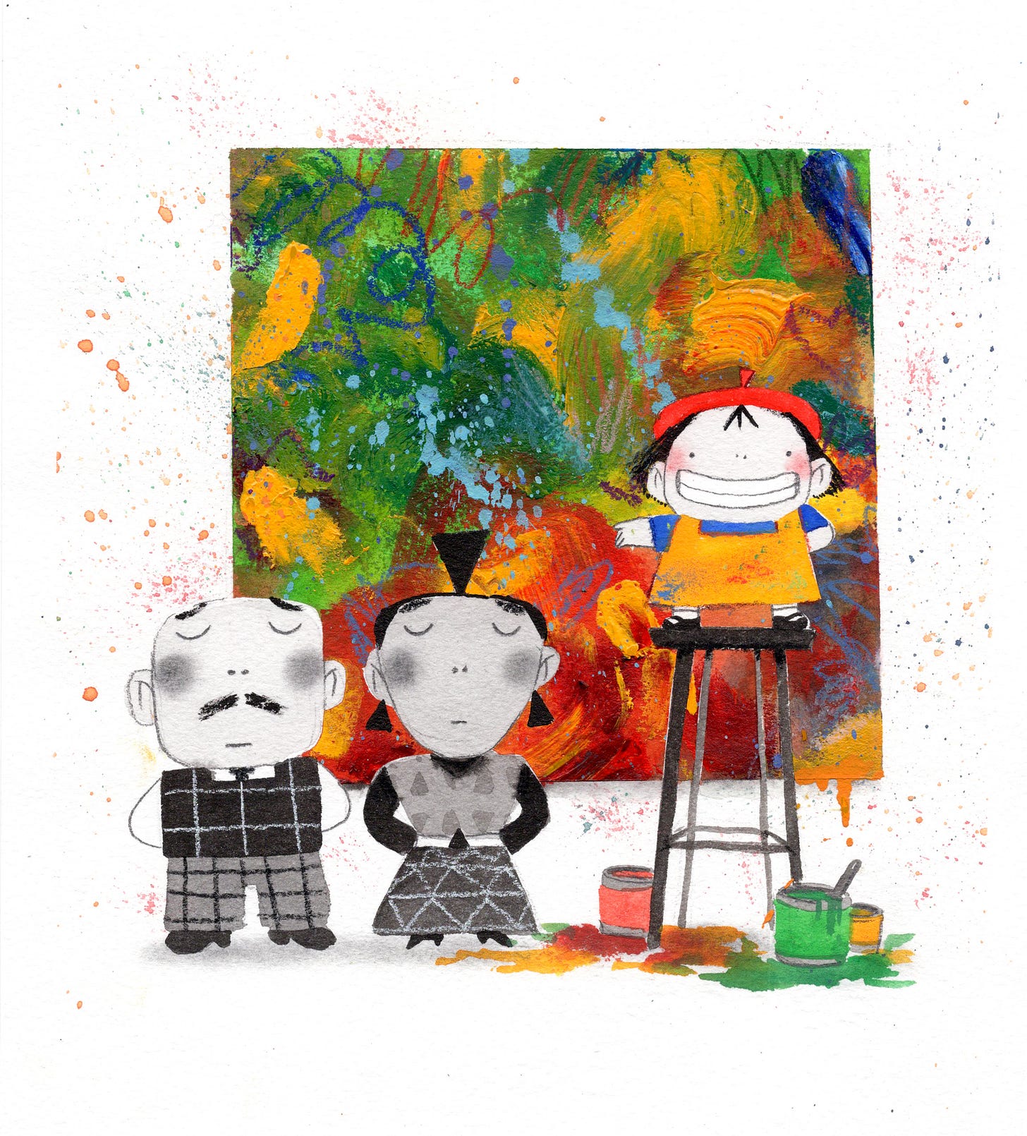
With the dummy, we also included two sample paintings: the earlier portrait of Olive and her parents as well as this one below.
If you’ve read the book you know that neither of these paintings make it into the final book!
Part Six: Wait, what?! I’m an author now??
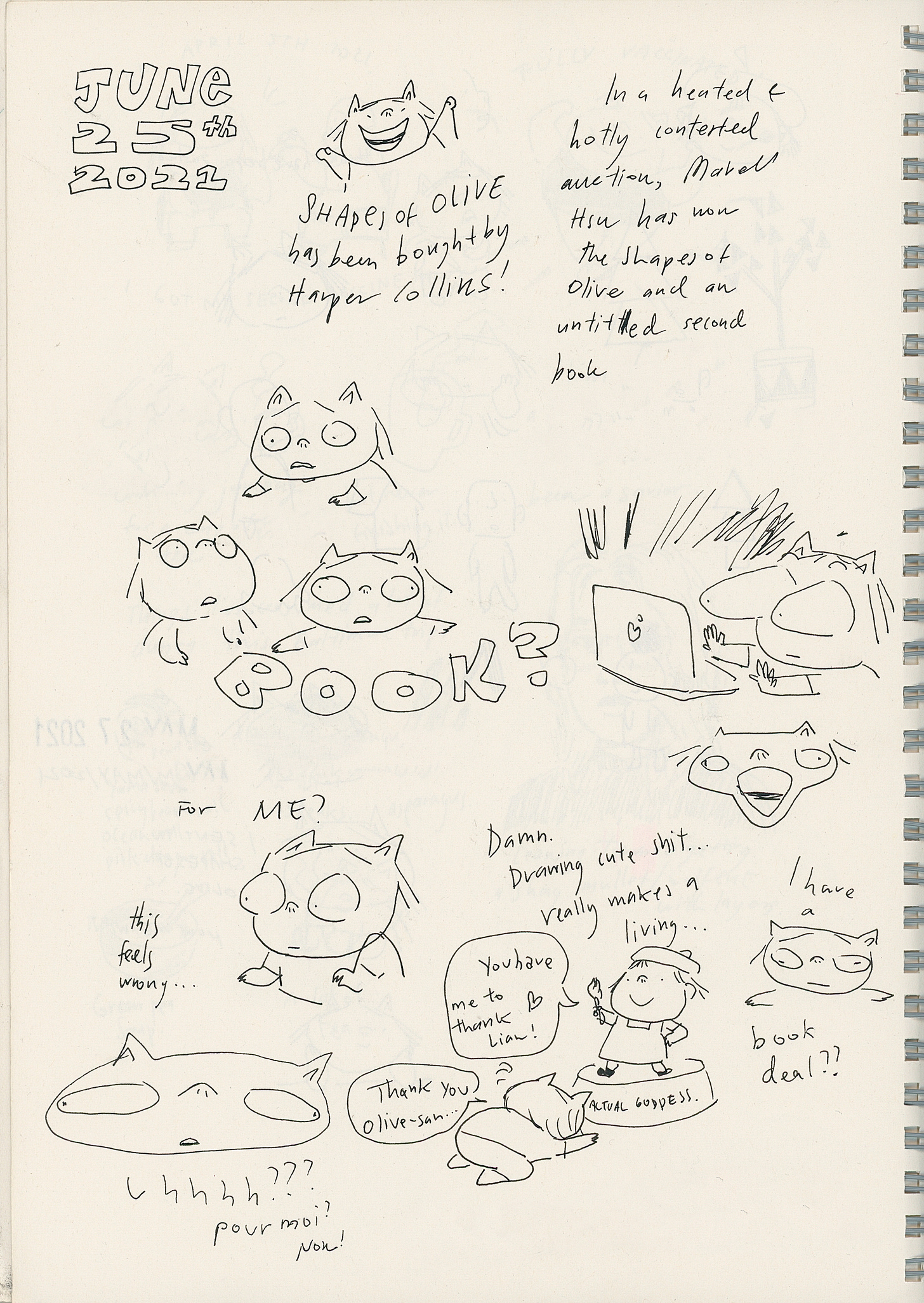
On June 25th, after meeting with editors and sitting through a nail biting five house auction, my book was bought by HarperCollins! What! Here is a page from my diary from the day, it’s quite funny:
Part Seven: What do you mean it’s just beginning??
Yeah, so I thought that I would submit my dummy, it’d be perfect and then we would just publish that baby. And boy, oh boy, was I wrong! I thought I was at the finish line but it turns out I was just warming up before and now it was actually time for the race to begin.
I met with my editor and now it was her turn to give me notes. Here is just page one of many notes I took during our first meeting.
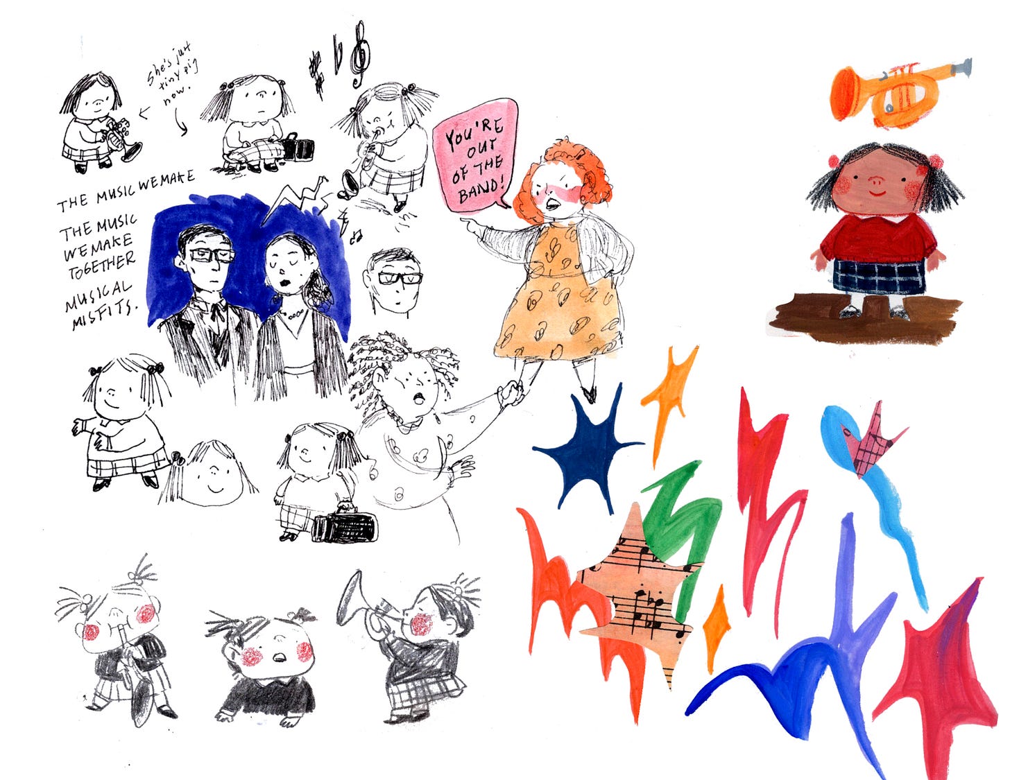
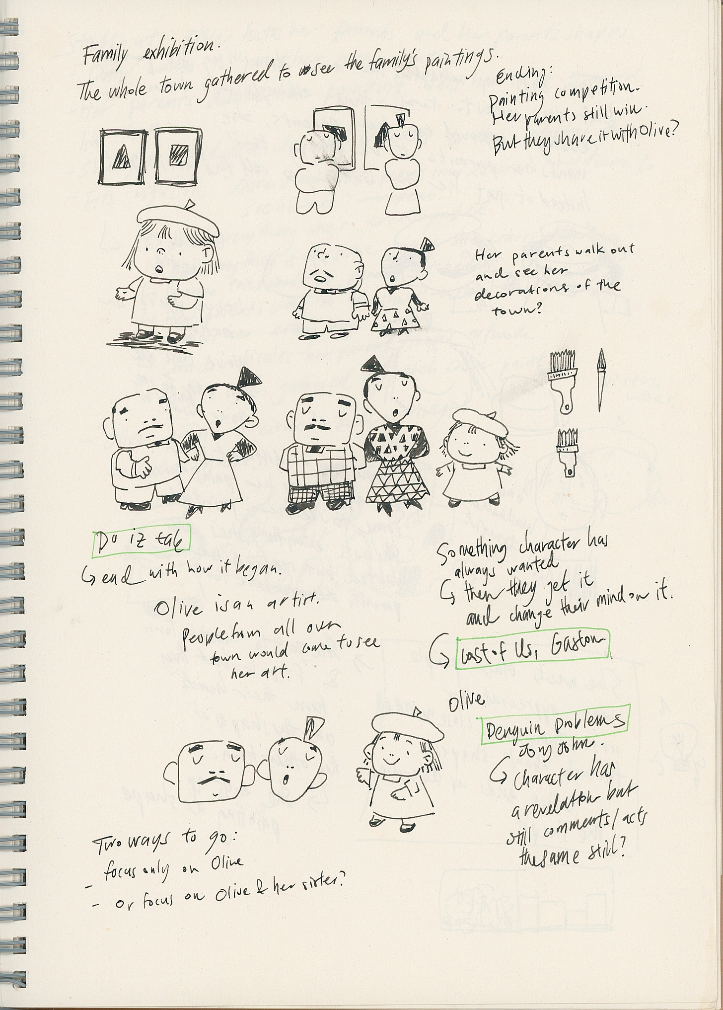
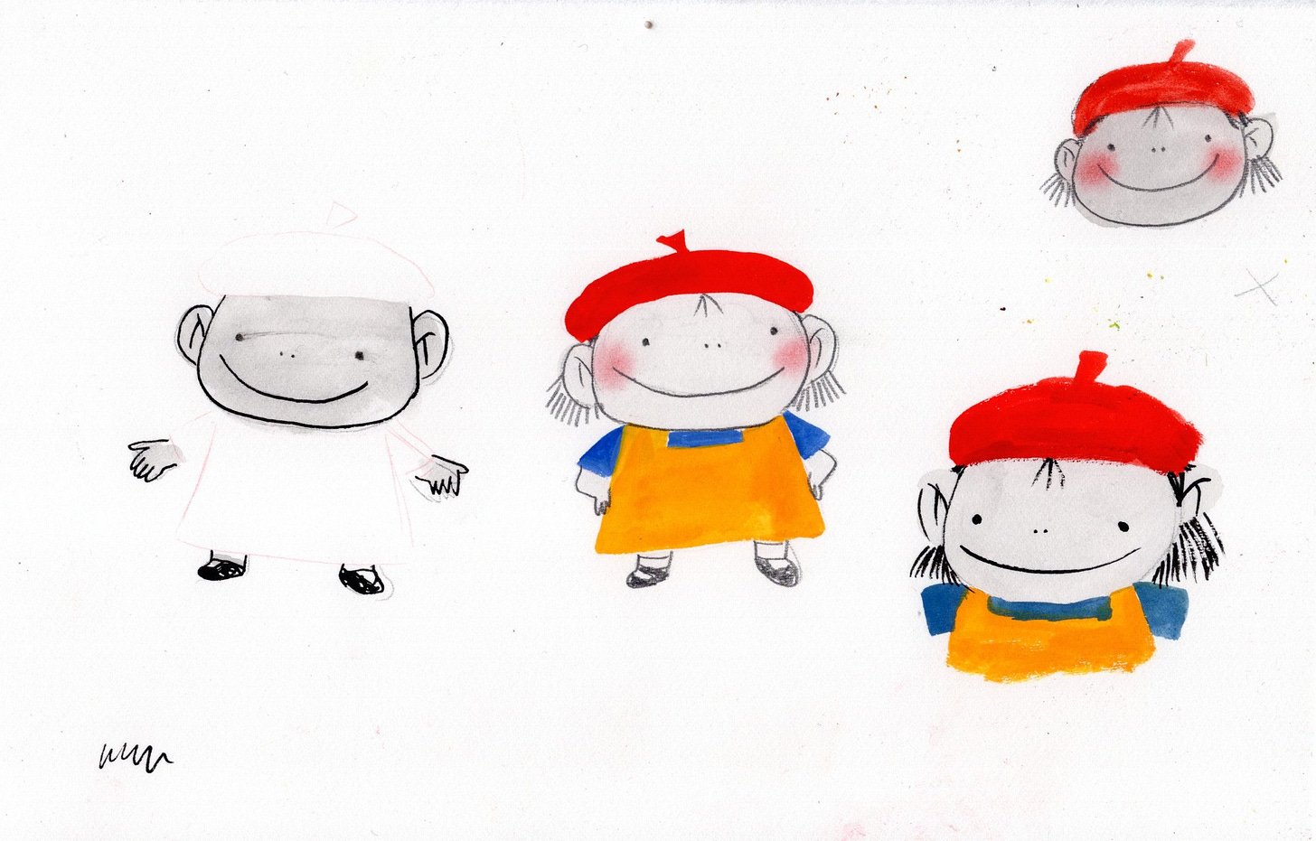
A main consensus we came to was that the book needed a better ending, but more on that another day. This post is getting too long! For now, I’ll just share some more sketches I did trying to hone down the look of the characters.
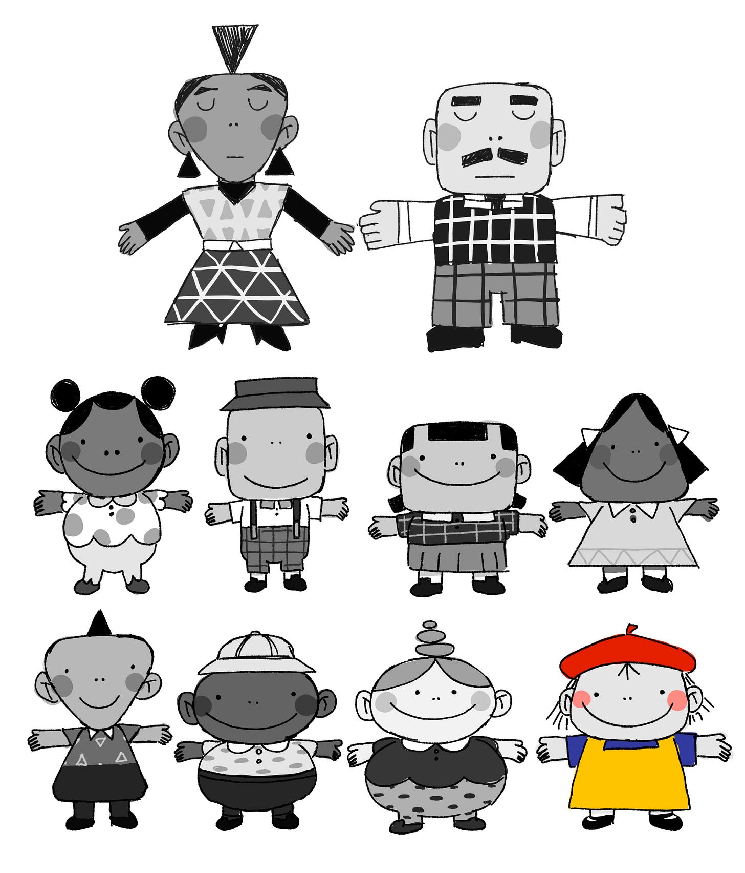
I really liked the simplified style I tried out in the page above and decided to stick with that for the book. Below is an adorable character sheet I drew out so I could reference outfits and proportions as I was working on the book:
Who’s your favorite? Personally mine is Marco, the square boy with the bucket hat.
Part Eight: I have to paint this… AGAIN?
Then it was time to figure out ~officially~ how I wanted the book to look.
Here are some more development paintings I did with the new simplified designs in mind:
Okay at one point I was like what if I do this book digitally? Wouldn’t that just be ~~wild~~~
Of course I immediately shut that idea down. It seems pretty contradictory to make a book about painting and making a mess without actually getting my hands dirty.
Anyways after much experimenting I finally settled on the *final* *FINAL* look for this book:
The book ended up being made with a combination of sumi ink, graphite, charcoal for the black and white parts. The color parts are primarily gouache as well as colored pencil, acrylic, pastels and crayons for Olive’s paintings. A fun fact about the art is that the color in the characters cheeks are from dipping a q-tip in graphite or ground up pastel to blush their cheeks.
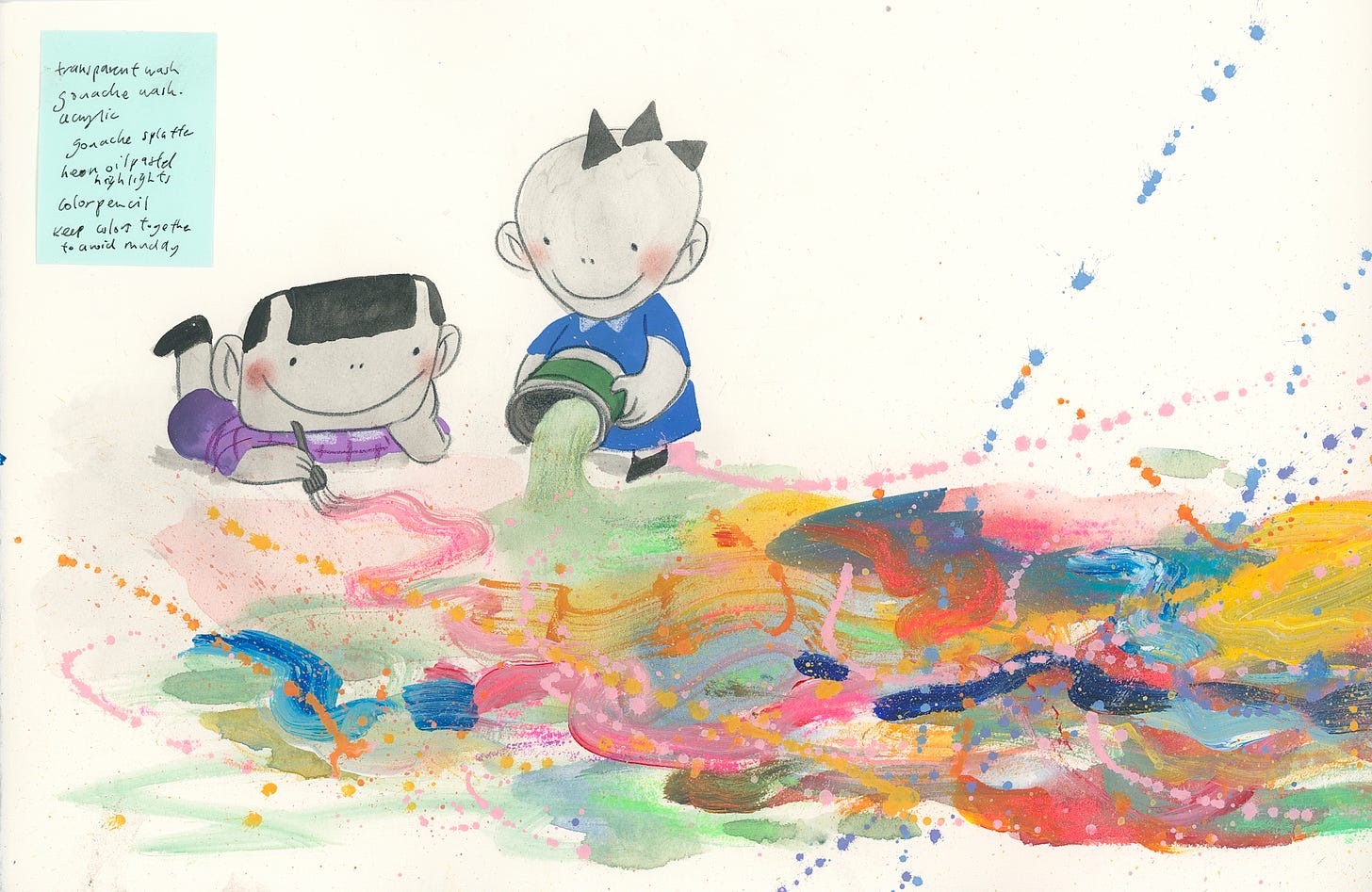
This painting above was when it was starting to get somewhere but I didn’t like how gentle and soft it was. Olive is zany and I needed to amp up the excitement and boldness more which led to these two tests below that captured her spirit better:
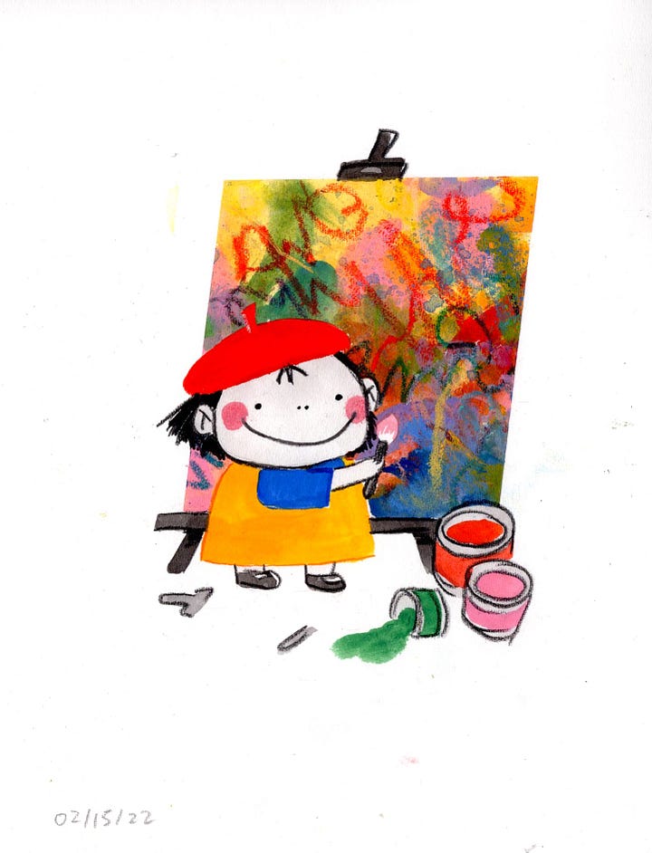
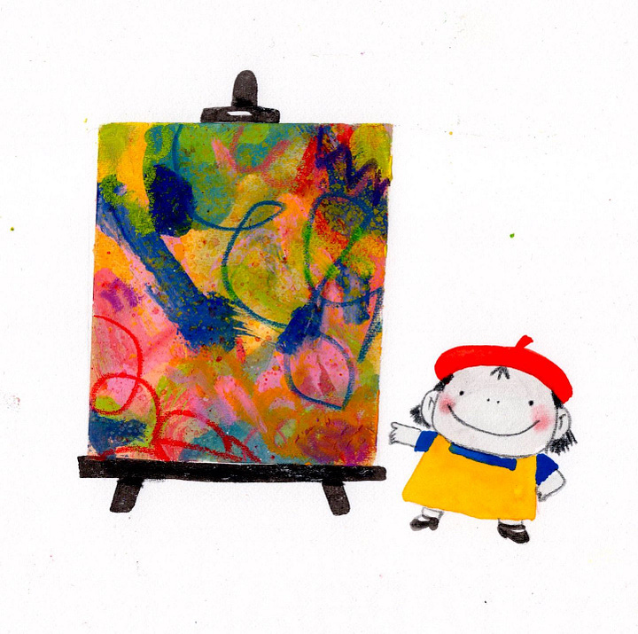
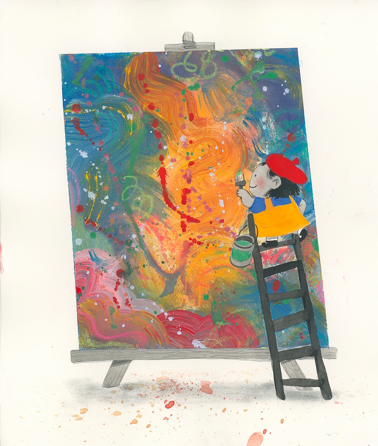
After all of this work, I finally finished the painting below and was FINALLY satisfied with the look.
Now all that was left to do was to re-sketch out the dummy with the new ending and then eventually paint the book. That’s not that hard right??
Part Nine: Hubris.
Here are all the versions of dummies I made along the way:
I have nothing to say but this:
Anyways, there are some spreads that never made it into the final book that I still quite liked so I’m going to share them:
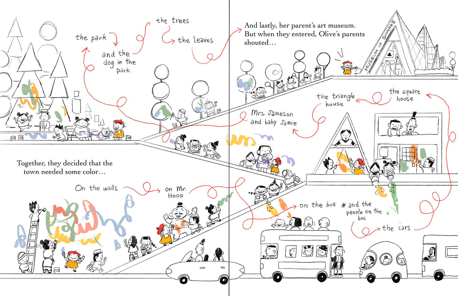
Eventually, my dummy was approved and I started on final art. I won’t get into that today but I will get into…
Part Ten: Oh god, it’s not over yet?
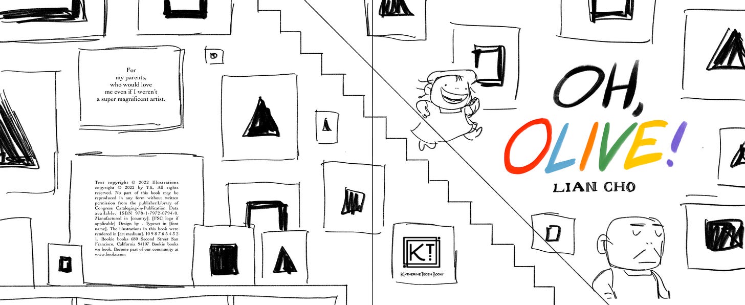
The cover.
Oh the cover.
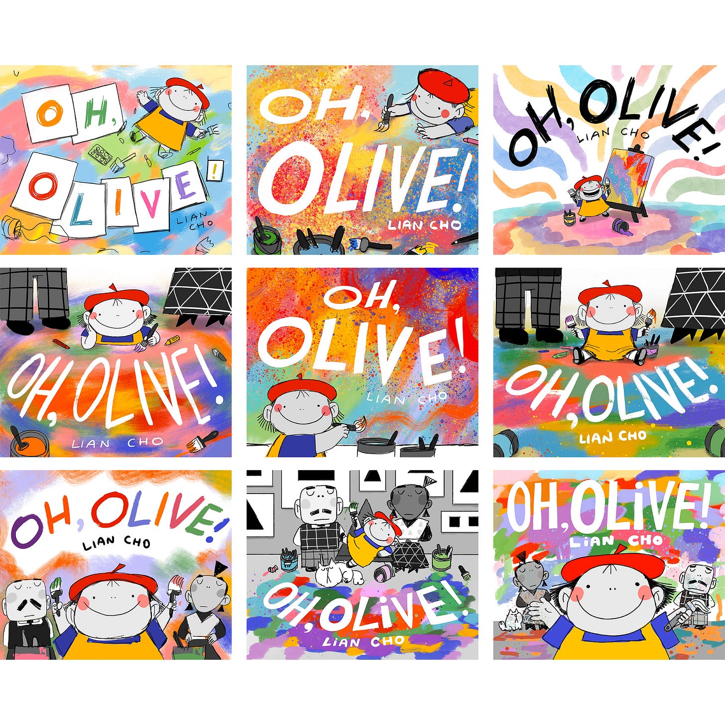
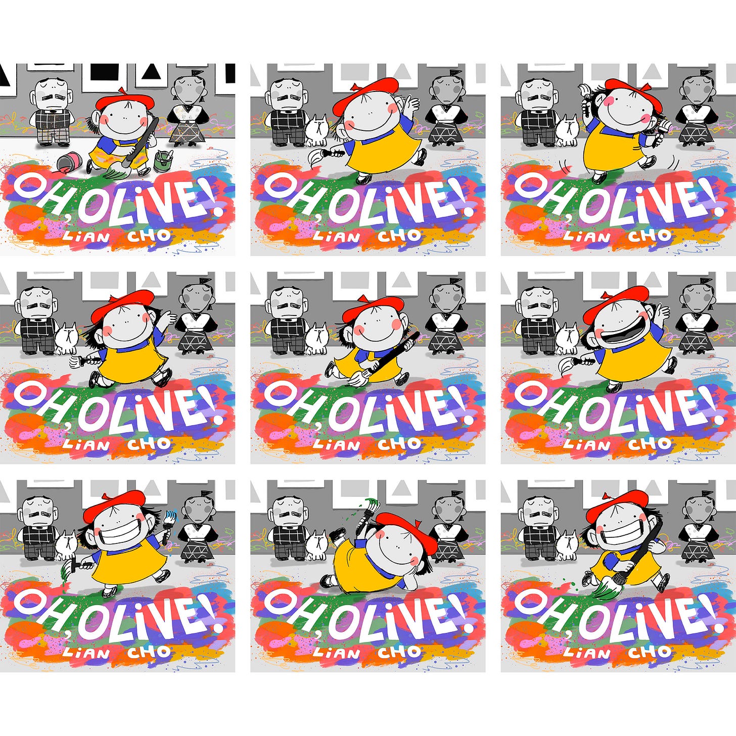
This cover… was the death of me. I usually pride myself on being able to whip up a great cover with ease. But damn… Olive really made me work for it. Here is the first round of “finished” sketches I did:
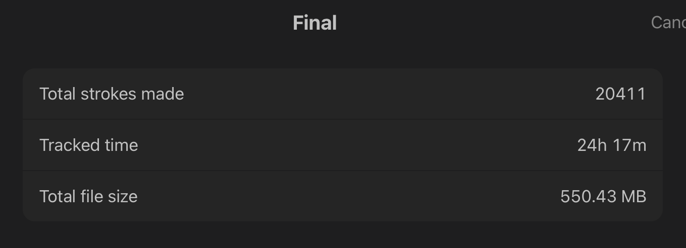
And here’s how long those took:
Unfortunately, none of those hit the mark so back to the drawing board I went and whipped up this idea which my editor liked. I could not figure out her pose for the life in me though and tried so many iterations that I felt like my eyes were going to bleed:
And here are the hours I spent on that:
But finally. We settled on it.
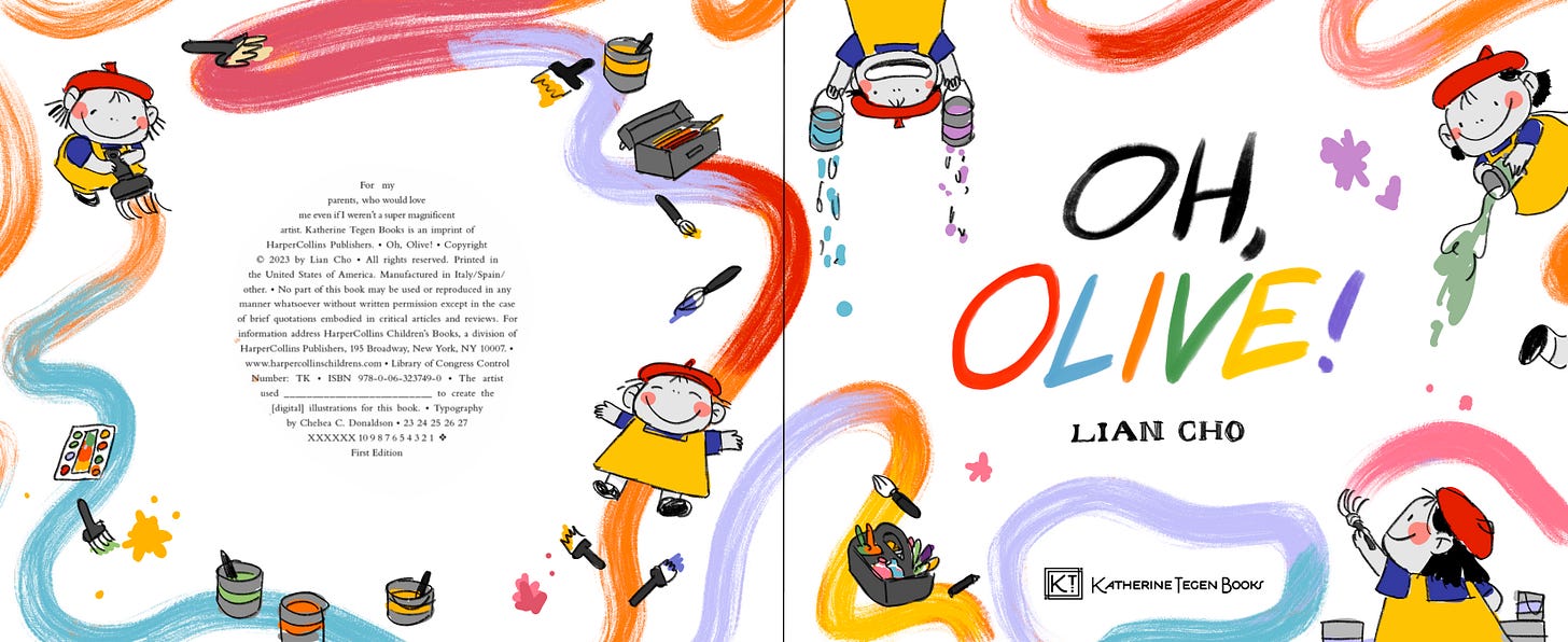
The final cover.
And so, Olive was born.
A big thank you to everyone who has bought a copy!! I can’t believe after all this work it’s finally out in the world.
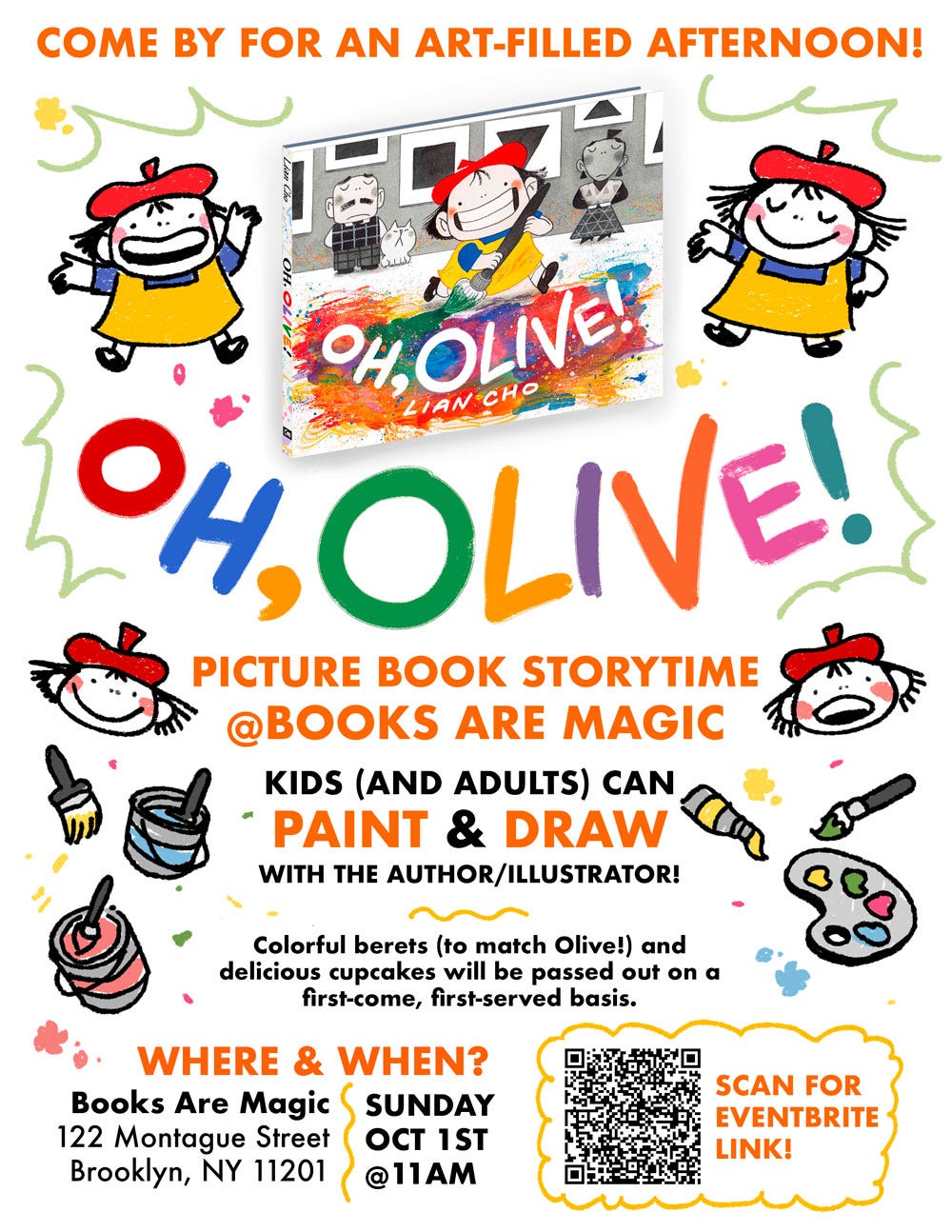
If you’re in New York, we’re having an in-person launch event at Books Are Magic on Sunday October 1st! Here is the Eventbrite page with all the details, we’ve “sold out” of all free (lol) RSVPs but that doesn’t matter, just show up and it’ll be a good time! Here are the details in a fun poster format:
Finally, if you thought 24 hours on a sketch was bad, I leave you with the most impressive “time spent” on a sketch from this book:
You wanna see the sketch don’t you, you sadistic bastard?! Here it is, nearly 37 hours of sketching compressed down to 30 seconds.
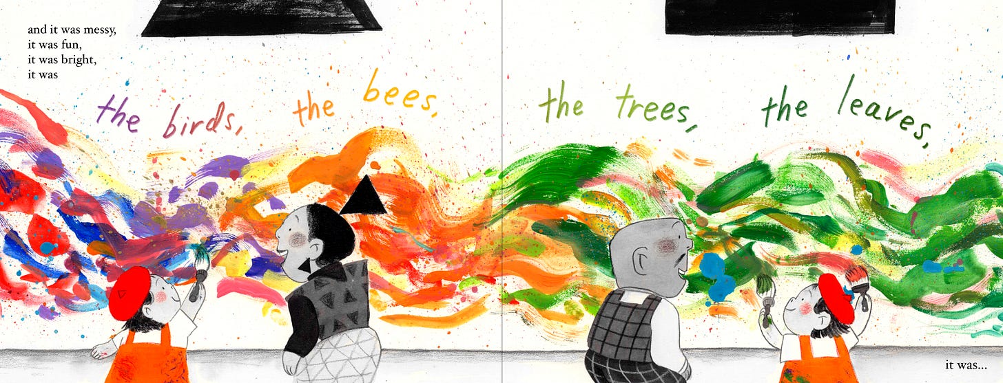
And I would be remiss to not show the final painting:
It was totally worth the approximately 60 hours spent on it…
Right?



















I have been EATING. UP. all of your process posts lately. Thank you for sharing so generously!! It's fascinating to see how it all came together. Congrats on such a magical, beautiful creation!!! 🌈🎨🖌️
Duuuuudeeee!! You put so much work into this post, and it's fantastic! Just wanted to acknowledge that! Love getting to see all the lead up work. :)