

How a Book Develops
All the hidden work behind a picture book

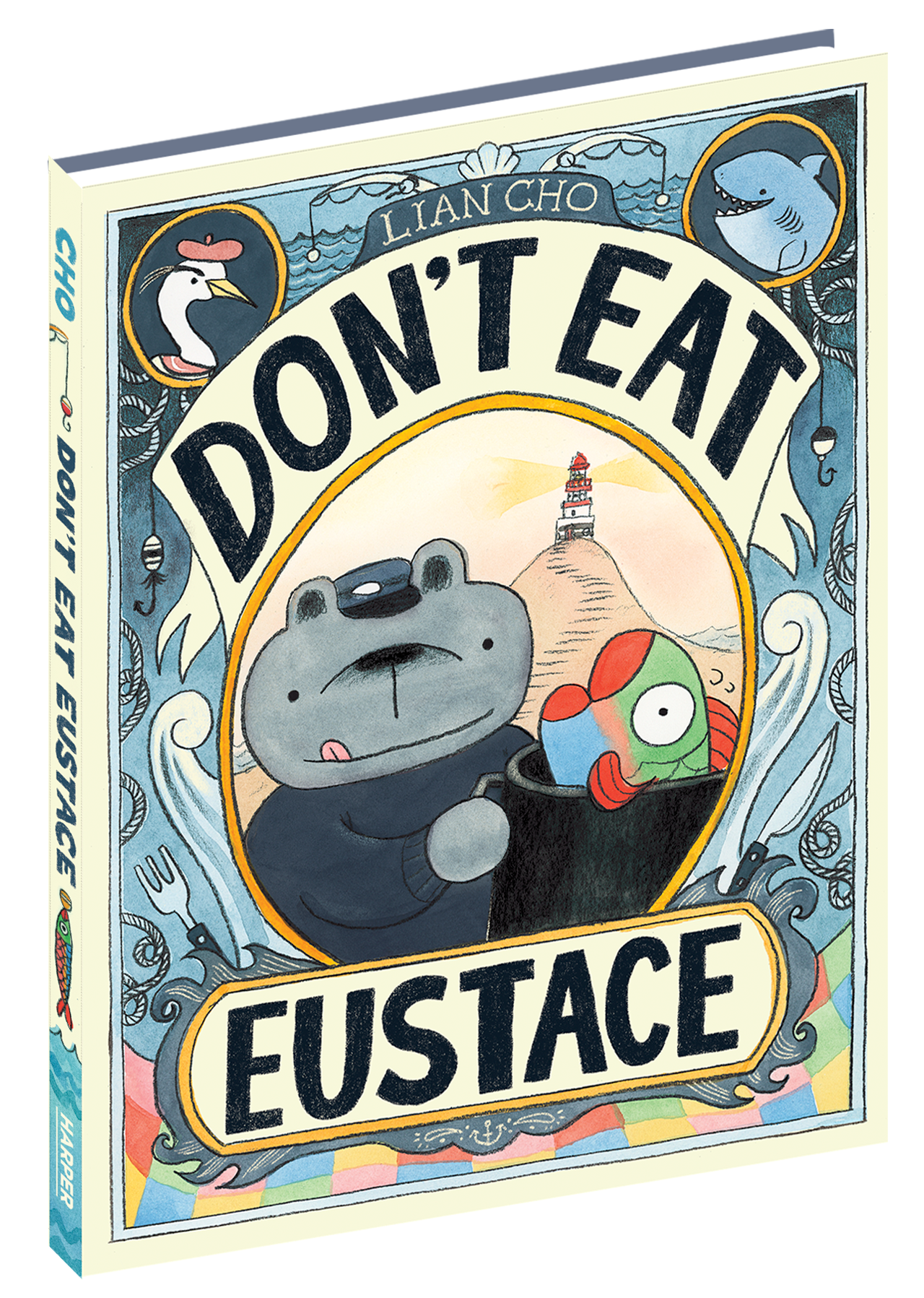
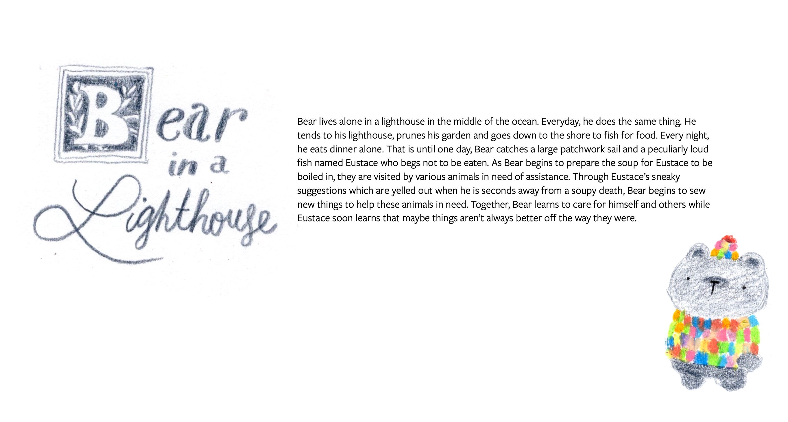
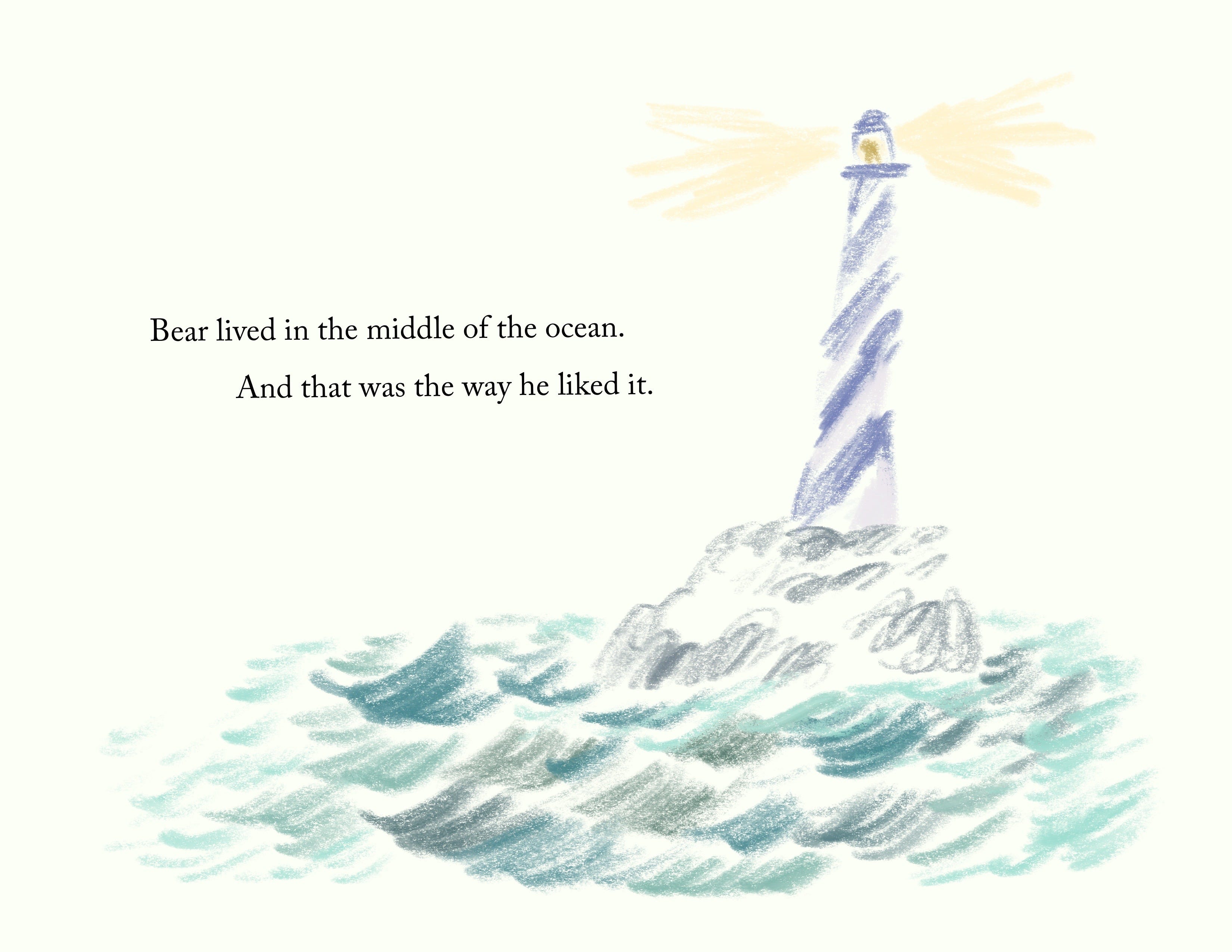
My third picture book Don’t Eat Eustace hits shelves NEXT WEEK!!!
To catch you up about what it’s about:
Author-illustrator Lian Cho of Oh, Olive! and Pig Town Party delivers her third hilarious picture book about a bear and the fish, named Eustace, that they’re trying to make their lunch. But a dash of diversion, a pinch of luck, and the surprising power of friendship just might save Eustace after all!?
When a book comes out, all everyone ever sees is the final, polished product.
What people don’t see, is all the very human work that goes into making a book and making art. People can’t shut up about AI recently and everywhere I look AI art is being used willy nilly. I’ve talked about my thoughts about AI in this post before, but I thought I would show you the absolutely fun and exciting experience of actually creating something yourself and experiencing things yourself.
This book included a lot of experiences, human trial and error, and human living. There are mistakes made in it, there are liberties taken, but there is also a lot of my soul in it. What is fun about a piece of AI art that is stolen and blended together?
Anyways, enough of my rant, let me just bring you on the adventures I went on for this book and we’ll call it a day okay? Ultimately, making art is fun, and the journey, not the destination is what makes it so satisfying.
Part One: I’m an overachiever (again)
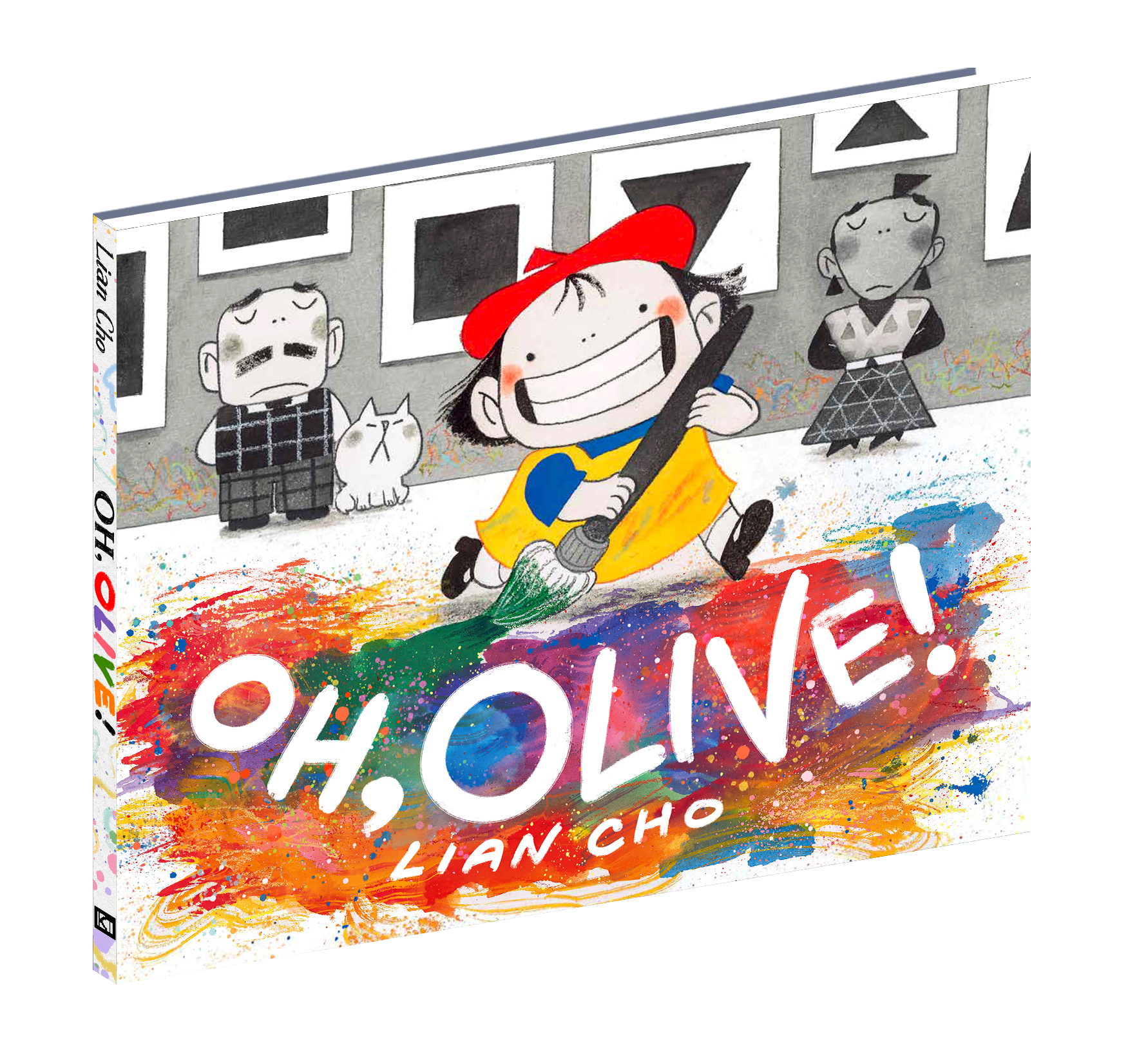
It was the year 2022 and I had just wrapped up artwork on my first author/illustrator picture book, Oh, Olive!
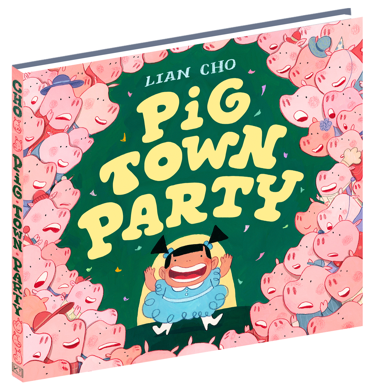
Originally I had signed a two book contract with HarperCollins. When it was time to pitch my second picture book, I was overcome with my usual spirit of overachievement. Instead of just pitching one idea, I put together a slideshow of eight different stories for my editor to choose from. Among these ideas, one would turn into my second book Pig Town Party as well as another book coming out next year titled The Pizza Brothers.
But that’s not what we’re here for. We’re here for Don’t Eat Eustace aren’t we?
It may be fun to learn that originally, Don’t Eat Eustace existed as two different ideas in this pitch.
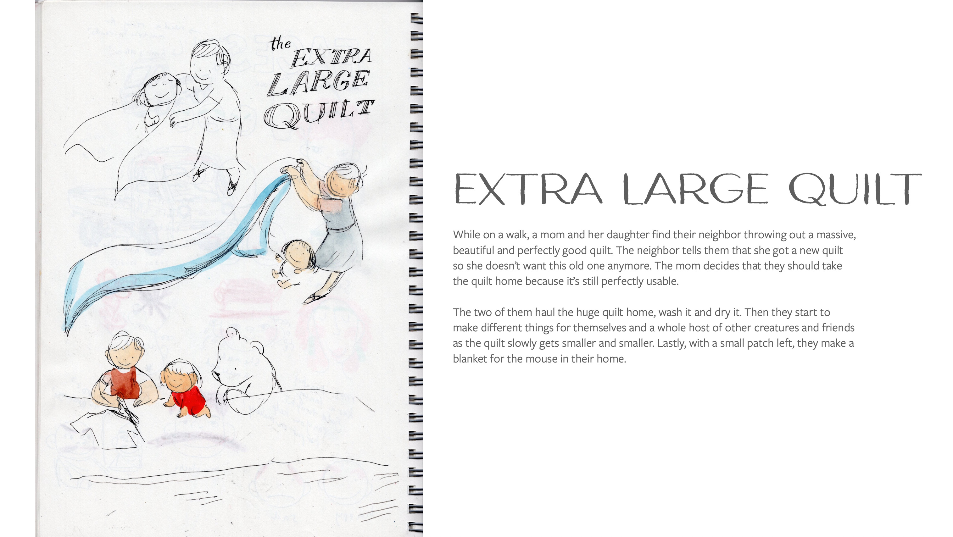
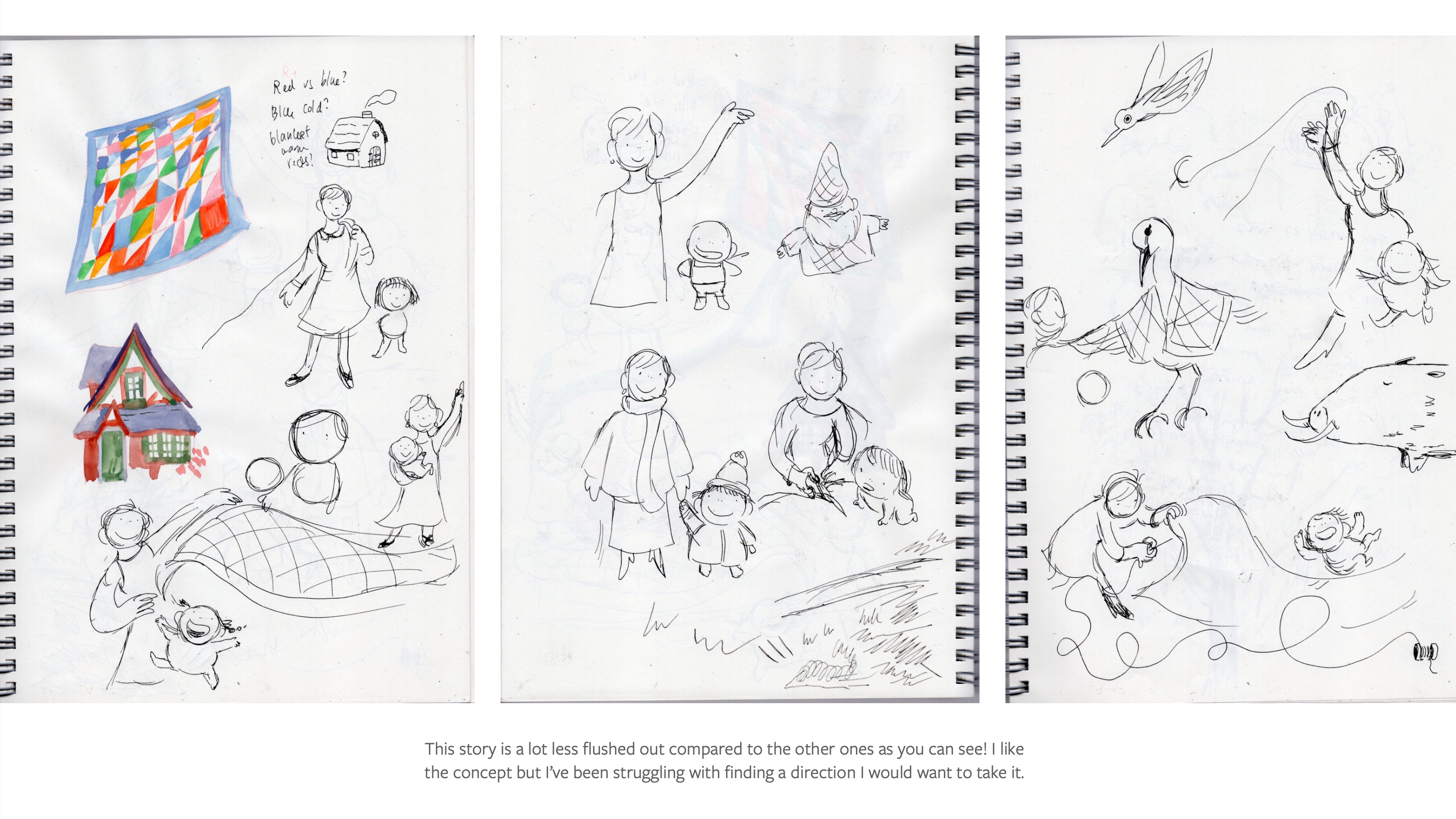
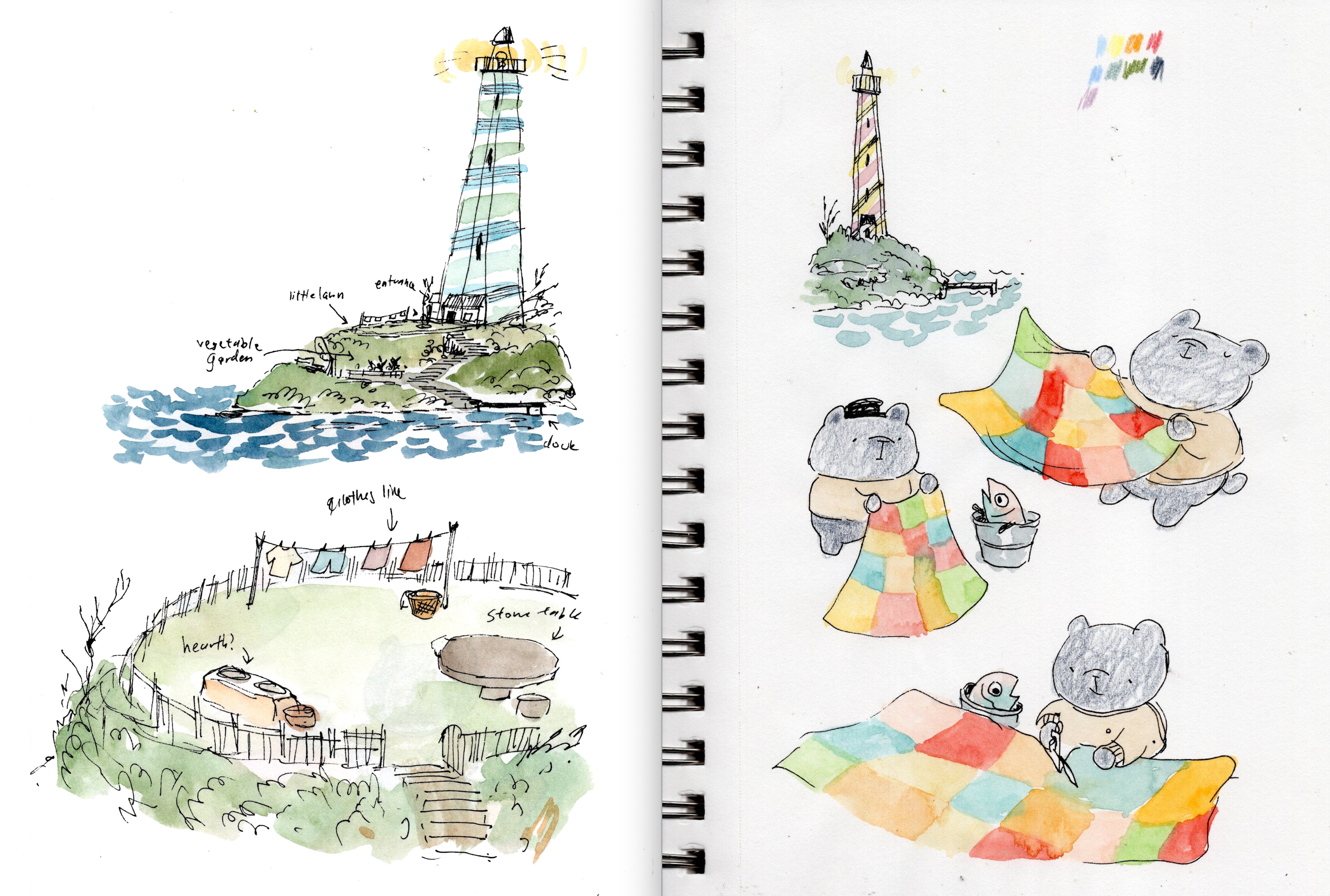
The first idea was a story about a mother and daughter who find a quilt being thrown out and they decide to clean and repurpose it into different things for different creatures. Here was the original pitch in my slide deck:
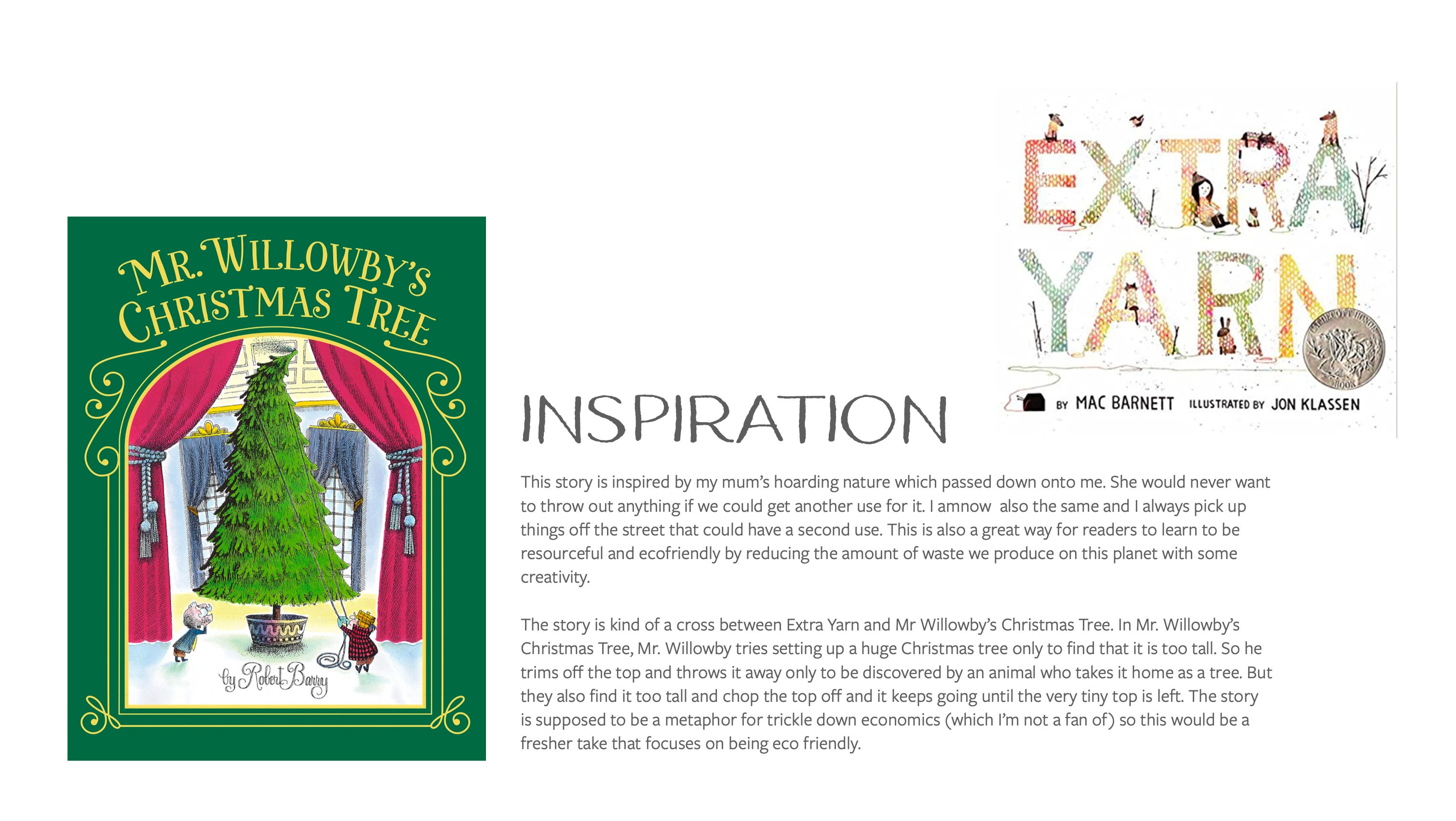
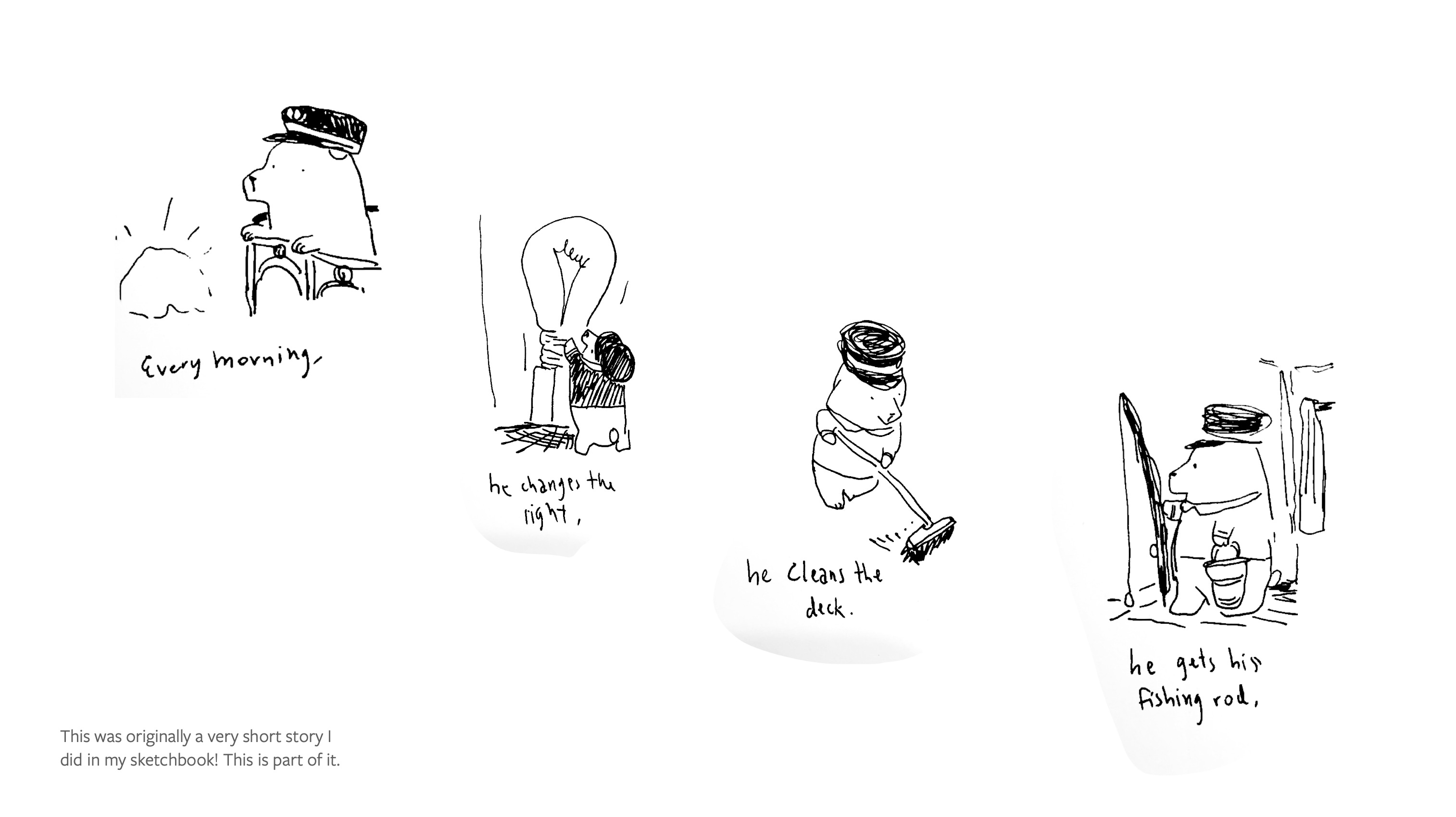
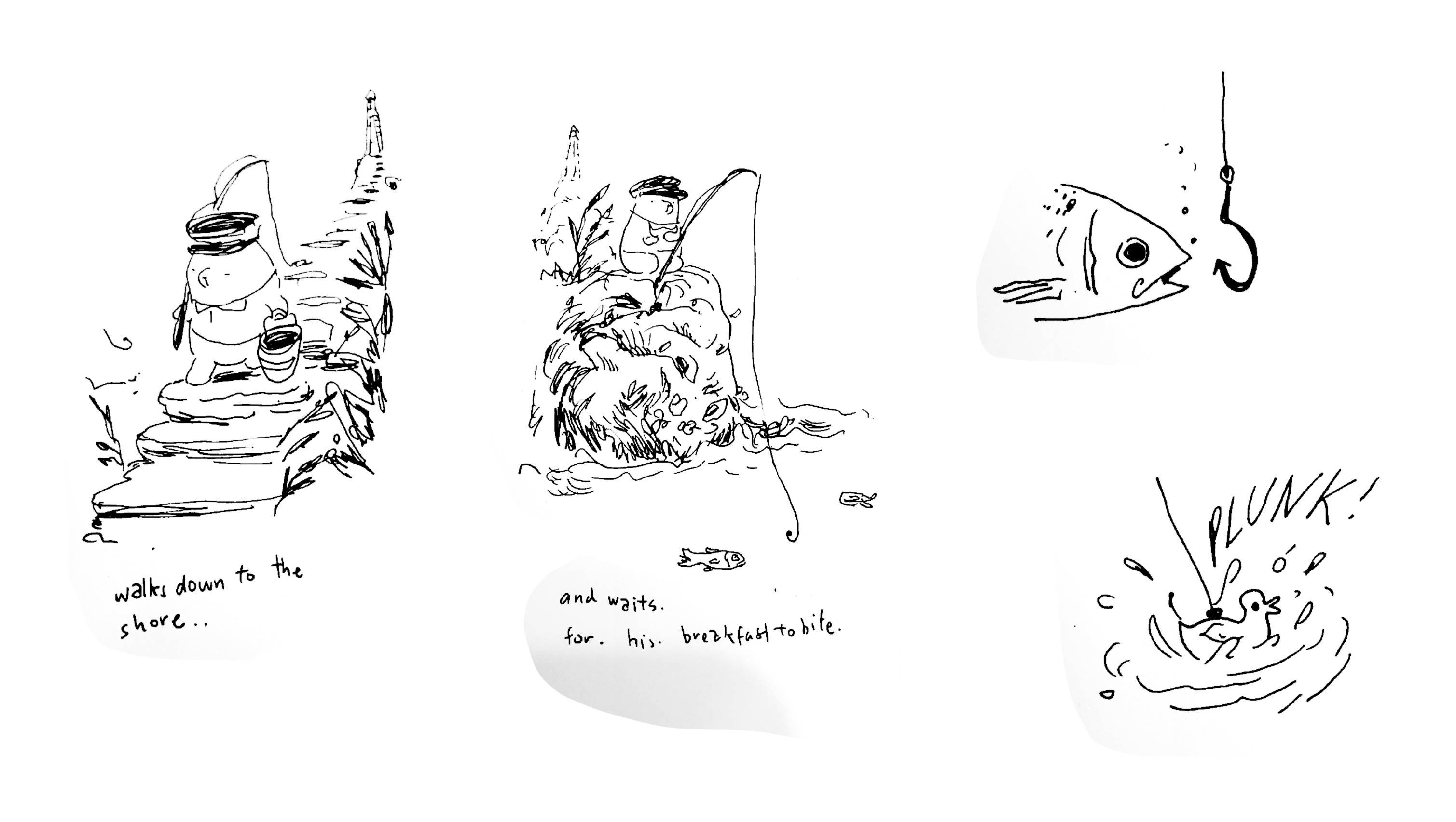
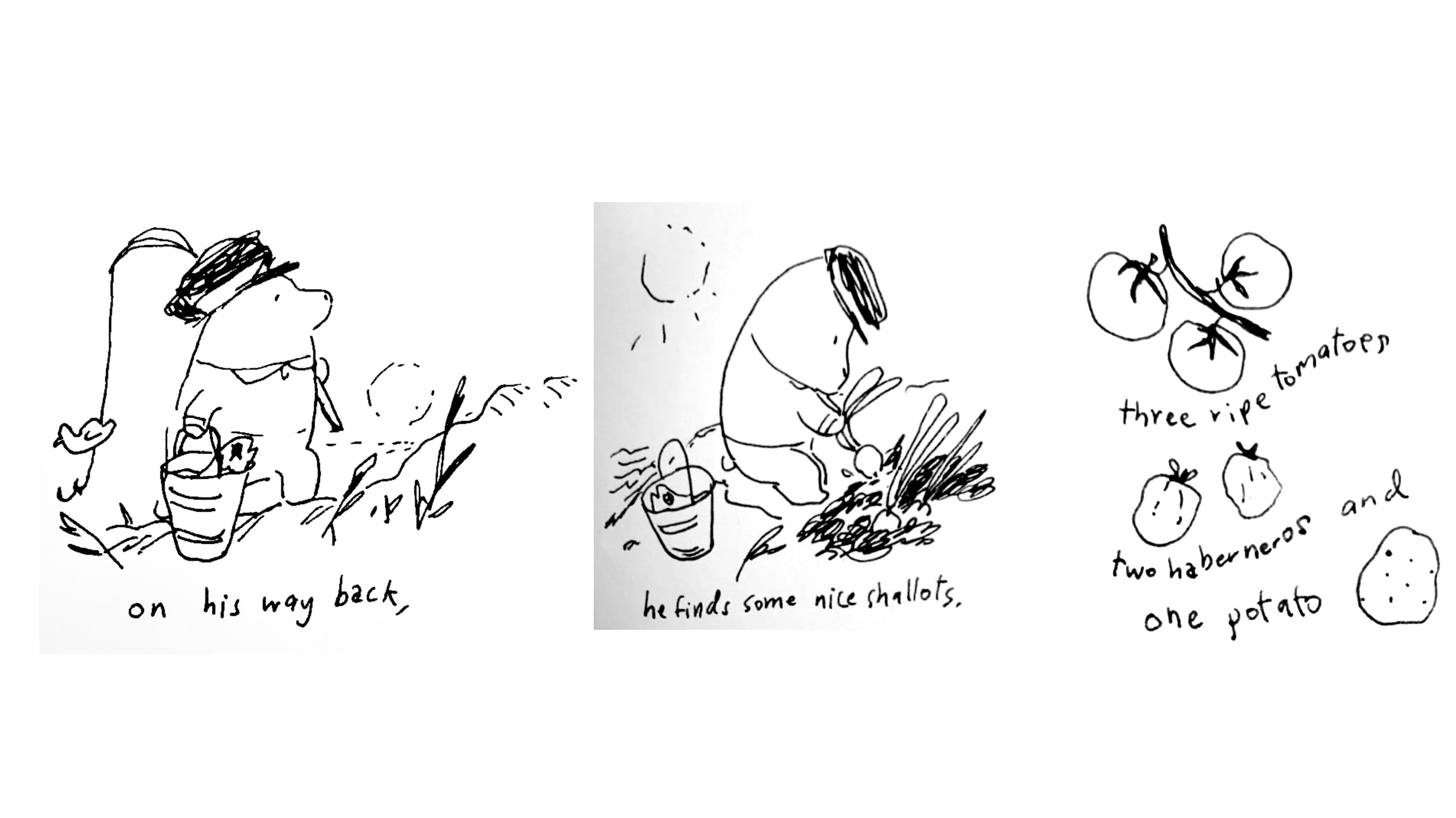
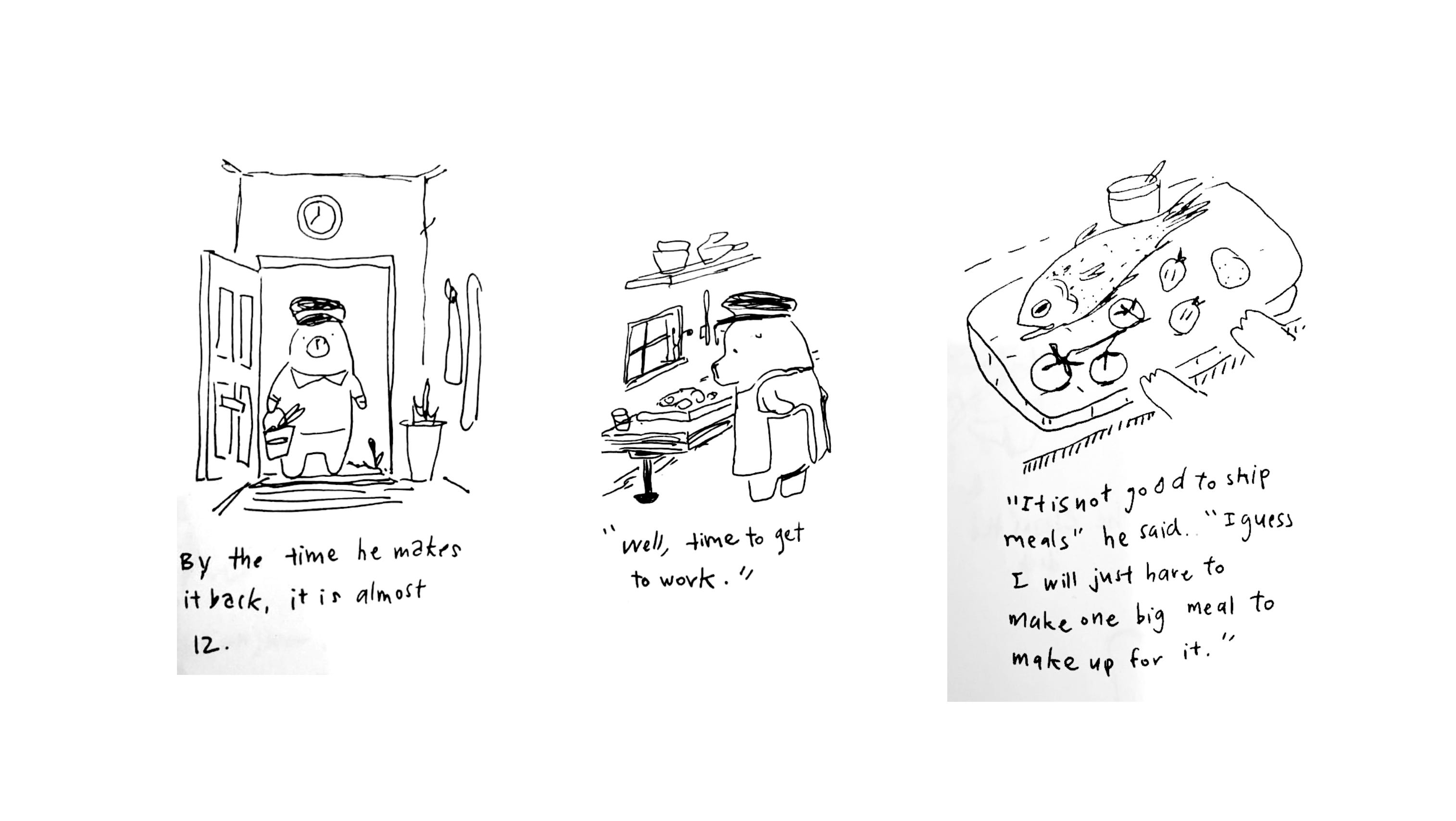
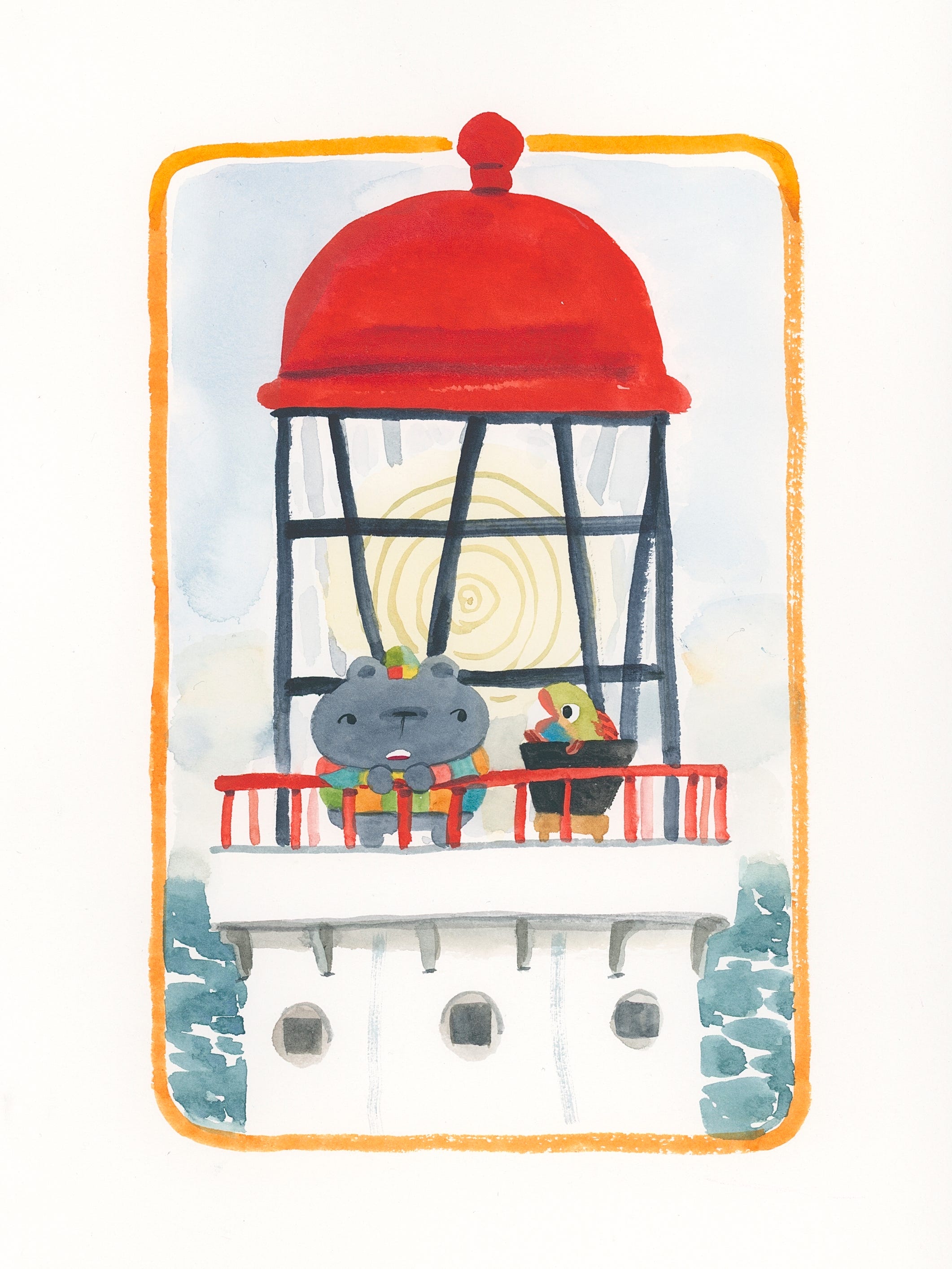
Separately, I had another story about a bear that lived in a lighthouse and goes out to fish for their dinner:
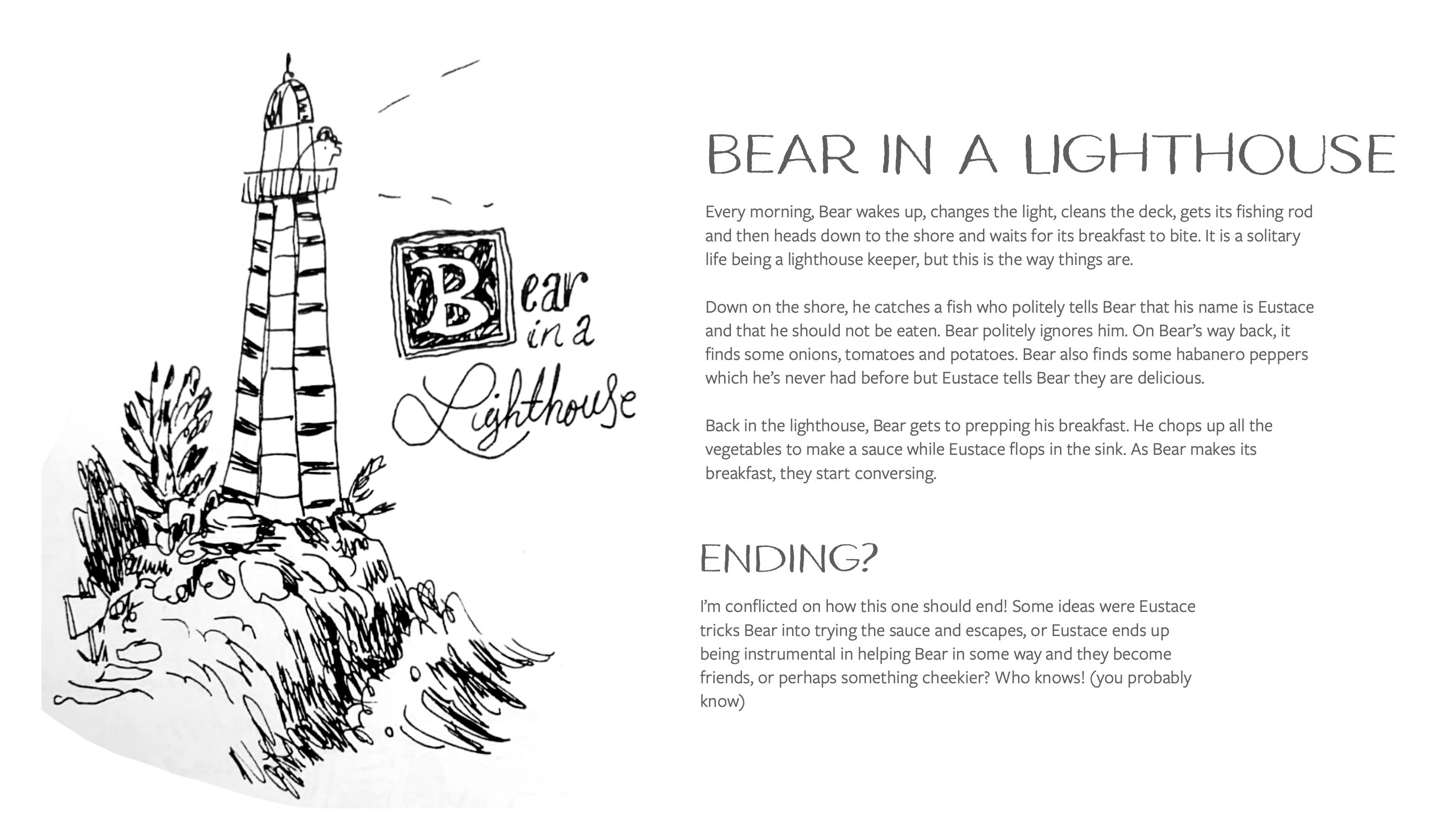
The problem with both of these stories was that I hadn’t really come up with a good ending.
Enter, MABEL (my editor at the time). She looked at all the stories I threw in her lap and had the brilliant idea of combining these two stories into one!
We decided on Pig Town Party as my book two idea, but Mabel (who also became obsessed with the same overachiever spirit as myself) became convinced that we could pitch two more ideas to Harper and get them on board with another two book deal.
So I worked hard to combine the two stories into a clearer pitch to send over:
The pitch included some sample art:
Then all there was left to do was wait with baited breath to see if acquisitions would say yes… And after much nail biting, I got an exciting text from Mabel!!
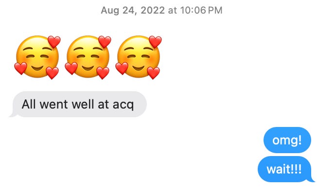
So Bear in a Lighthouse (Don’t Eat Eustace) was a go!
However once the story was acquired, it would be another two years before I started working on it as I had to wrap up my first and second books first. Which leads us to part two…
Part Two: Life is meant to be lived! Get out there!
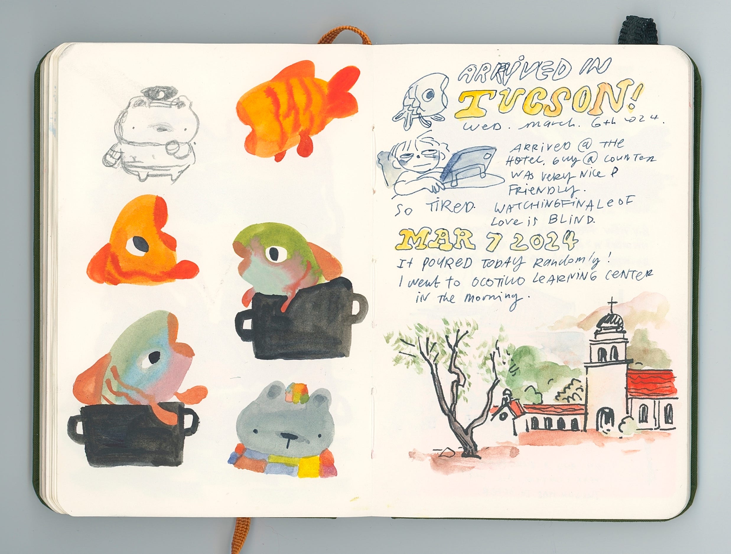
In January of 2024, I started working on Don’t Eat Eustace which was tentatively titled The Bear in the Lighthouse at the time.
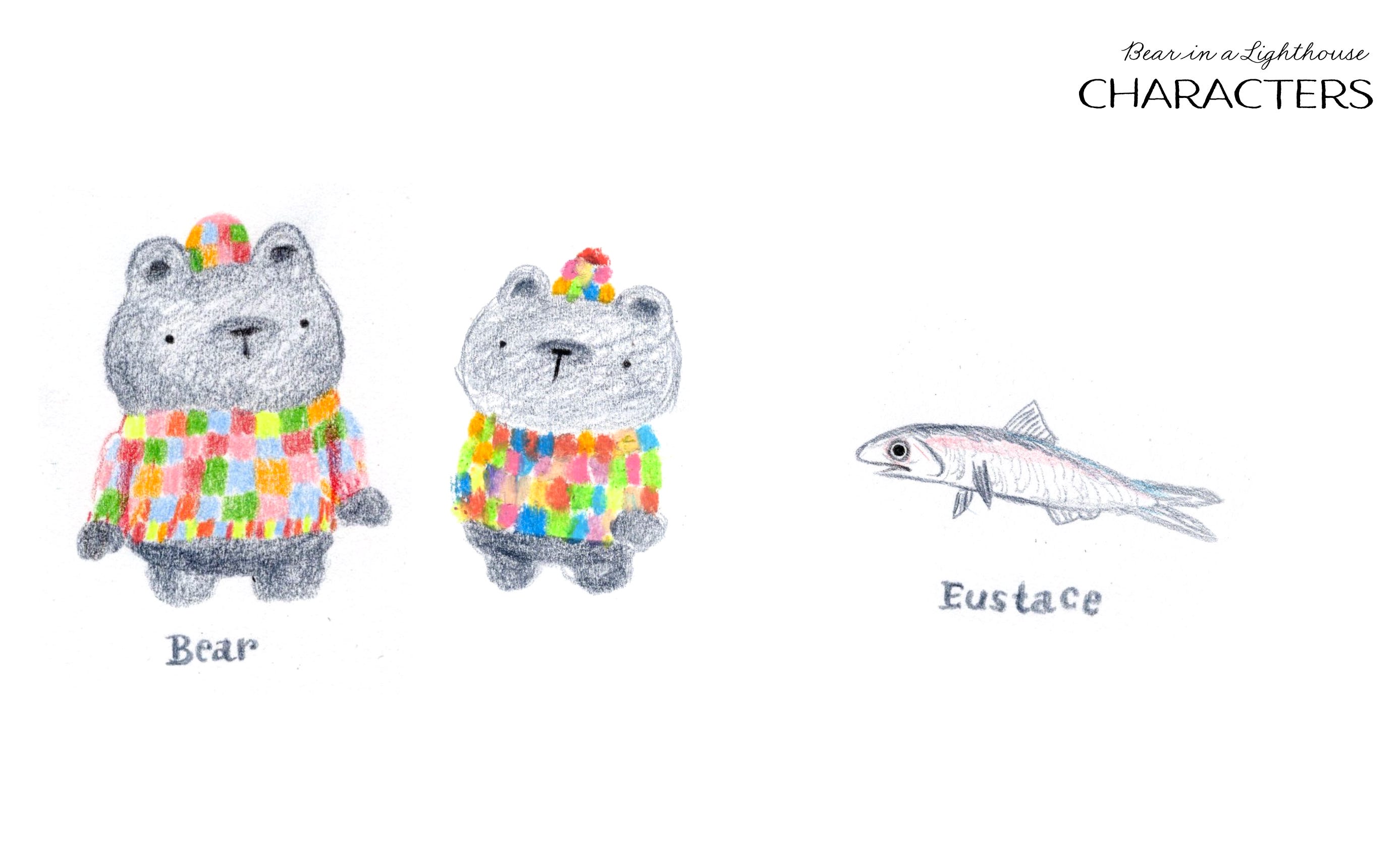
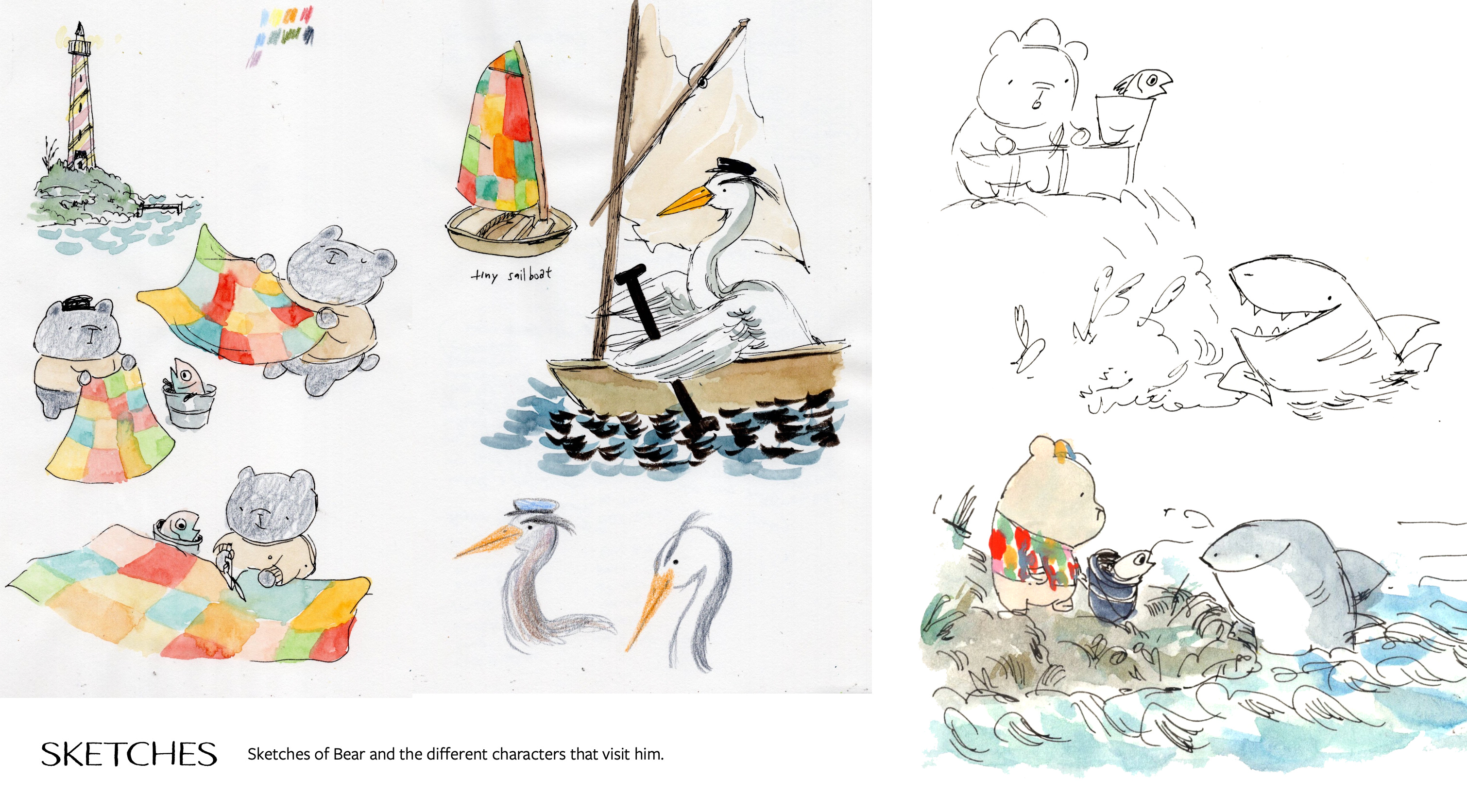
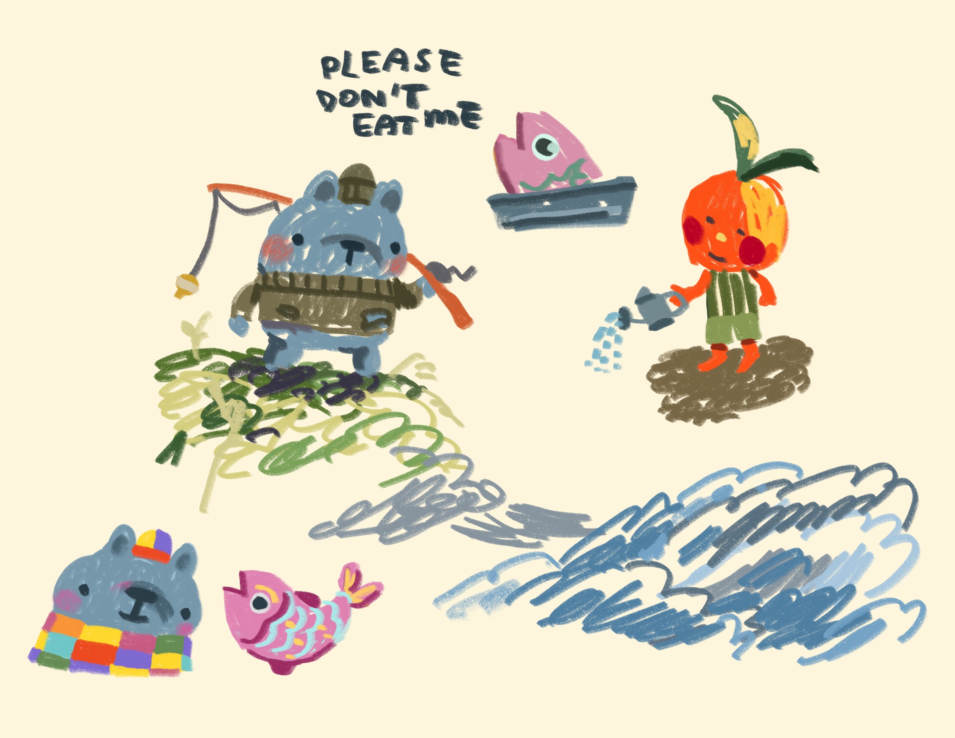
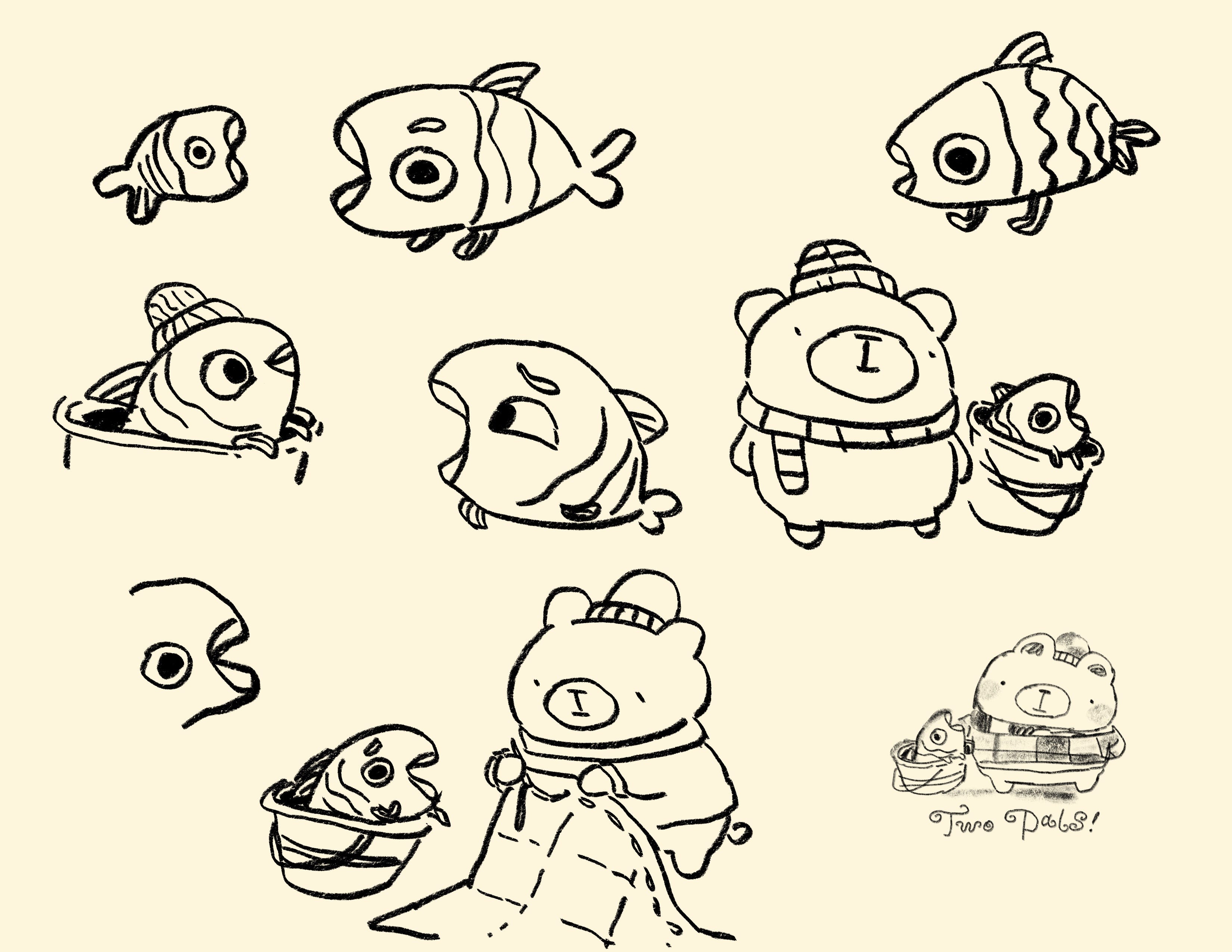
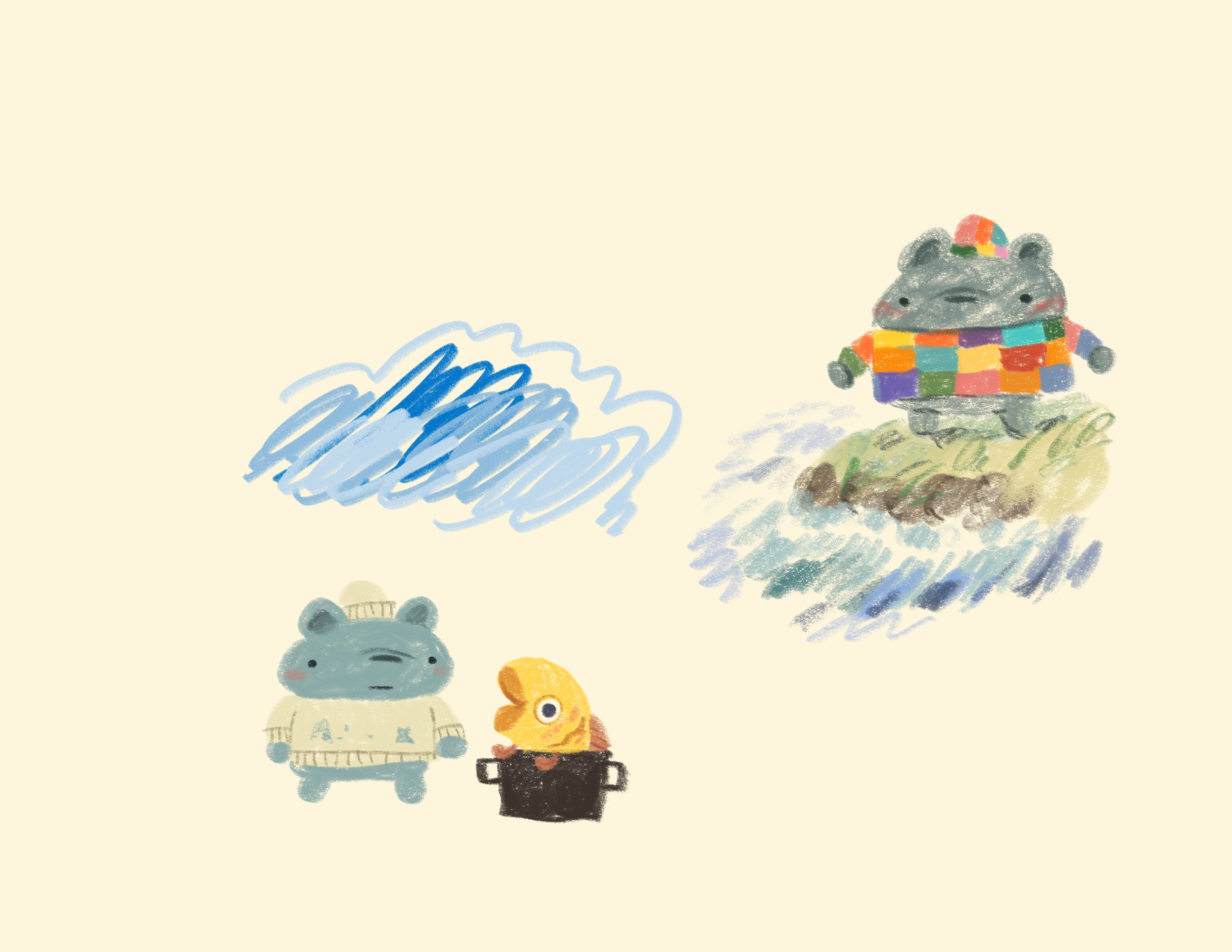
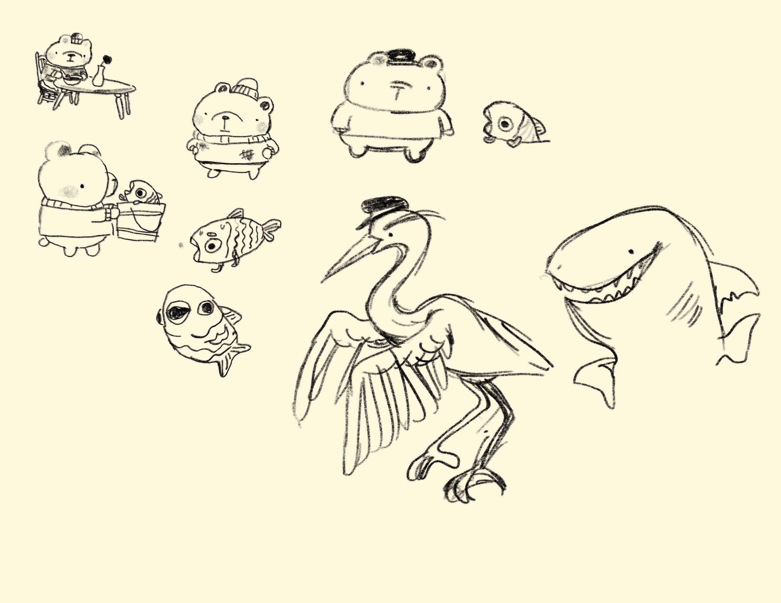
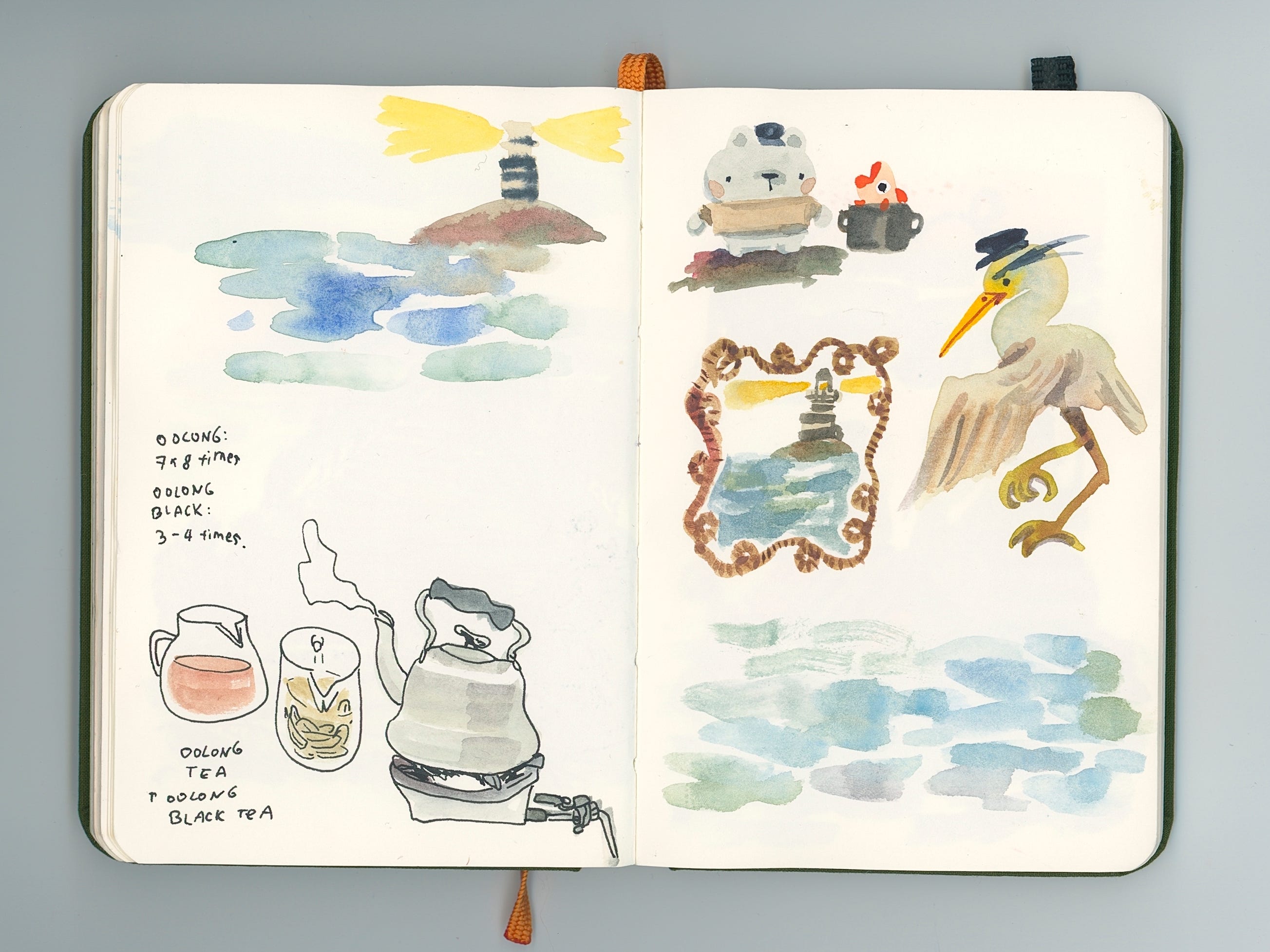
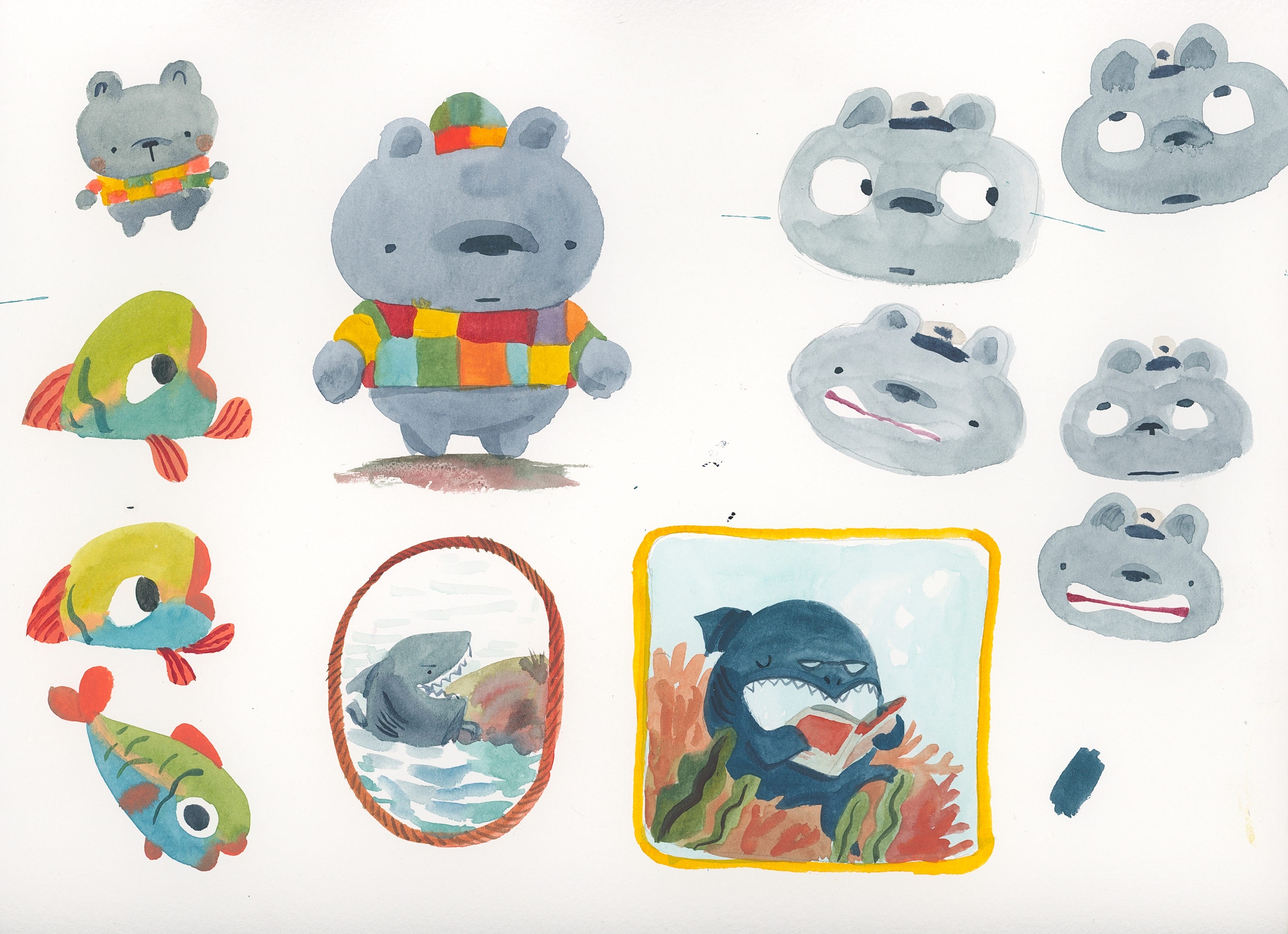
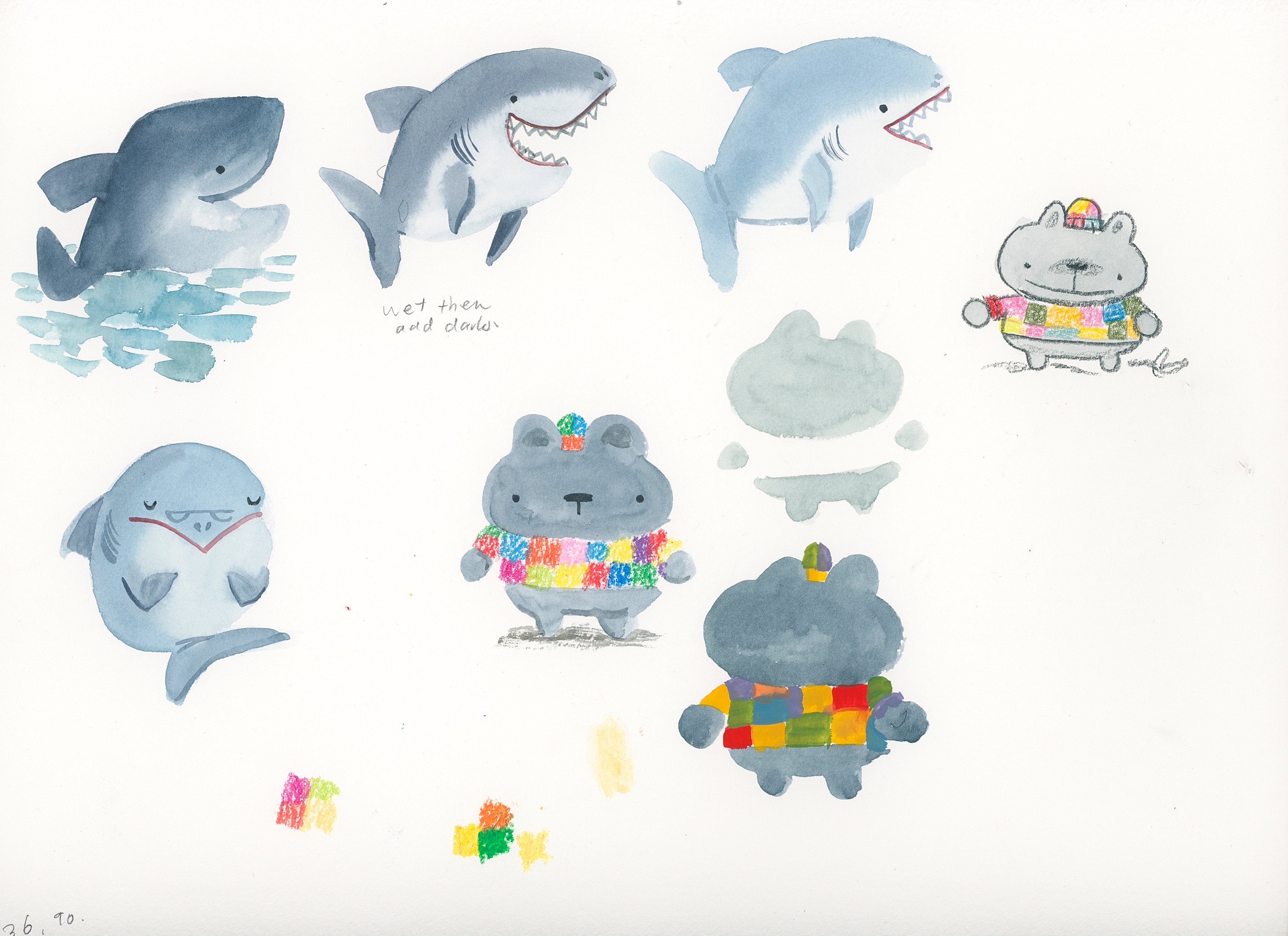
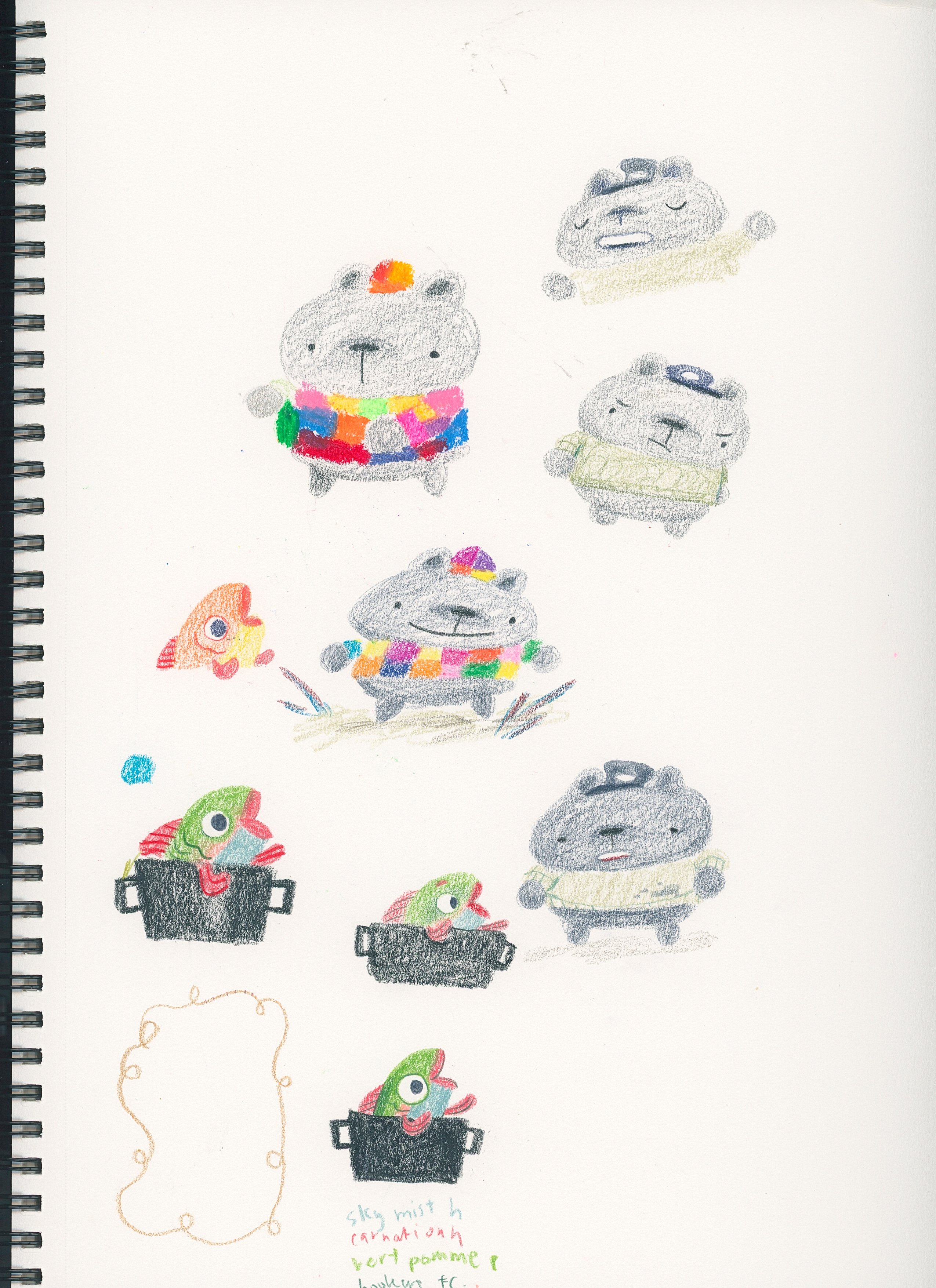
I started off with a lot of noodling around to figure out how I wanted the characters to look:
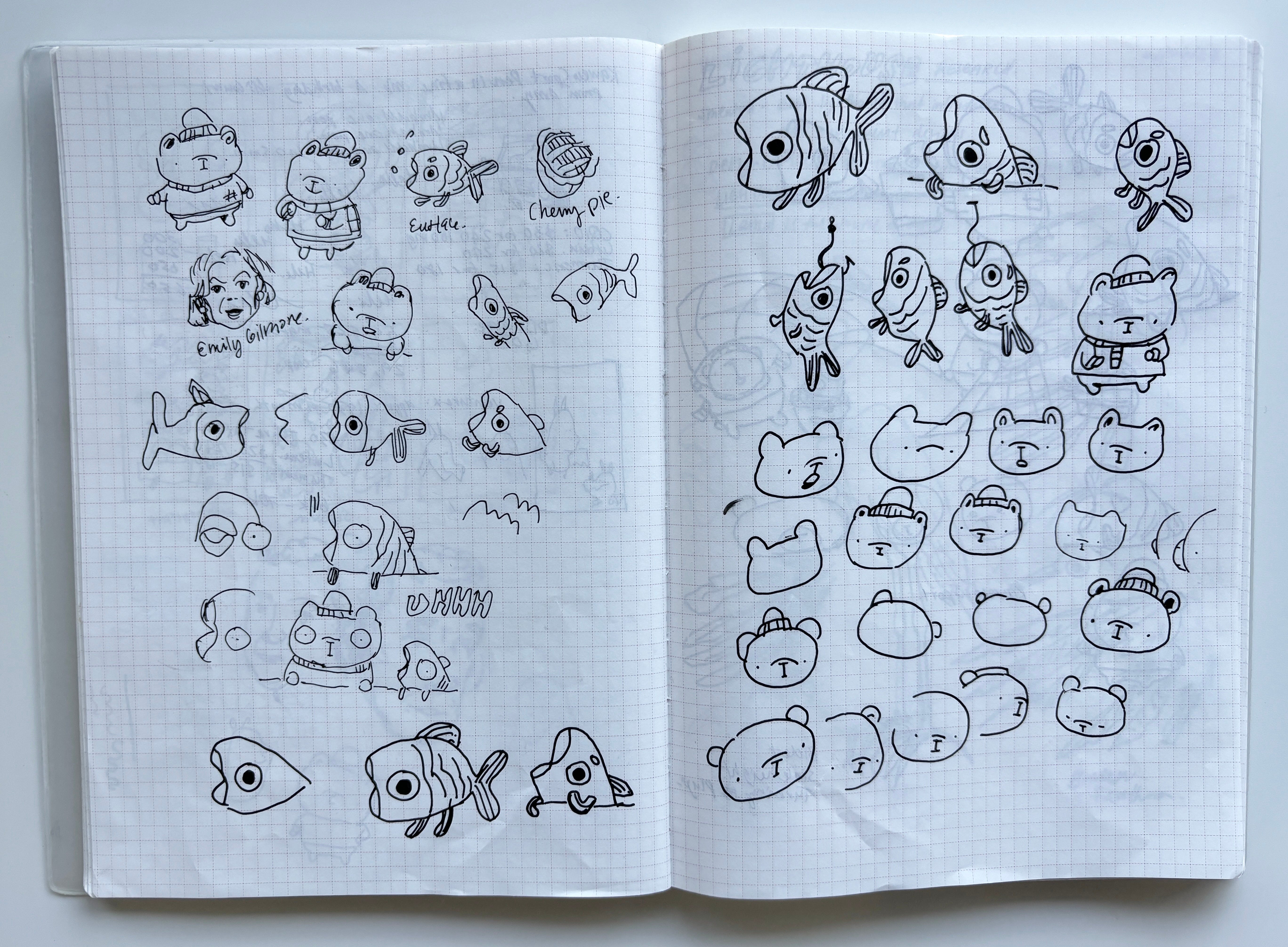
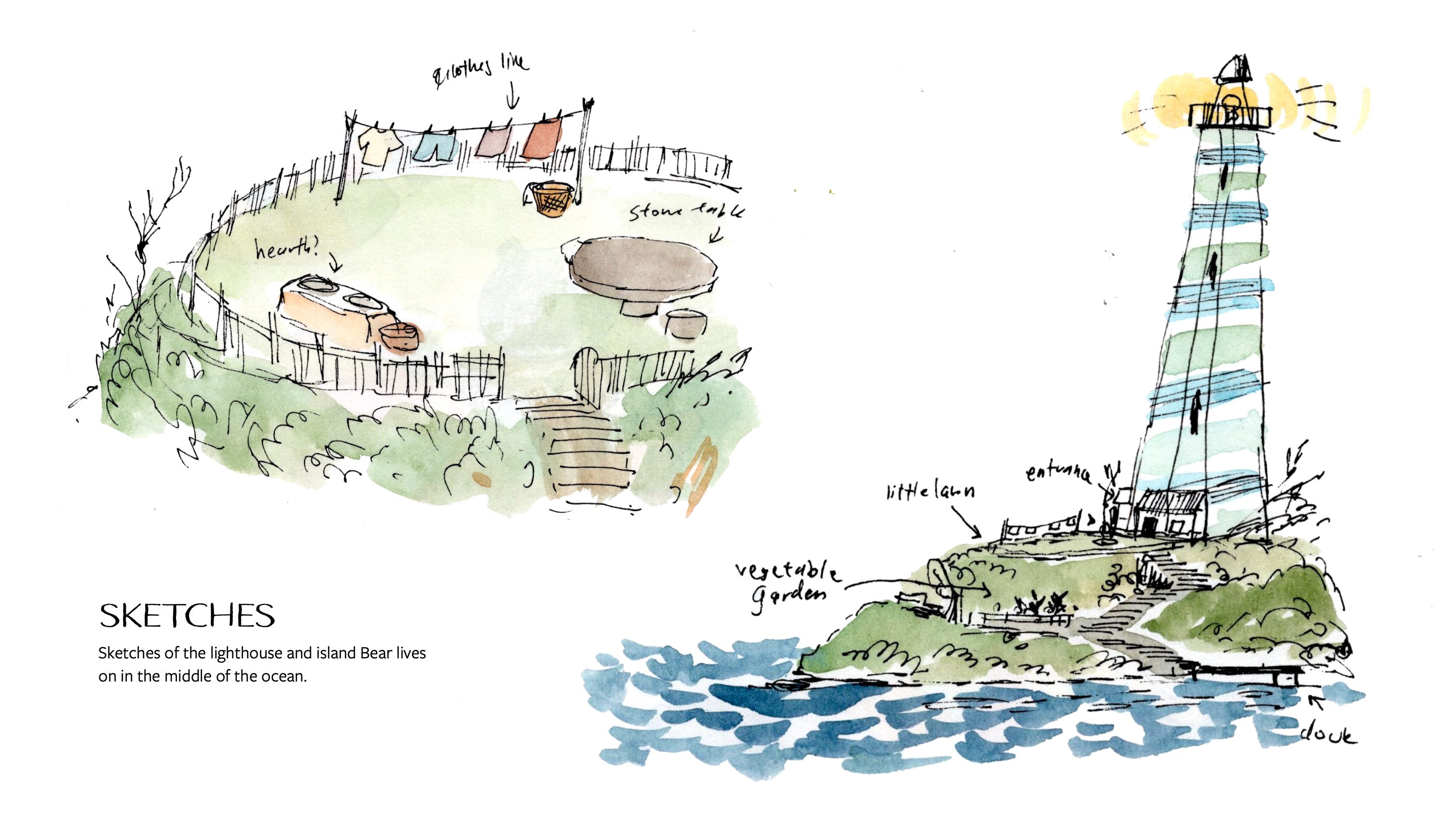
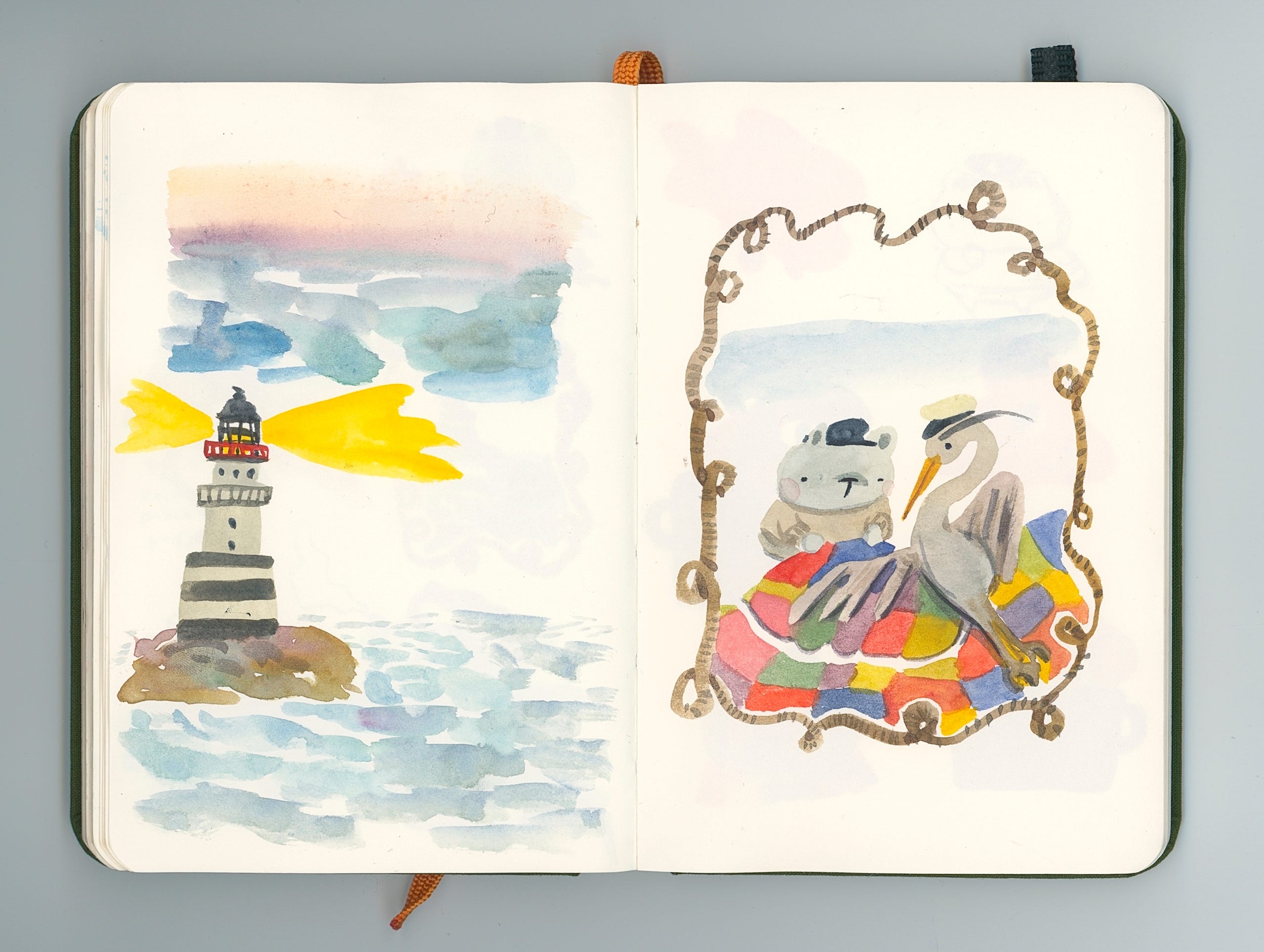
After figuring out ~loosely~ what I wanted the characters to look like, I then started to focus on the setting, particularly the lighthouse. Here were my original sketches of the “lighthouse":
And here’s a close up of what I thought a lighthouse was… For some reason in my head I was stupidly just like “it’s just one big lightbulb right?”
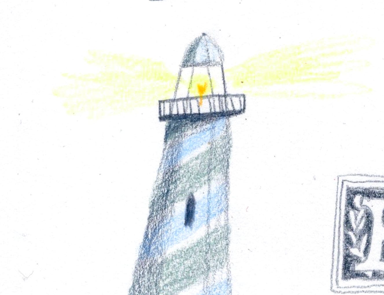
Spoiler alert, it’s not just one massive lightbulb in a lighthouse!!!
Deciding to listen to my own advice on learning how to draw new things, I decided to do some proper research. After some googling, I found out that I actually lived pretty close to the National Lighthouse Museum. What!
Just a subway and ferry ride away from my Brooklyn apartment at the time, Staten Island houses the National Lighthouse Museum. It was my first time in Staten Island because, well, it tends to be the punchline of every joke. It turned out to be totally fine and part of the reason I am saying this is because there was a massive outlet store right next to the ferry terminal and I love shopping (and discounts). I went with my illustrator friend Laura and we both got very excited about the prospect of shopping.
Anyways, back to the National Lighthouse Museum.
Here it is below:
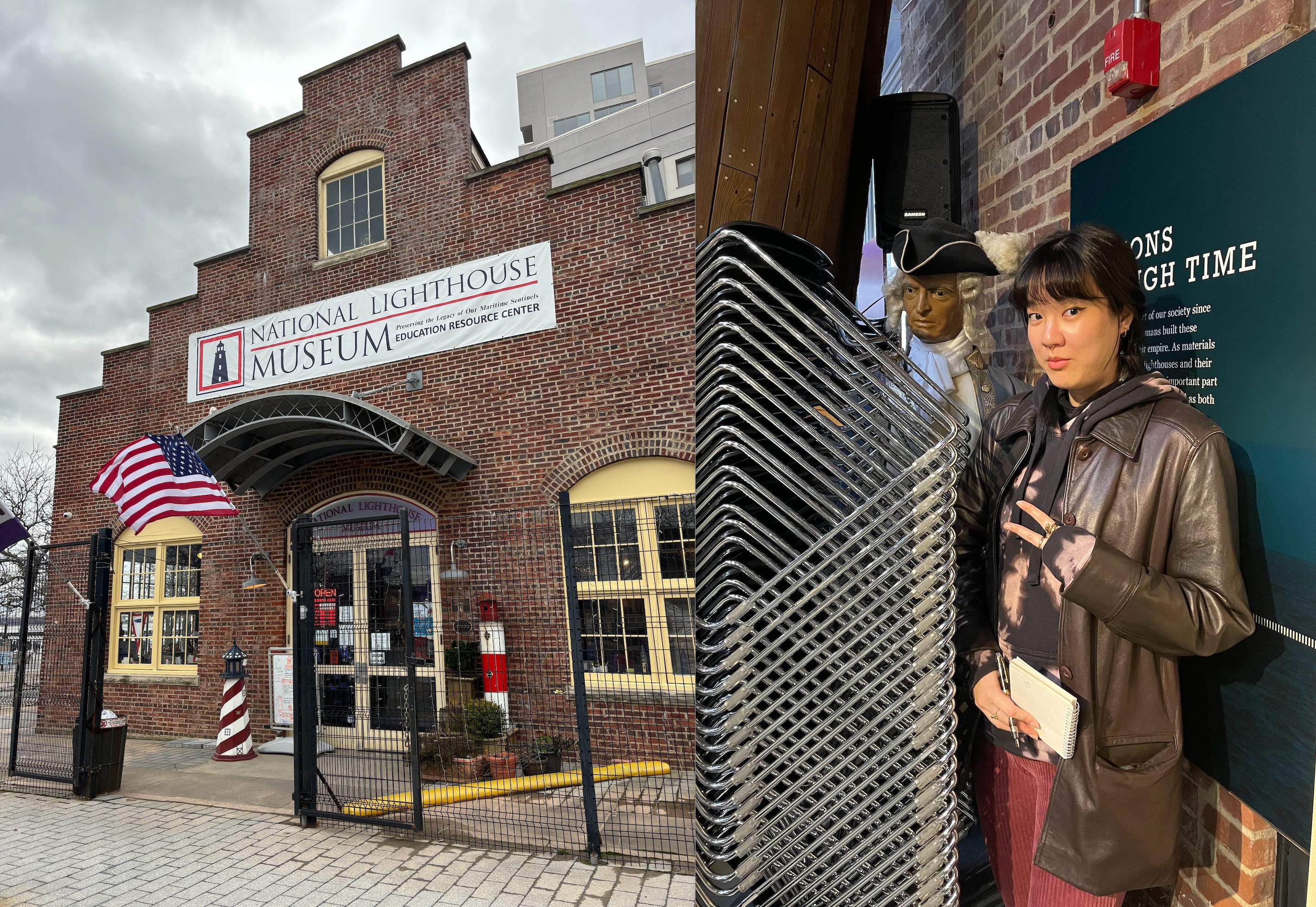
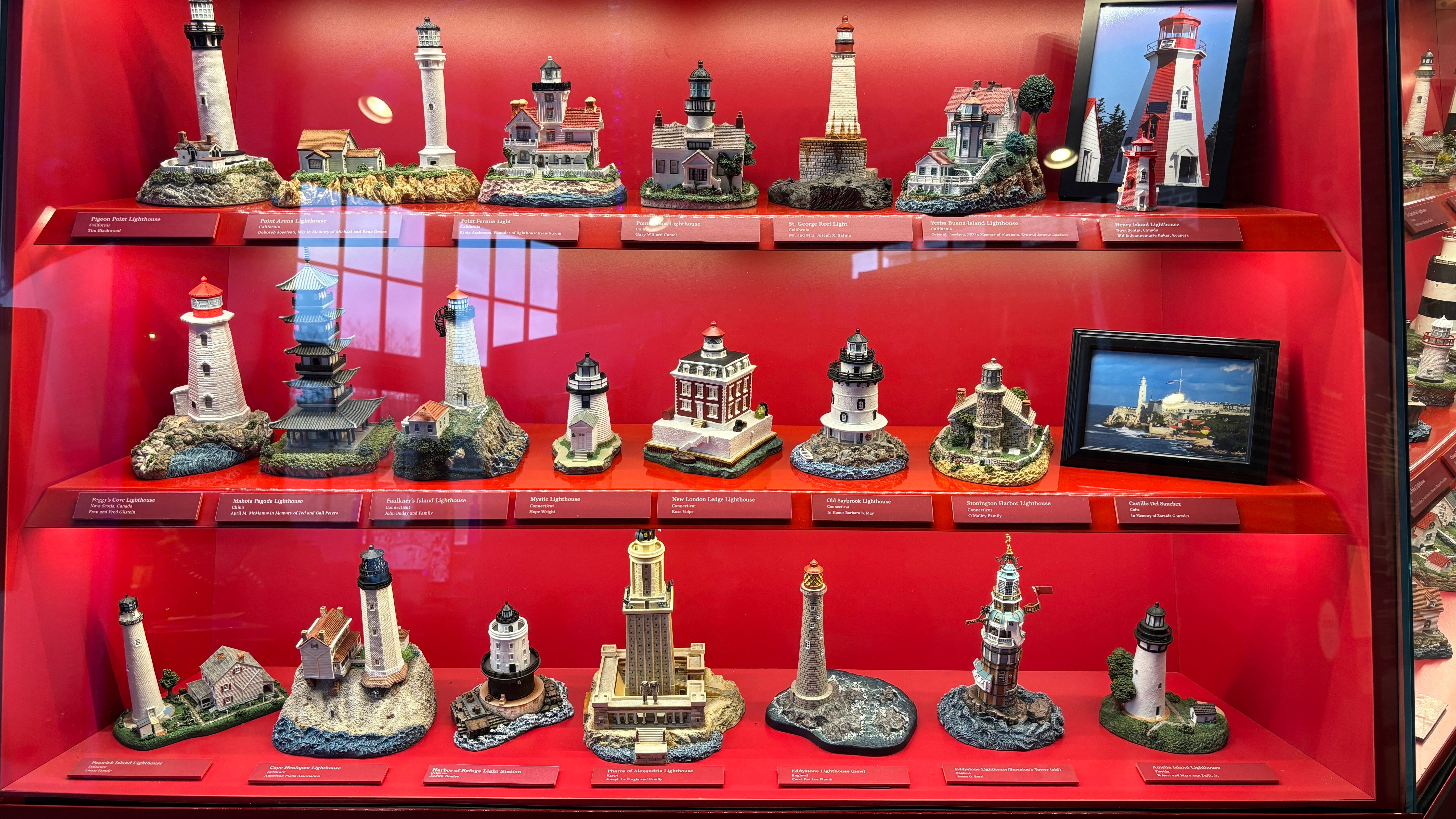
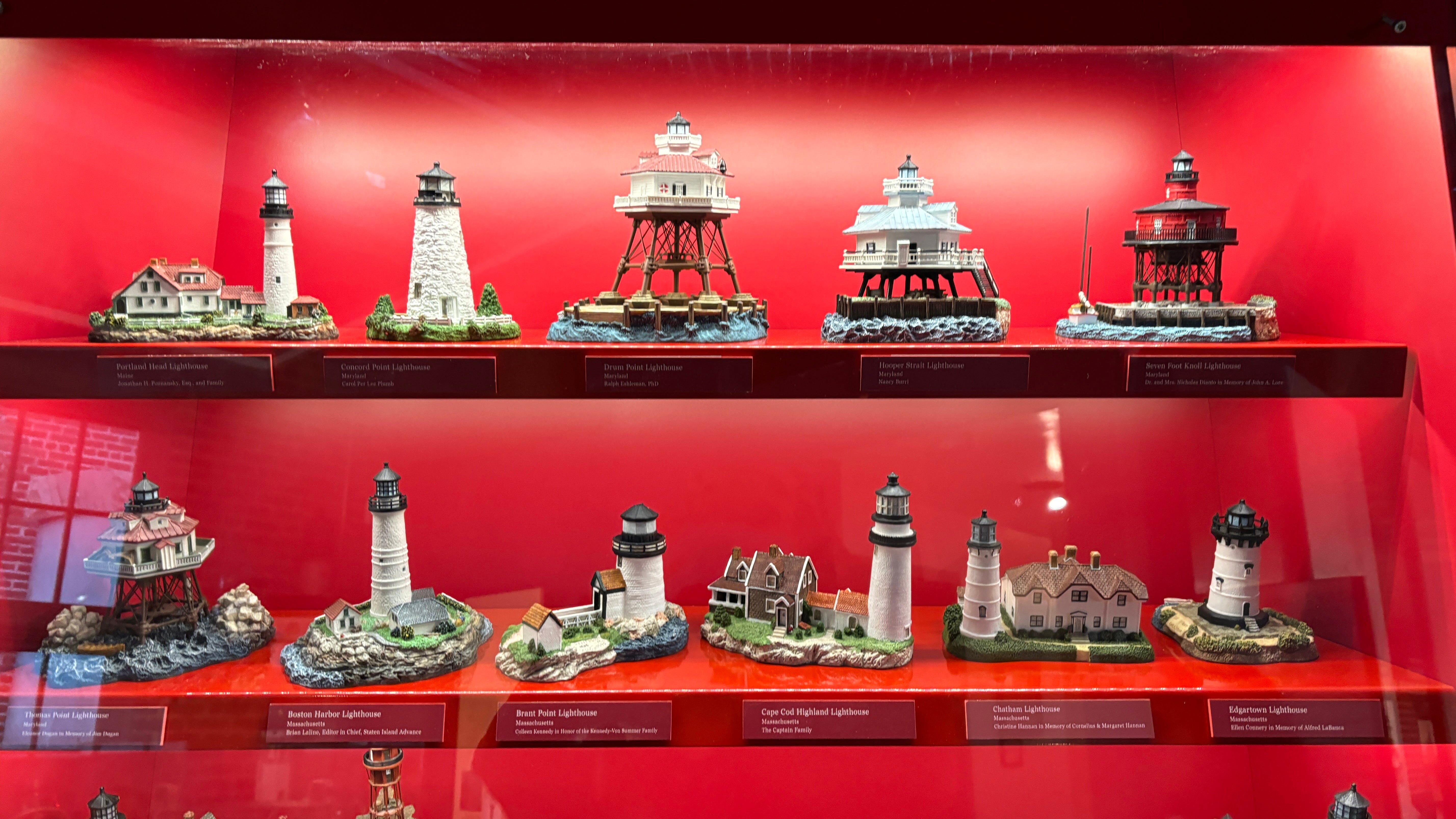
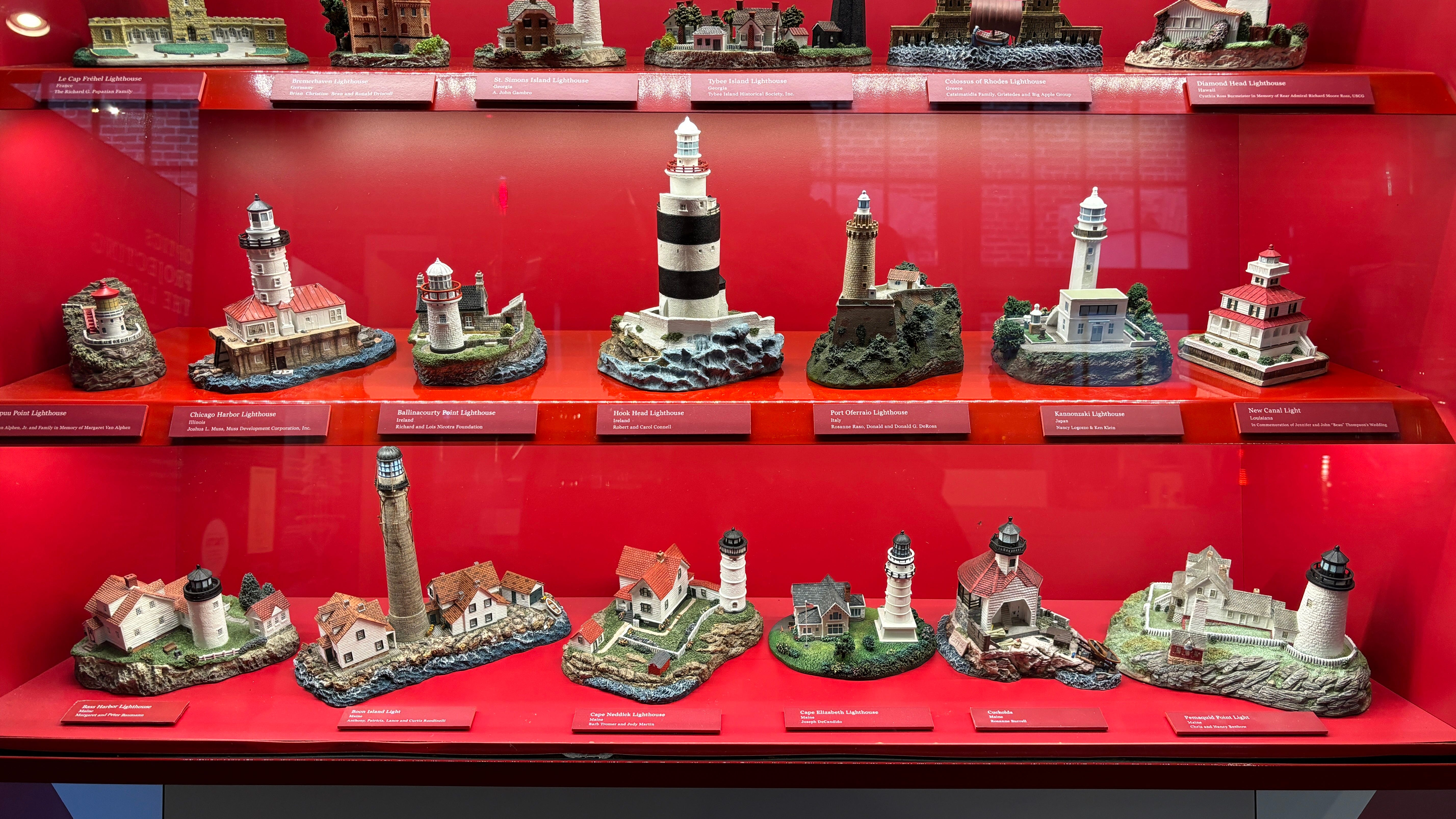
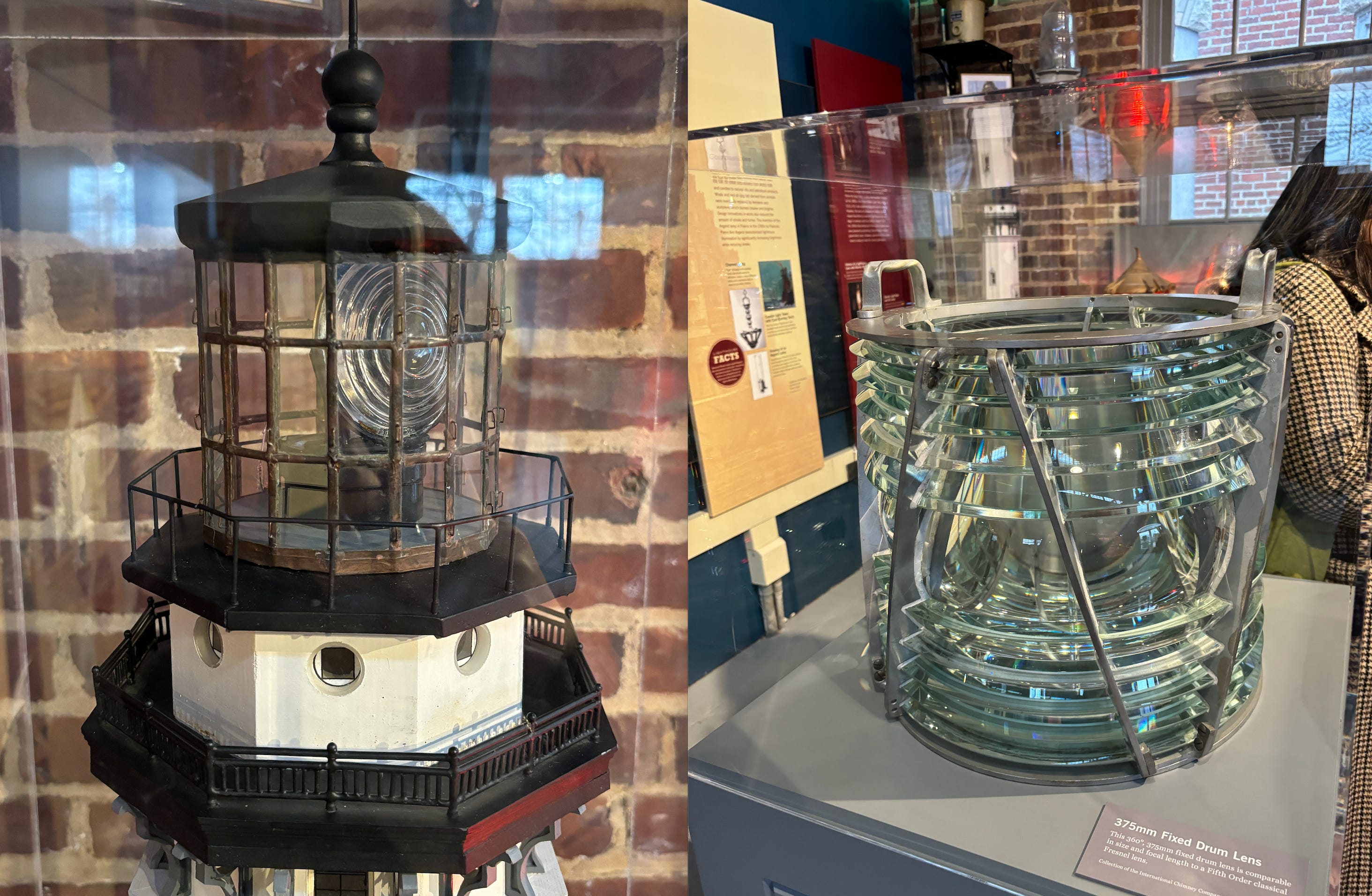
We were honestly not expecting anyone inside but there were surprisingly a large number of families who had ventured out to this museum. It was pretty small inside but had a pretty dope display of hundreds of lighthouses from all over the world. Here are some of them:
When I was taking photos of these lighthouses, a man who worked at the museum popped up next to me and asked in a thick British accent if I wanted to learn about his favorite lighthouse. So naturally, I said “yes” and he led me to this lighthouse:
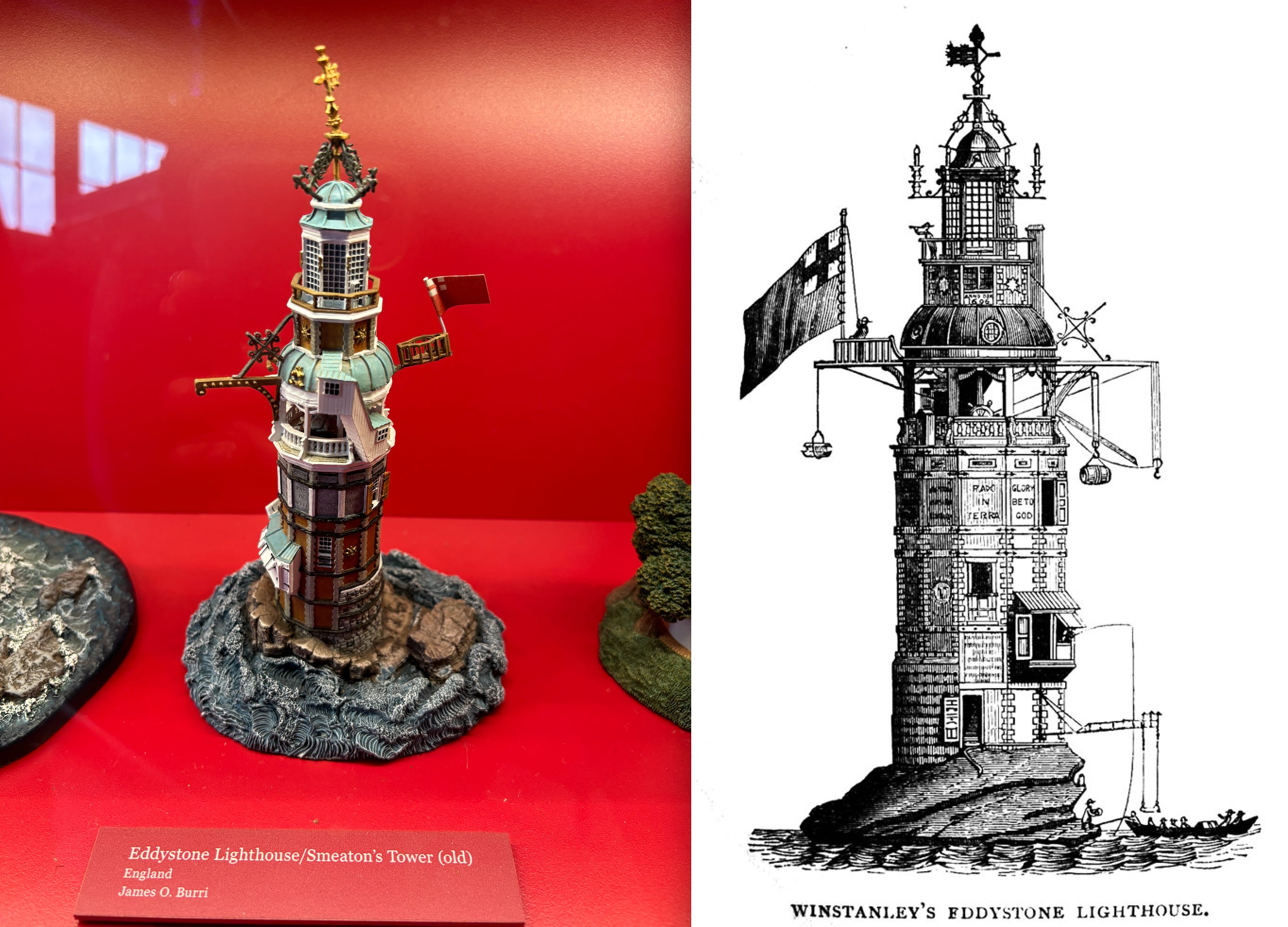
This is the first iteration of the Eddystone Lighthouse and the word’s first open ocean lighthouse. The guy who built this lighthouse, Henry Winstanley, had so much faith in his design that he believed that it was constructed so well that it could survive any storm.

So confident was Winstanley in his construction that he declared his wish to be inside his lighthouse when “the greatest storm there ever was” hit England.
In 1703, the Great Storm hit Britain, and the lighthouse was completely destroyed with Winstanley and five other men inside. Oh well…
There were many iterations of the Eddystone lighthouse after the first one and the third iteration is one that inspired all future lighthouse designs:

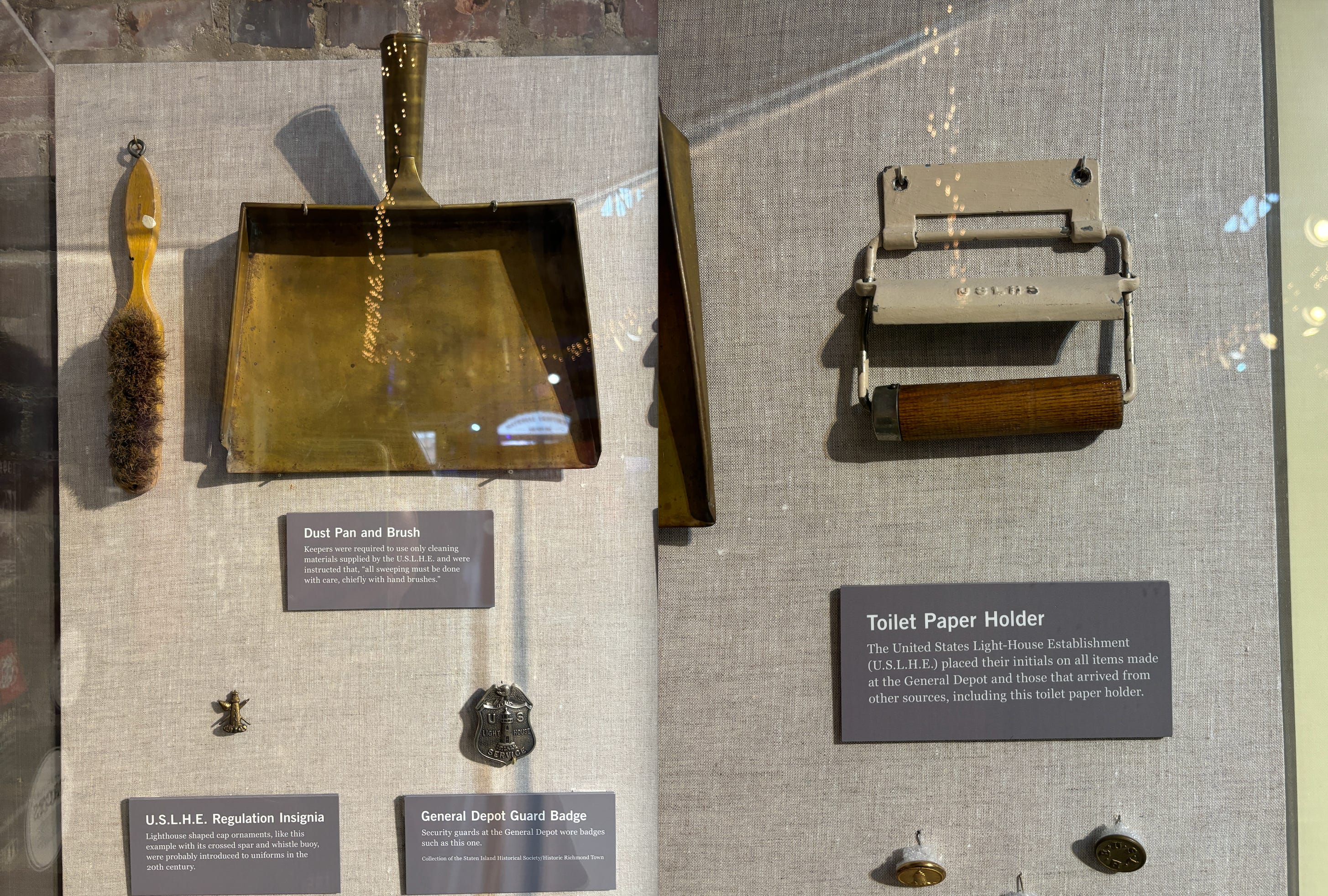
At the museum, they also had a lot of official lighthouse merch such as this dust pan and brush as well as the United States Light House Establishment provided toilet paper holder:
And finally, I got to see what the lights in a lighthouse look like… and yup, it’s not just a massive lightbulb:
After a fruitful trip to the museum, I hopped on my plane to Taiwan the next day to visit my family and did some studies on the plane:
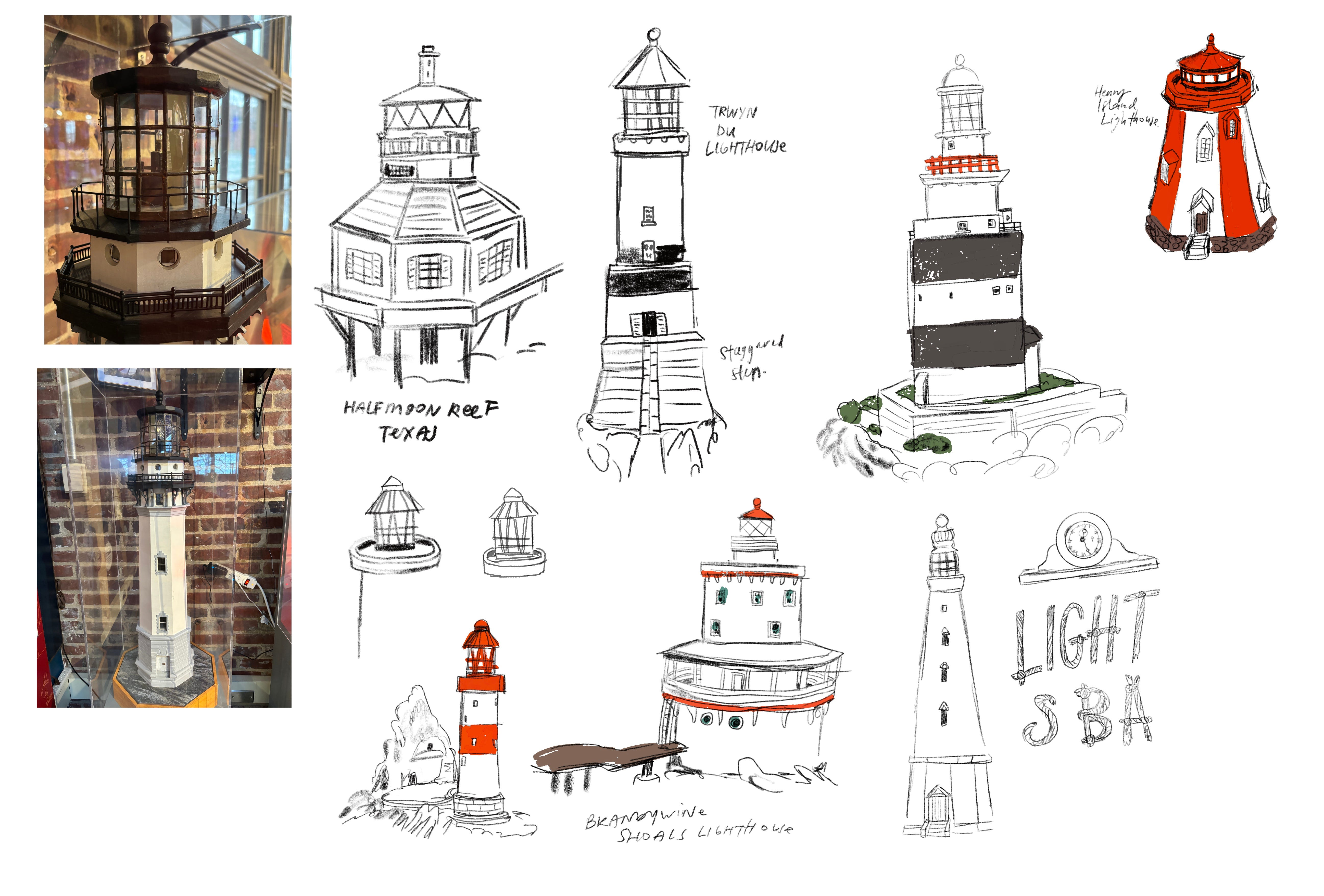
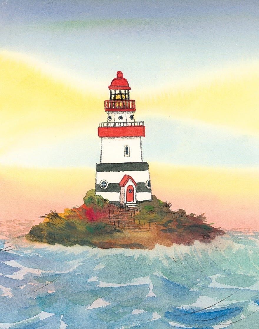
The final lighthouse in Don’t Eat Eustace ended up being an amalgamation of different models of lighthouses I found at the Lighthouse Museum.
From there, I landed in Taiwan and began my journey of figuring out how I wanted to paint the art in this book.
Part Three: Taiwan adventures
During my trip to Taiwan, my family took a trip to Wujie (武界) & Puli (埔里).
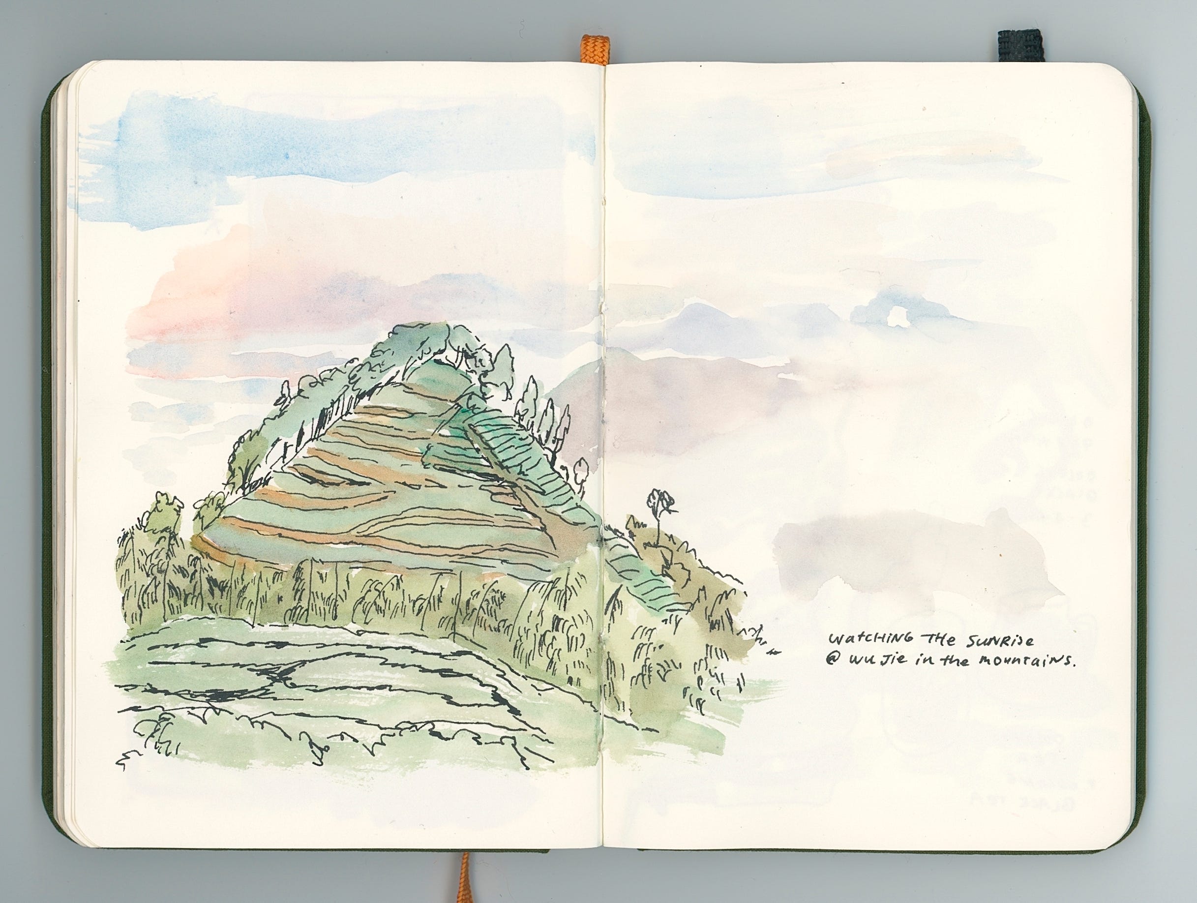
We woke up extra early to ride a rickety van up the mountains to try to catch a glimpse of the 雲海 or “sea of clouds.”

The sea of clouds surrounded the mountains and inspired some loosey goosey painting styles that ended up making it into my book:


I used this opportunity to do a quick painting in my sketchbook as we stood up top of the mountains:
Anyways, the reason I’m sharing about this trip is because we also visited a paper factory where I got to see first hand how paper for traditional paintings are made.
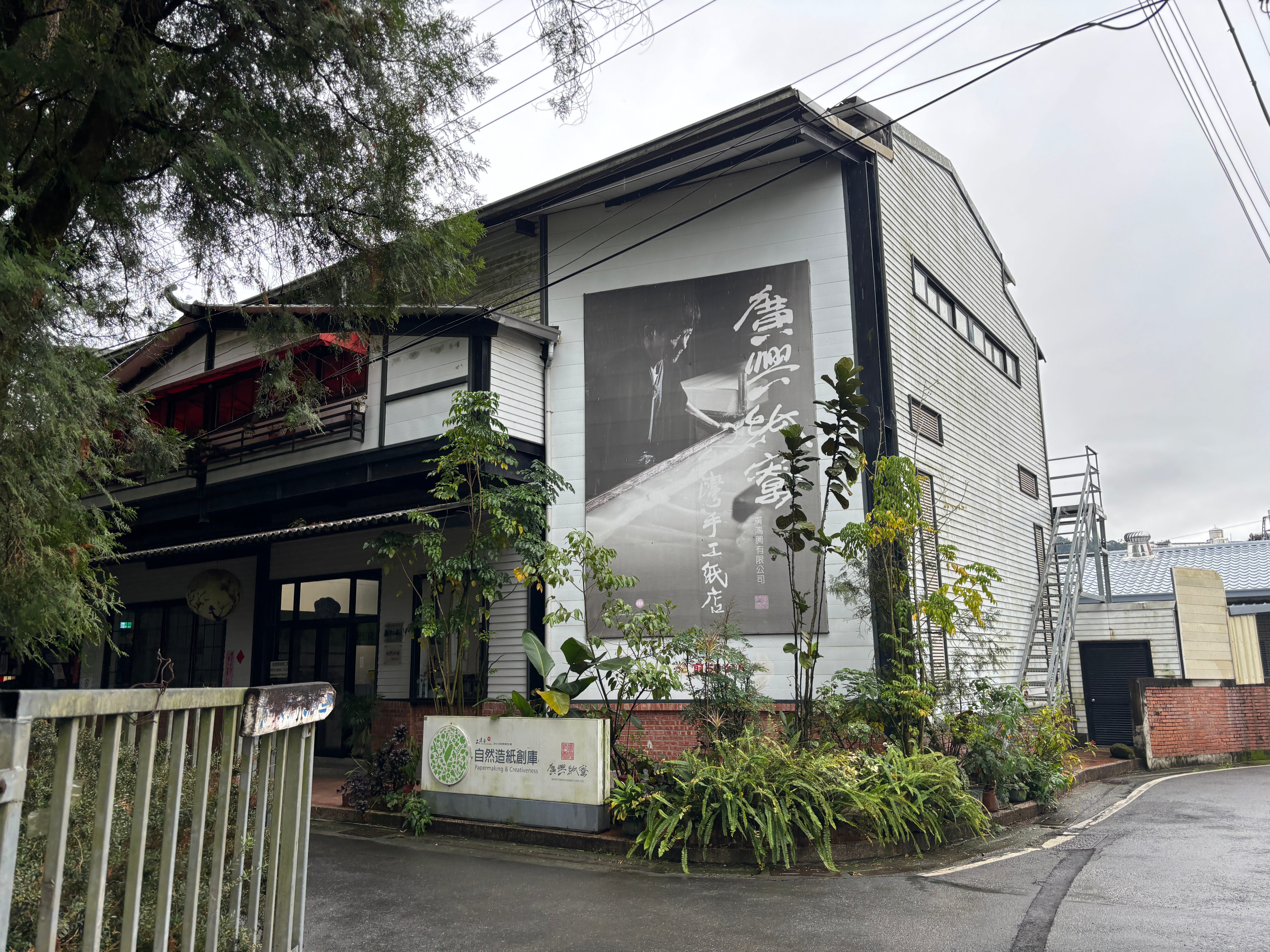
We got to do a cool tour of the factory where they showed us the whole process. Below are the steps the wood goes through to become paper:
Puli is a small township in central Taiwan and according to this info board, they are famous for the 4Ws:
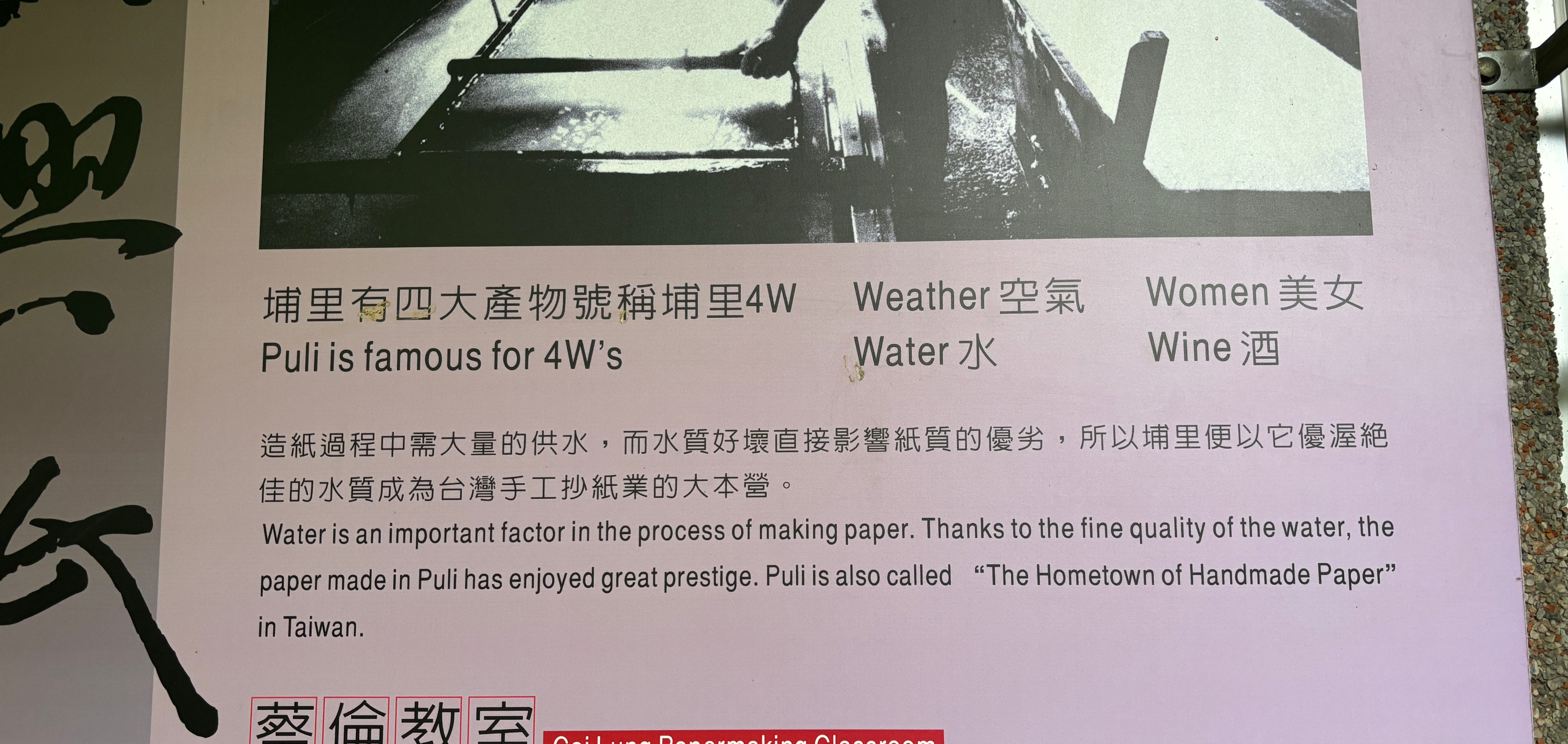
According to my parents this is apparently very true and they say all the beautiful babes are from Puli… Too bad I’m not from there. Damn.
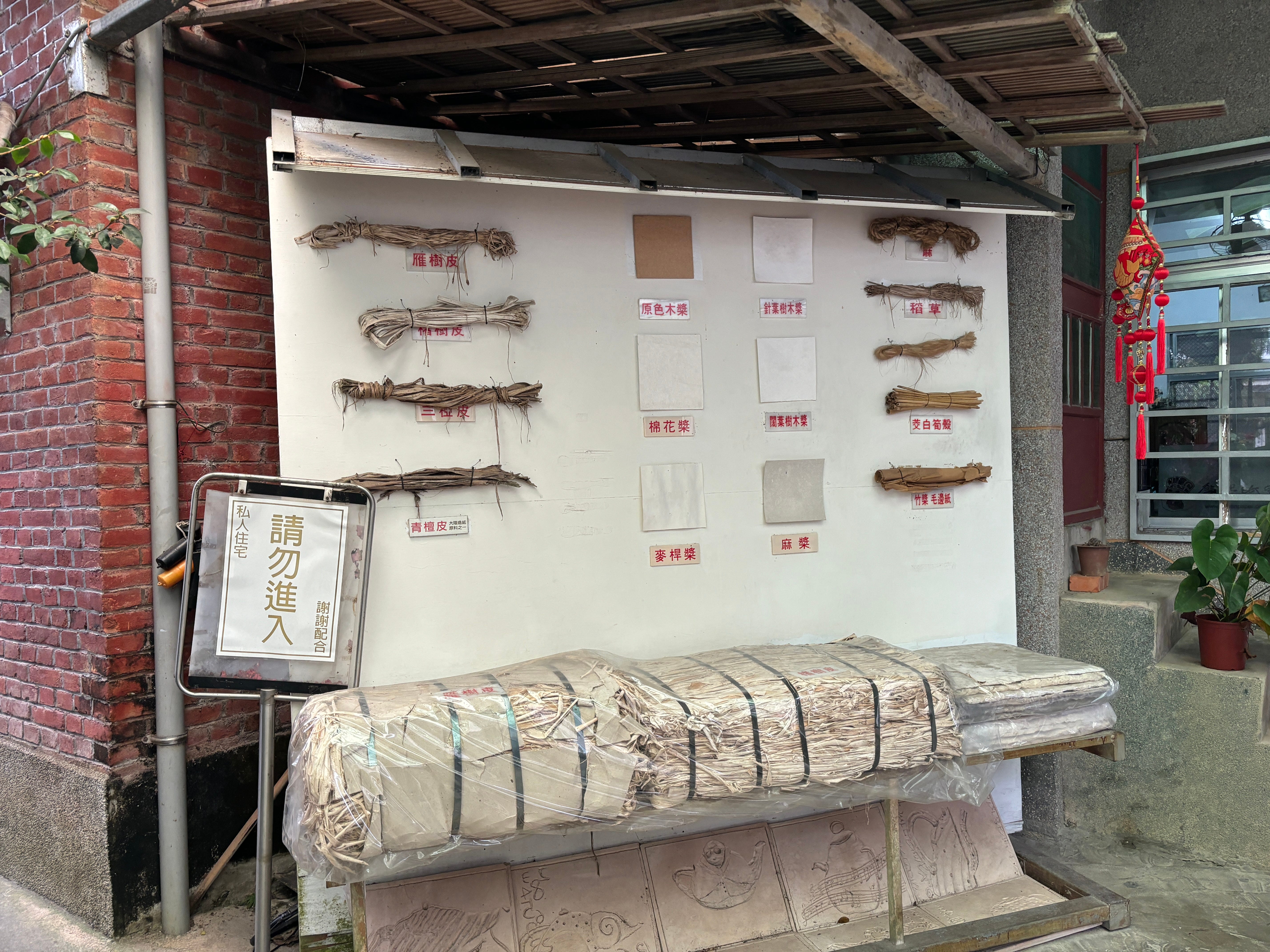
Anyways, we got to see how the wood is blended:
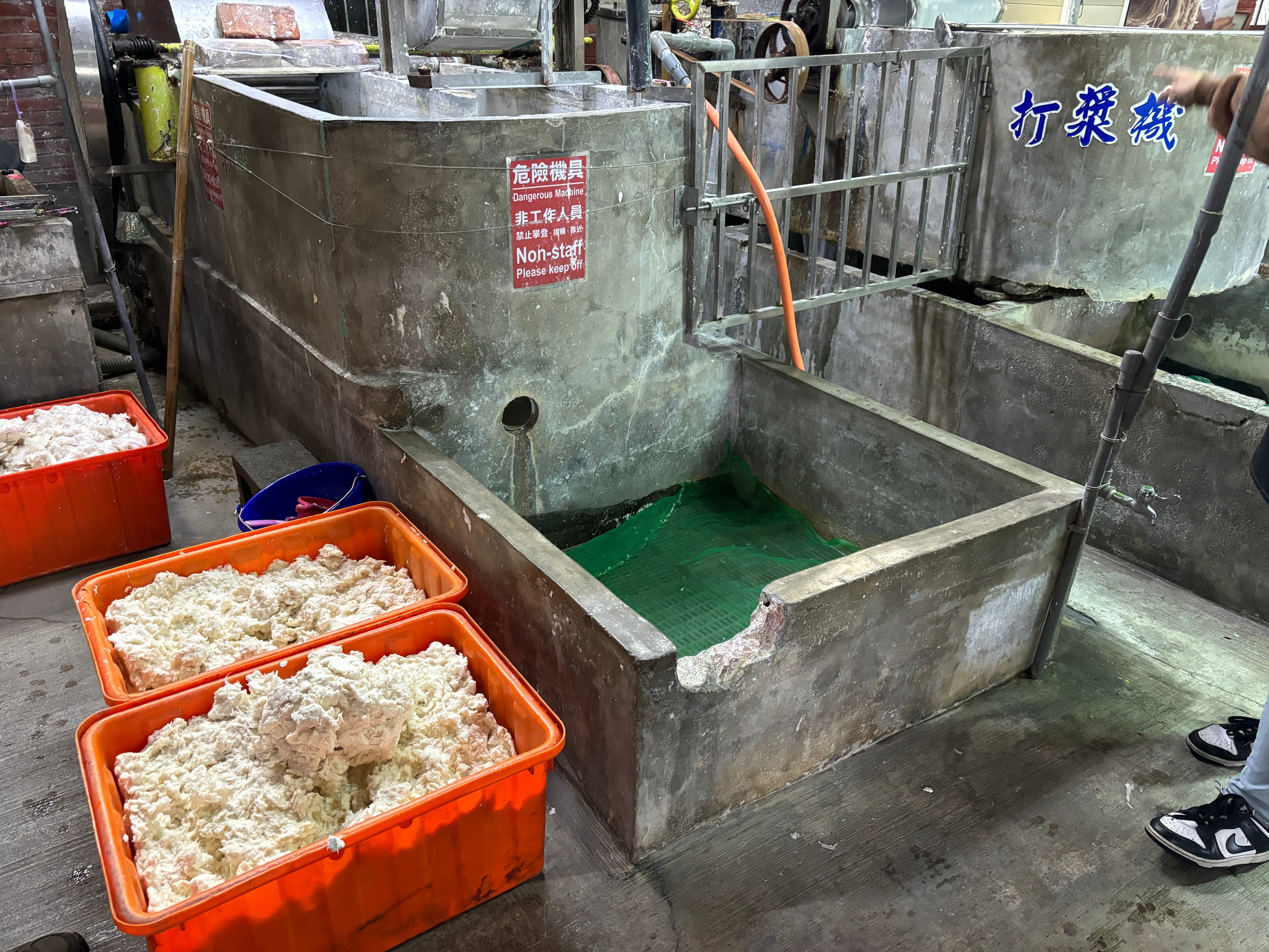
The pulp is then strained and laid into blocks made up of layers and layers of paper:
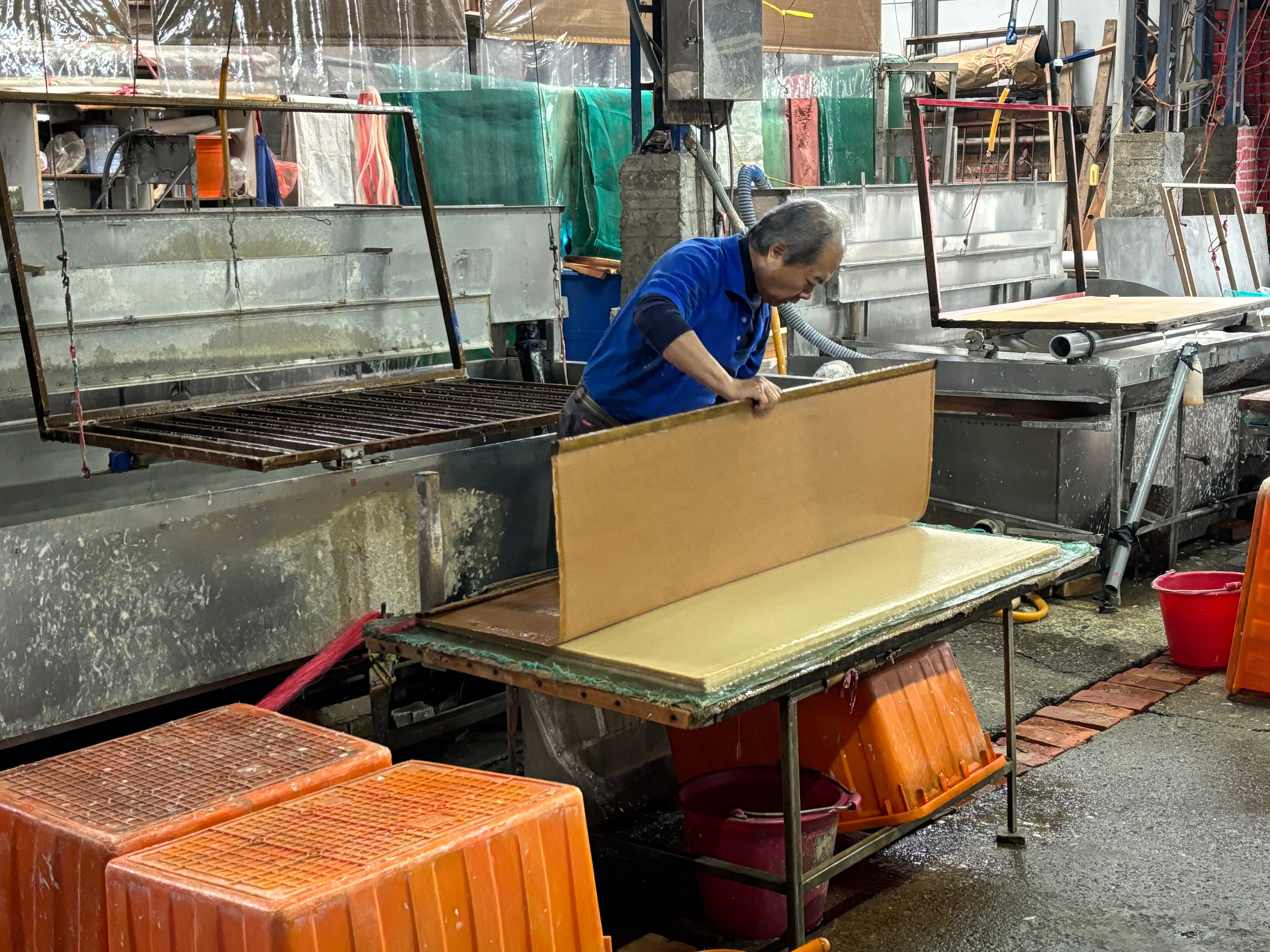
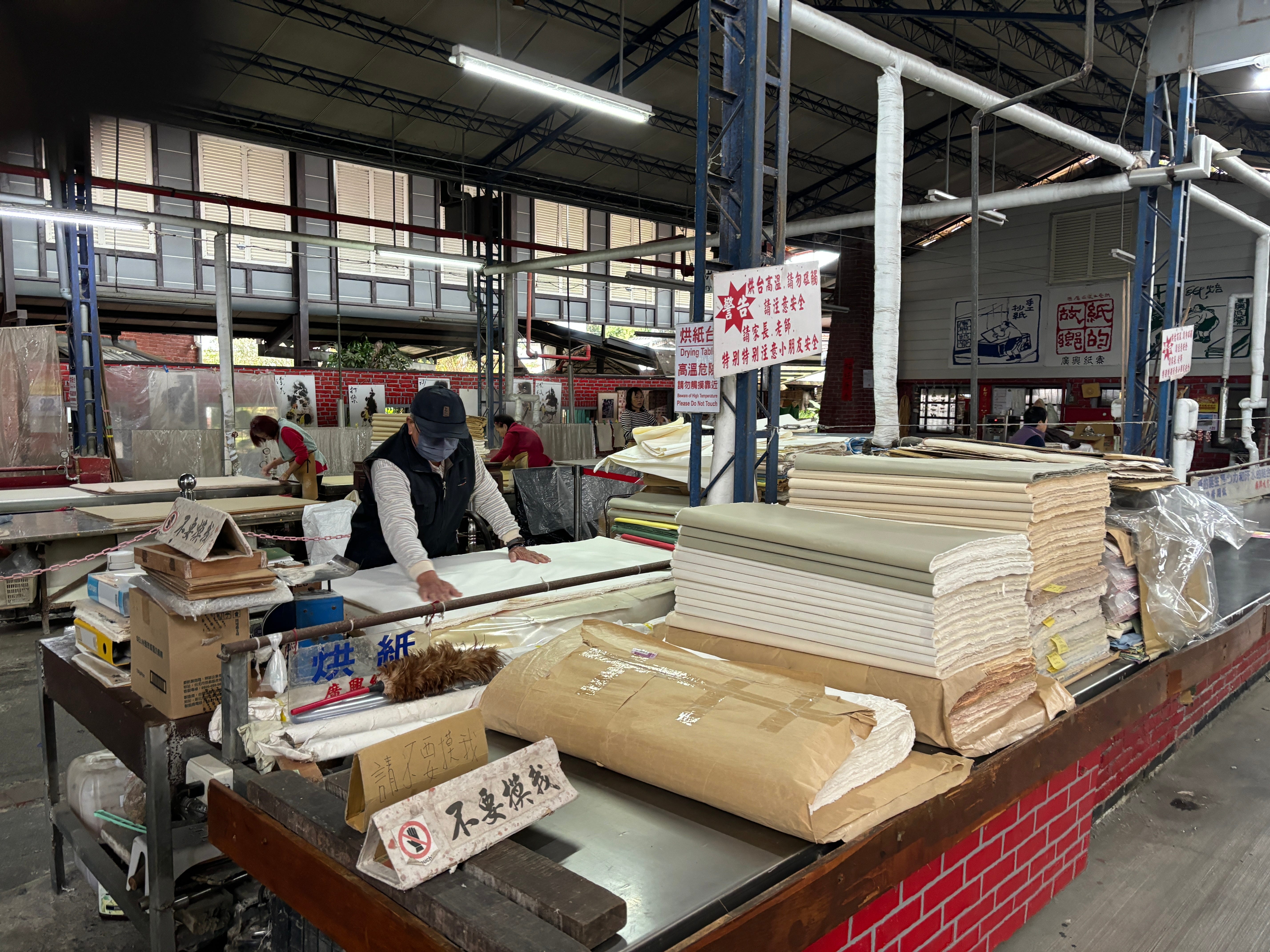
Once the layers are semi dry, they are separated and then laid on a massive heated flattop where the master dries the paper:

Then all that paper is packaged and sold!!
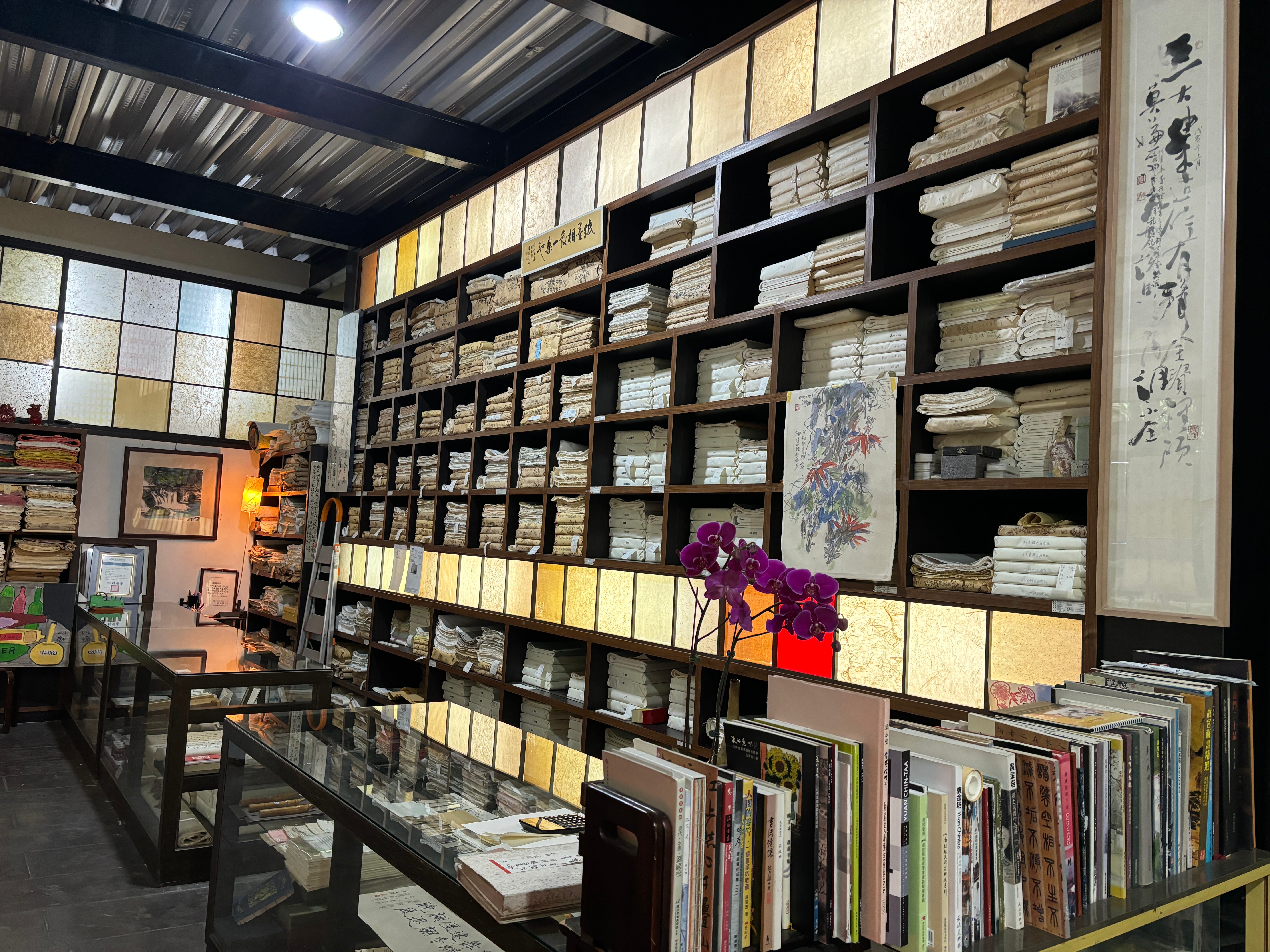
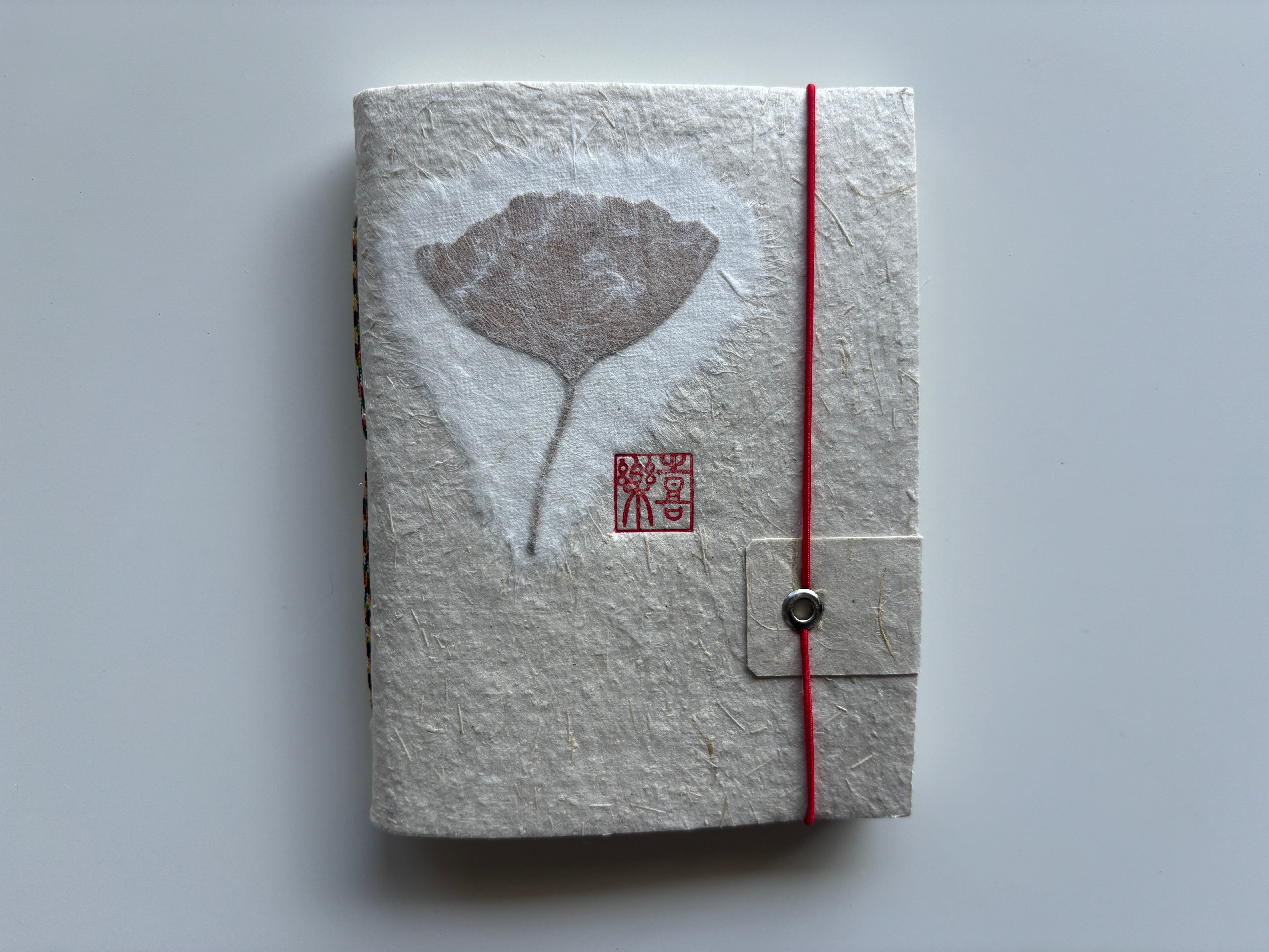
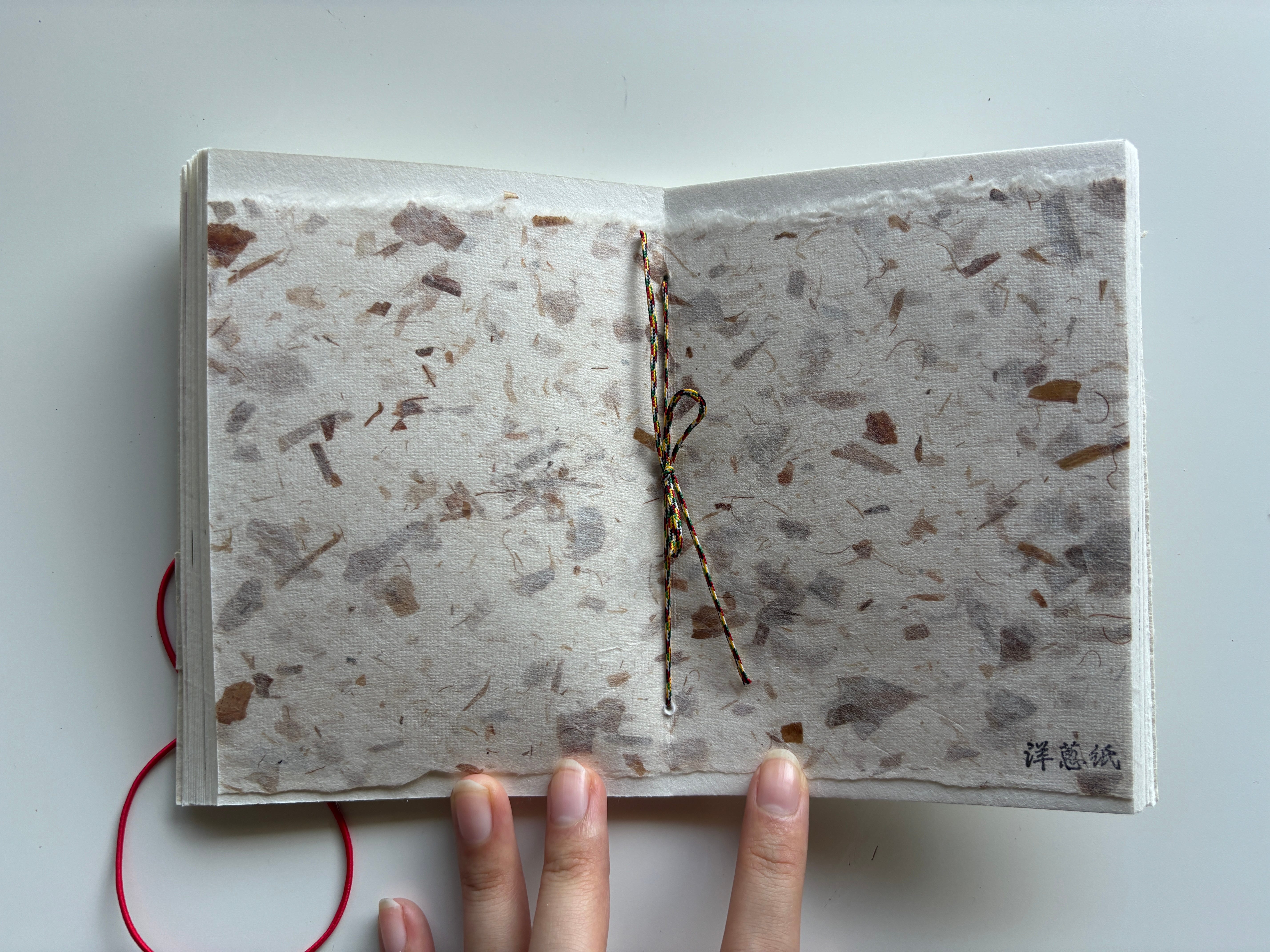
Of course I looked at all of this and said “YEAH! I’m gonna channel that energy into this book!!!” I bought a cute little notebook at the store that featured all these different kinds of paper:
Which leads us to…
Part Four: I can totally do this!
I told myself that this paper would be perfect, I would paint this entire book with this beautiful paper and brush strokes inspired by my homeland. An homage to my heritage.
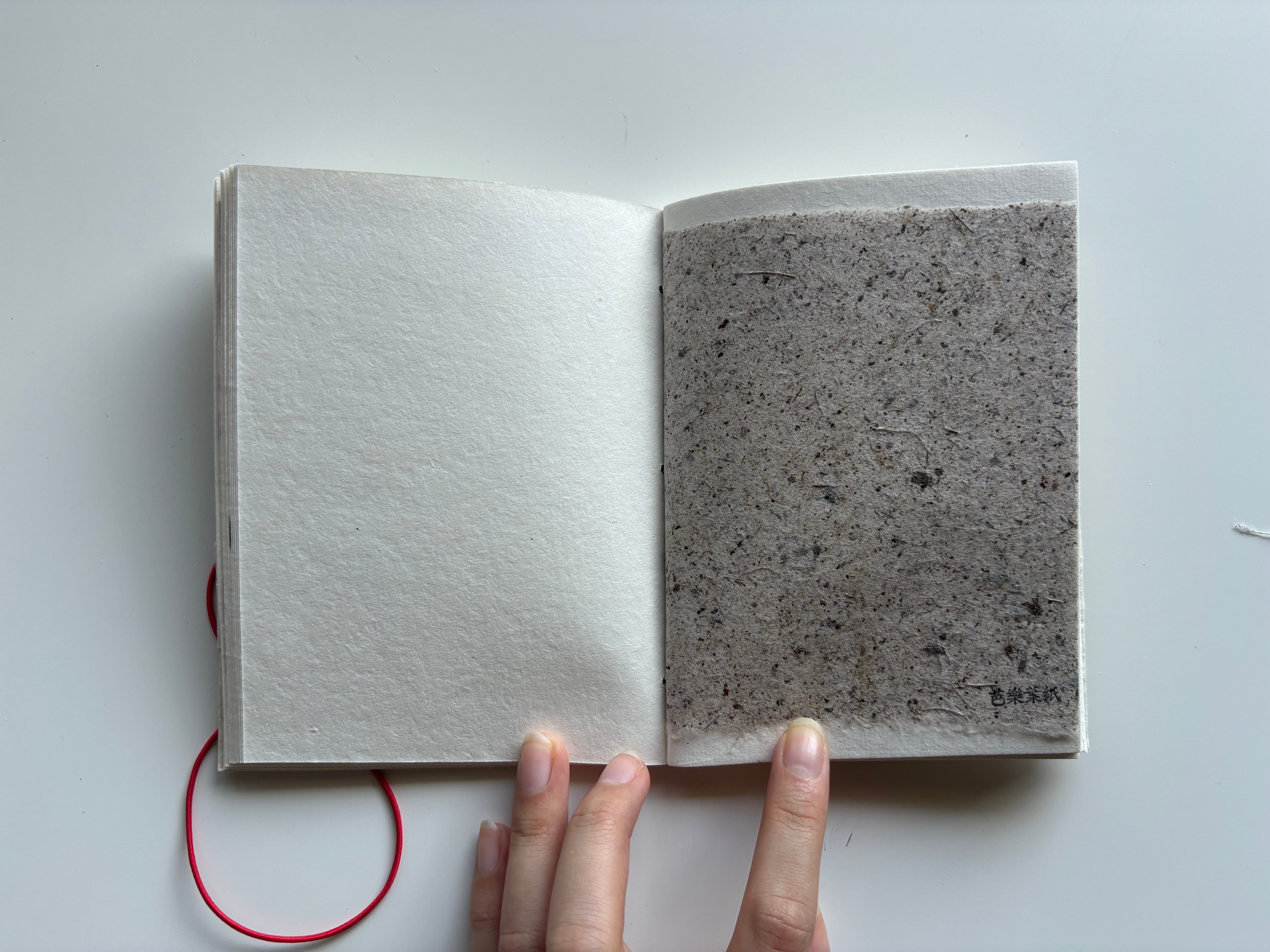
So I tried a test page:
And unfortunately…
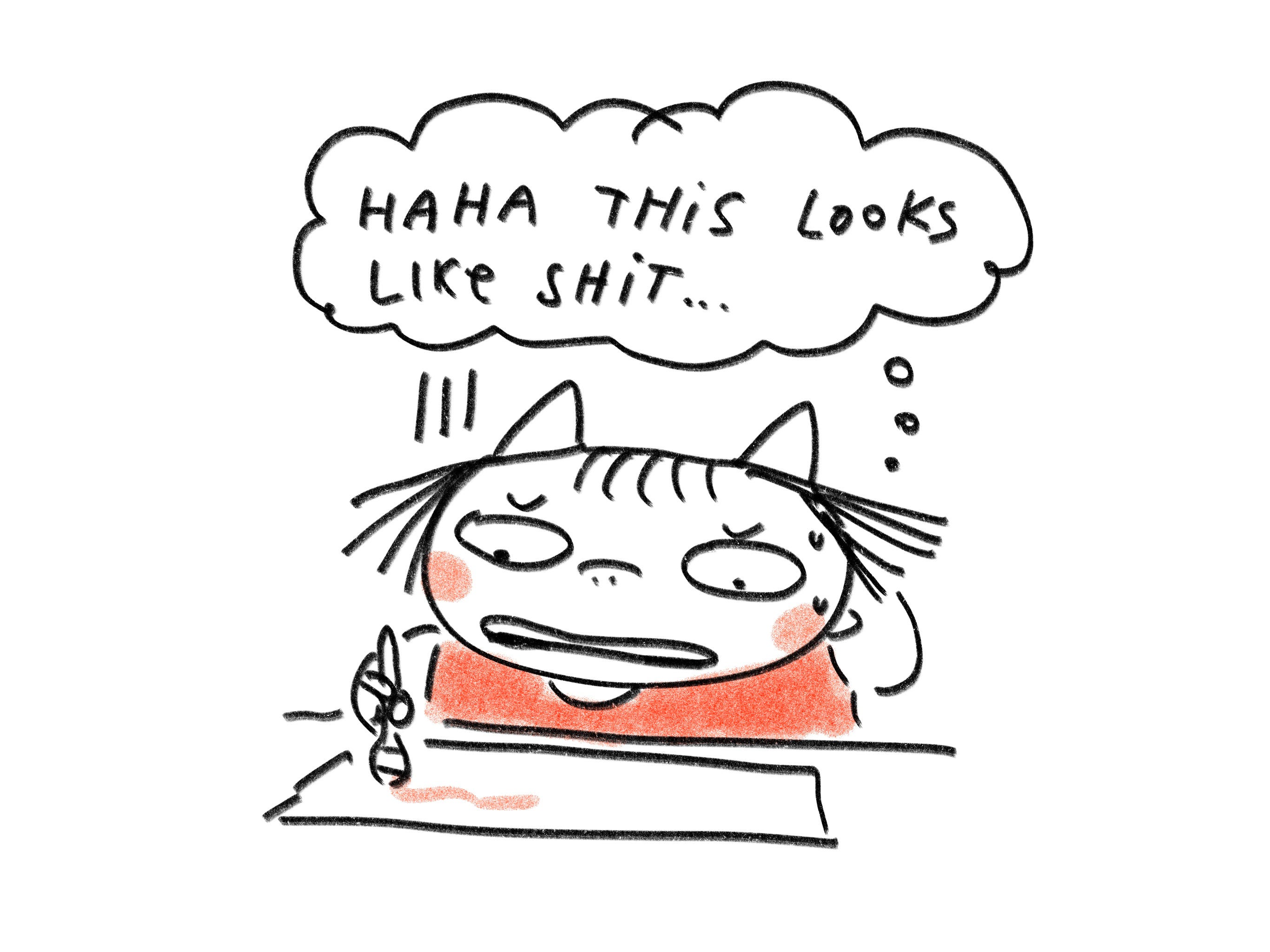
It did not perform the way I wanted it to AT ALL! UGH.
Turning to other points of inspiration, it was also around this time that I discovered an amazing book at the bookstore that I became obsessed with. It’s called ANGRY. Here’s the cover:
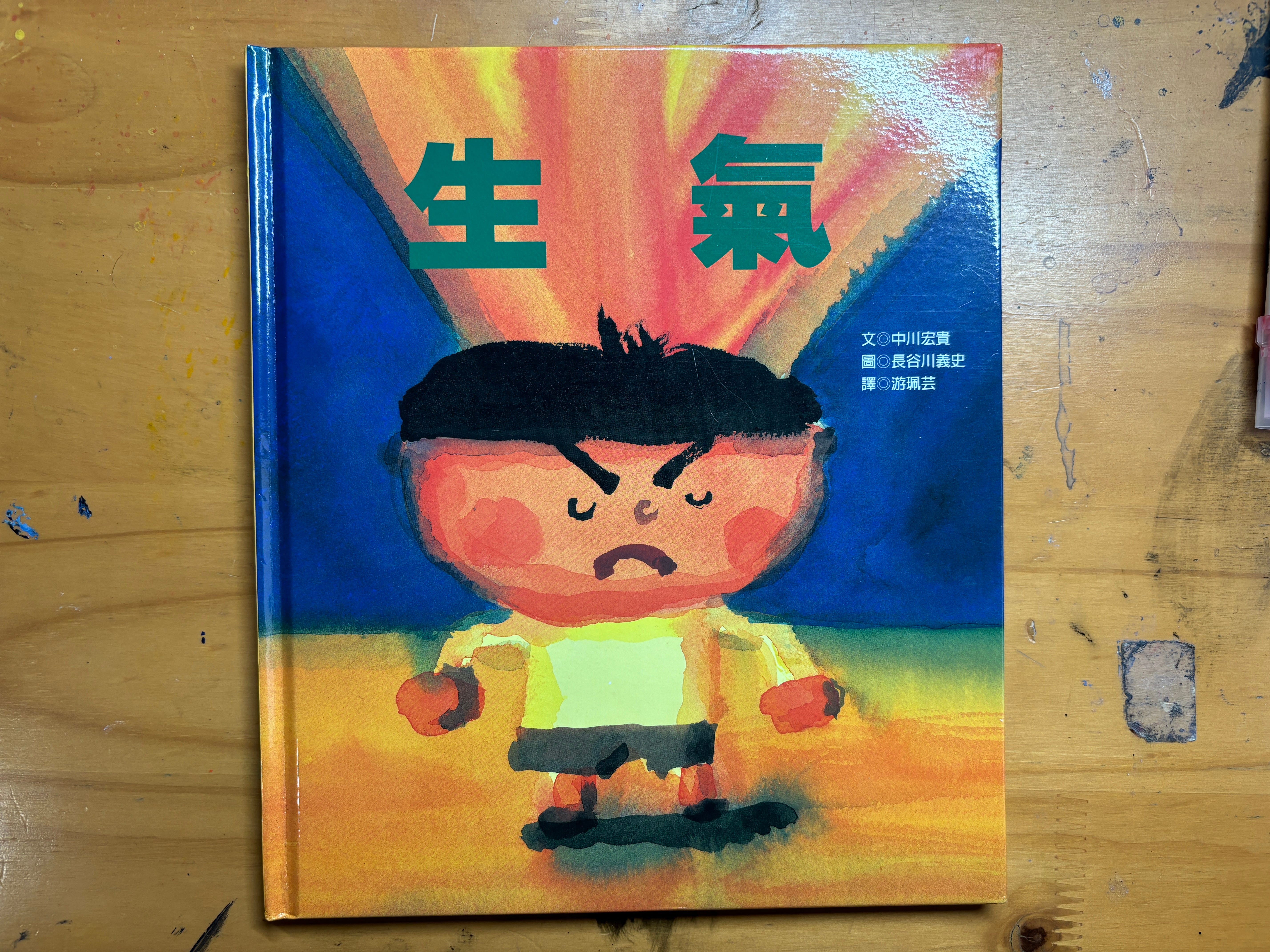
It’s illustrated by Japanese illustrator, Yoshifumi Hasegawa and is about a boy who is constantly pissing off everyone around him.
The art is super loosey goosey and beautiful and made me go: I want to paint like that.
So next, I became obsessed with doing something like this for my own book.
Imbued with inspiration, I tried out some tests in my sketchbook while I was in Taiwan and I loved the way that these came out:
From there, I naively thought it was done and I had decided on the look for this book! Easy peasy! And so I went to work on the sketches for the book and didn’t give painting another thought.
Fast forward to a couple months later, it was time to ~officially~ start the final art and paint this book. And so, I started my journey.
Part Five: It’ll be smooth sailing right??
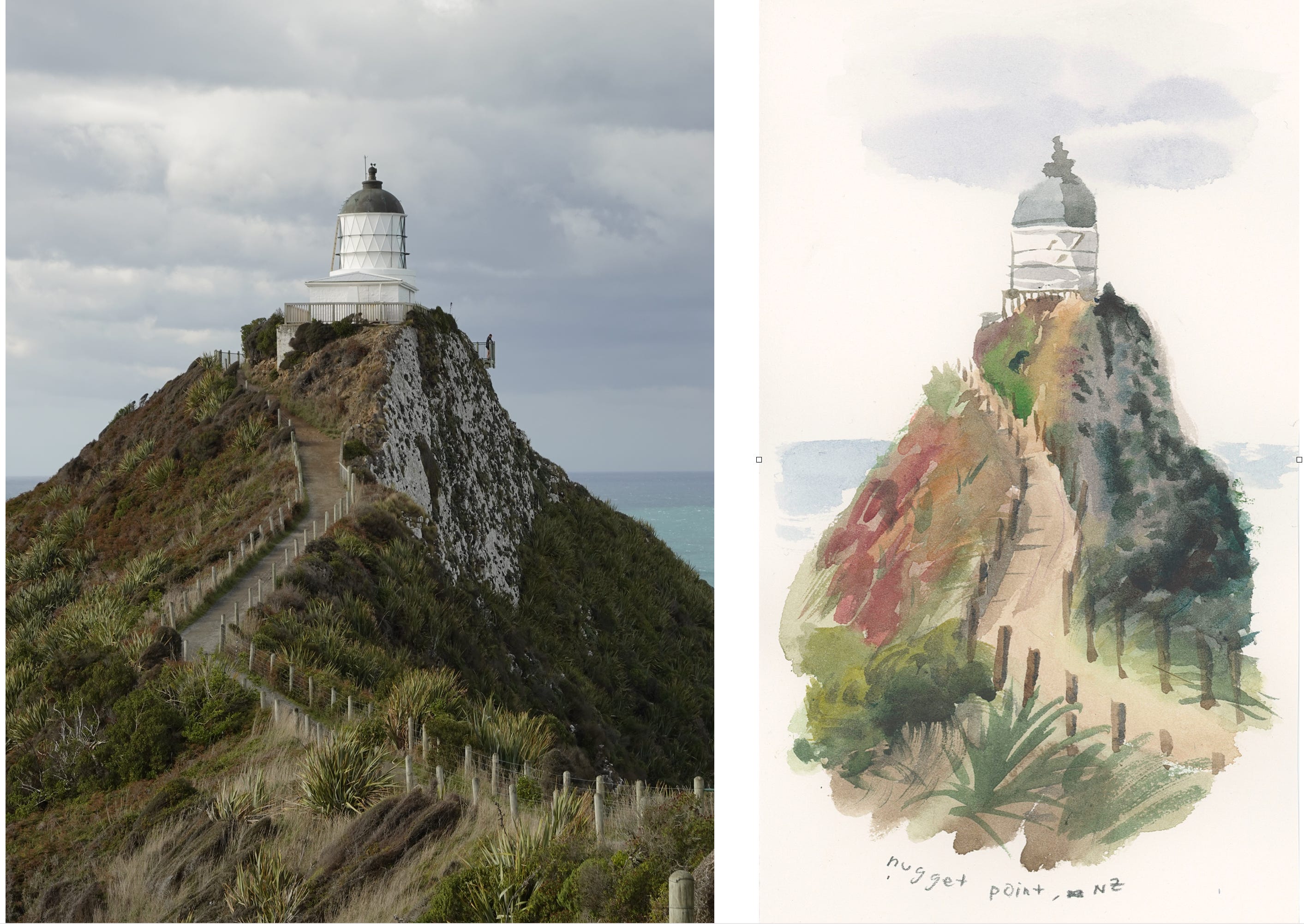
First, to dust off the rustiness and prove that I could still paint, I did a study of a photograph I took during my trip to New Zealand the previous year. We also visited a lighthouse where I took lots of reference images:
From there, I felt confident and did a test painting of the main characters for this book on Arches hot press paper:
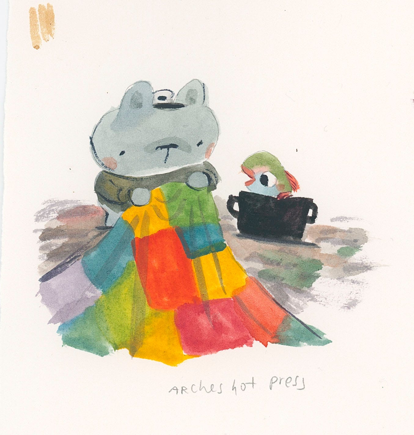
It came out cute… but it felt… too clean and too realistic? So I decided that it was indeed, not settled, and I would forge on and experiment some more.
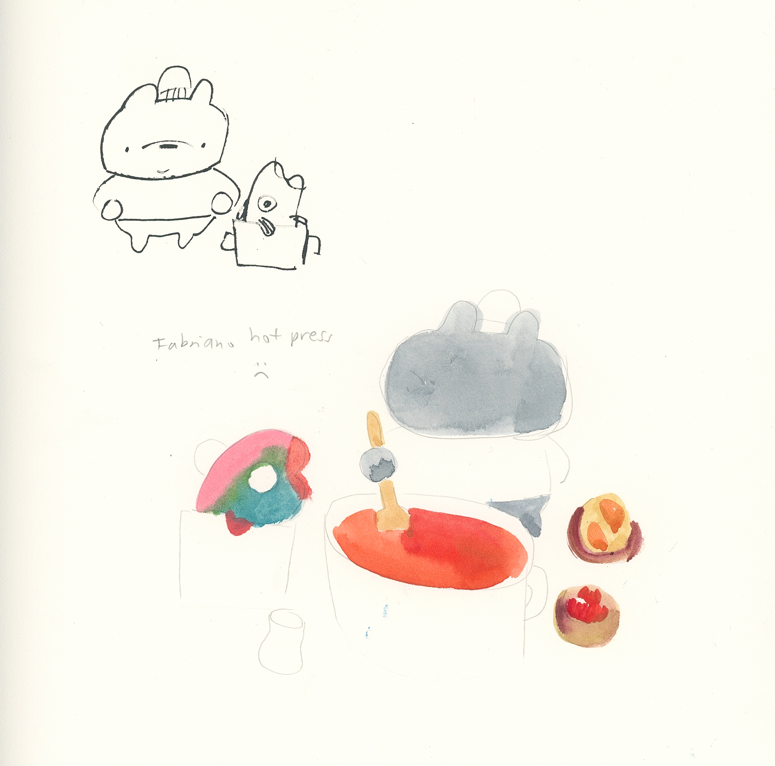
I wasn’t sure what was off about it, and so I decided to try painting on many different types of paper to see which one felt the best:
Oh and of course, I did my usual thing of “What if I painted this book digitally!!!”
As usual, I abandoned that idea and went back to my traditional materials.
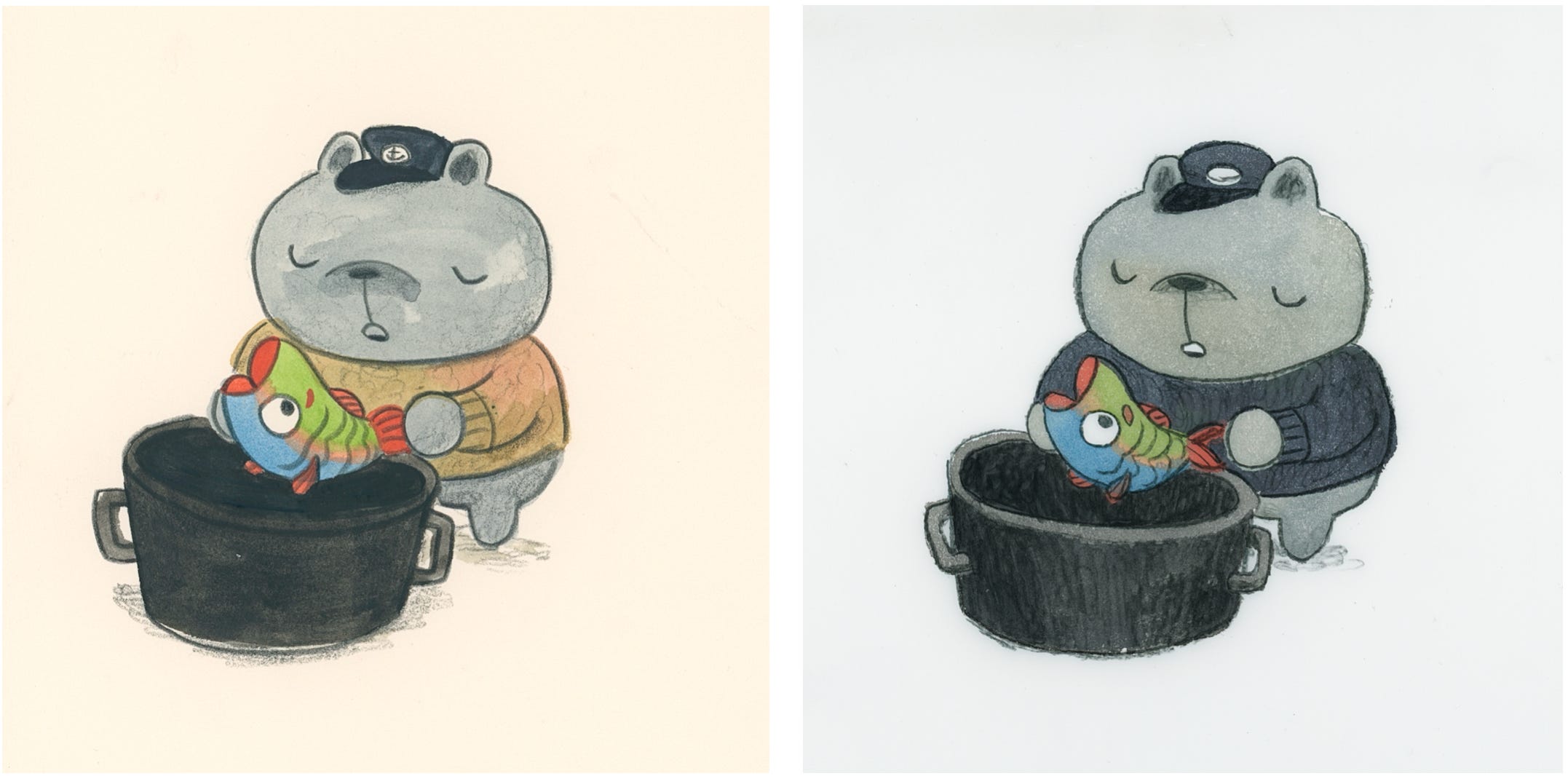
I liked how my paintings in my sketchbooks came out but for some reason I was struggling to recreate the same look. Thinking back on how I made them, I came to the conclusion that maybe the reason they looked different was because I was using crappy sketchbook paper as well as a waterbrush (this thing) rather than a regular brush.
So I decided to try painting on crappy paper with a waterbrush and actually liked the way it came out:
The bear looked good as well as the fish but I was struggling to paint the shark so I tried it out some more:
And it was looking kind of good???
Time to test out an actual scene from the book instead of just painting spots:
It came out…. okay??? But it just felt like something was missing!!! So I decided to keep going…
I decided to pivot back and test out this painting on more expensive papers:
Somehow they just progressively got worse and worse and just weren’t the vibe I wanted.
Wanting to take a break from this conundrum I decided to take a sidequest and focus on trying to figure out how I wanted to paint the patchwork in this book.
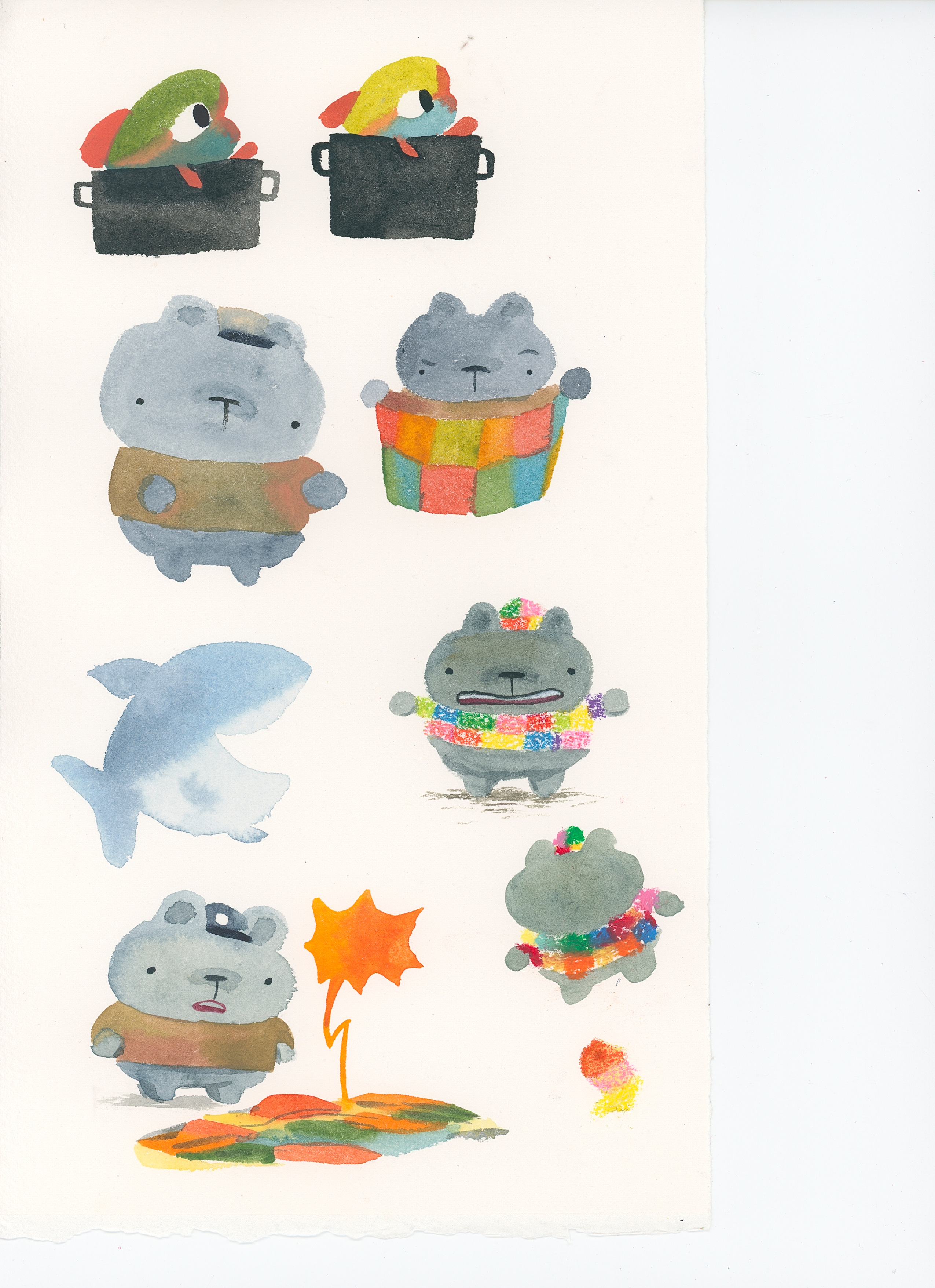
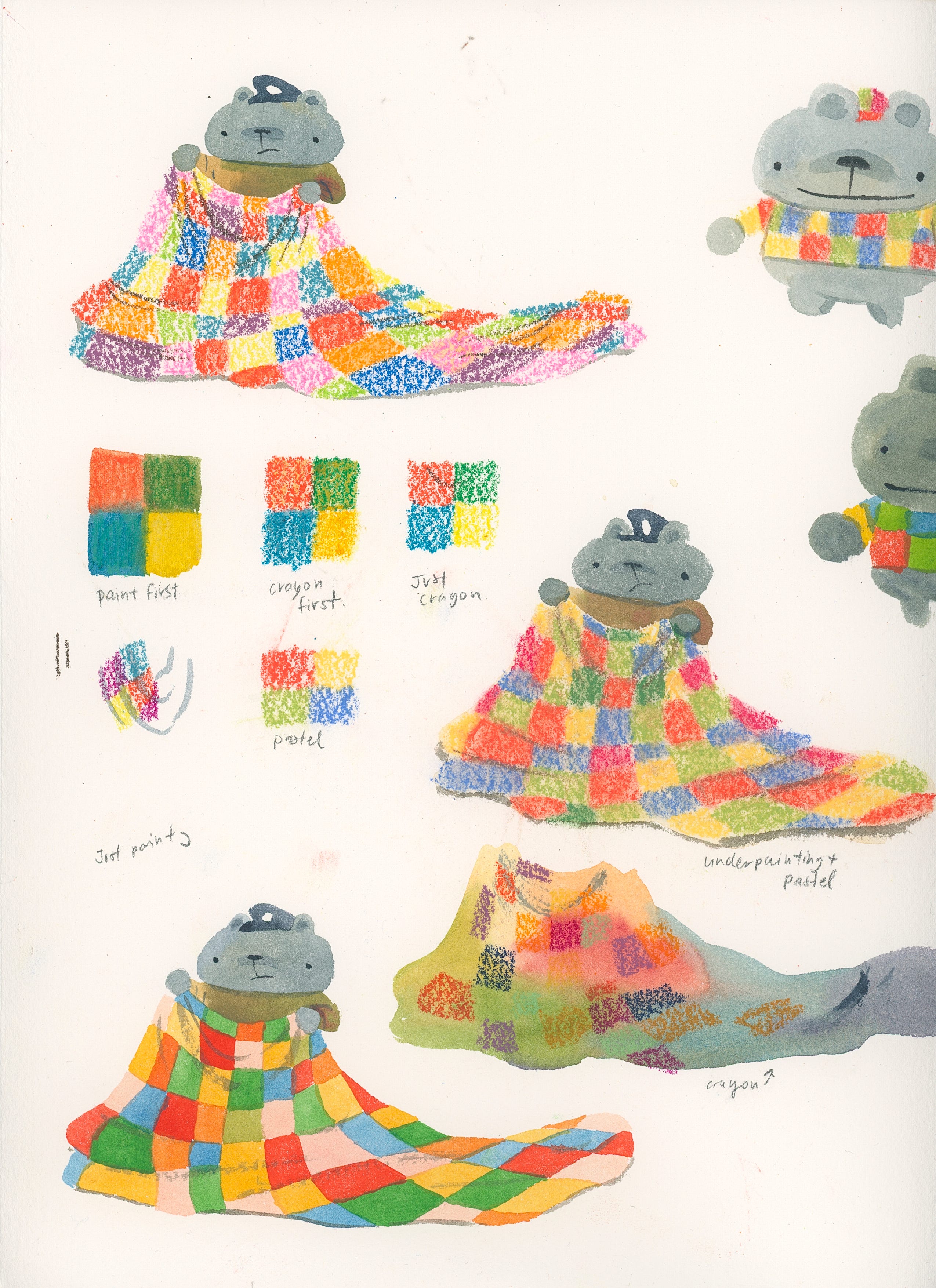
I tested out a whole bunch of different looks, and decided I wasn’t a fan of any of them! AH! I liked the painting but it felt too clean, the crayon was nice but didn’t get the point across and the pastel was just kind of weird to work with.
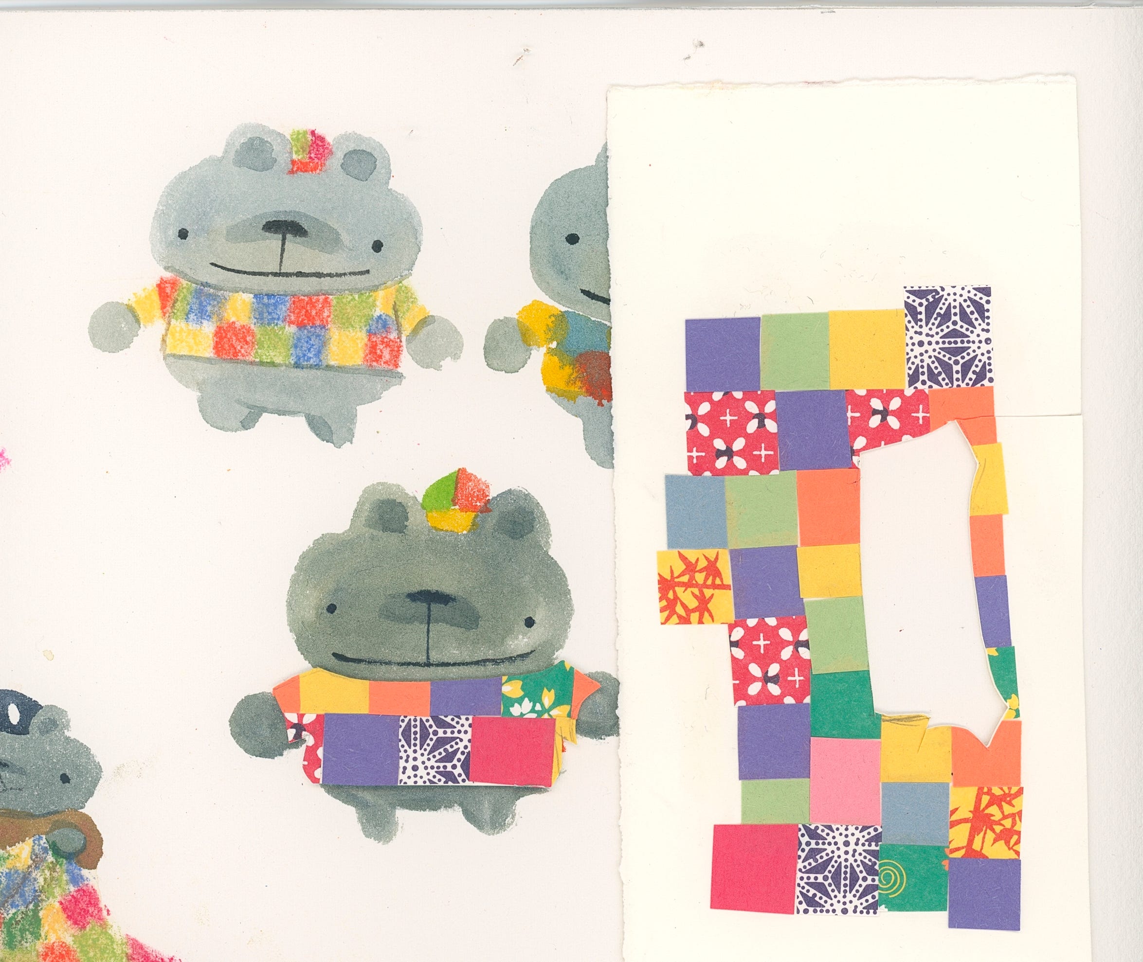
At one point, I even said “fuck it! what if I used REAL cloth?! or what if I patchworked pieces of construction paper and cut them out??”
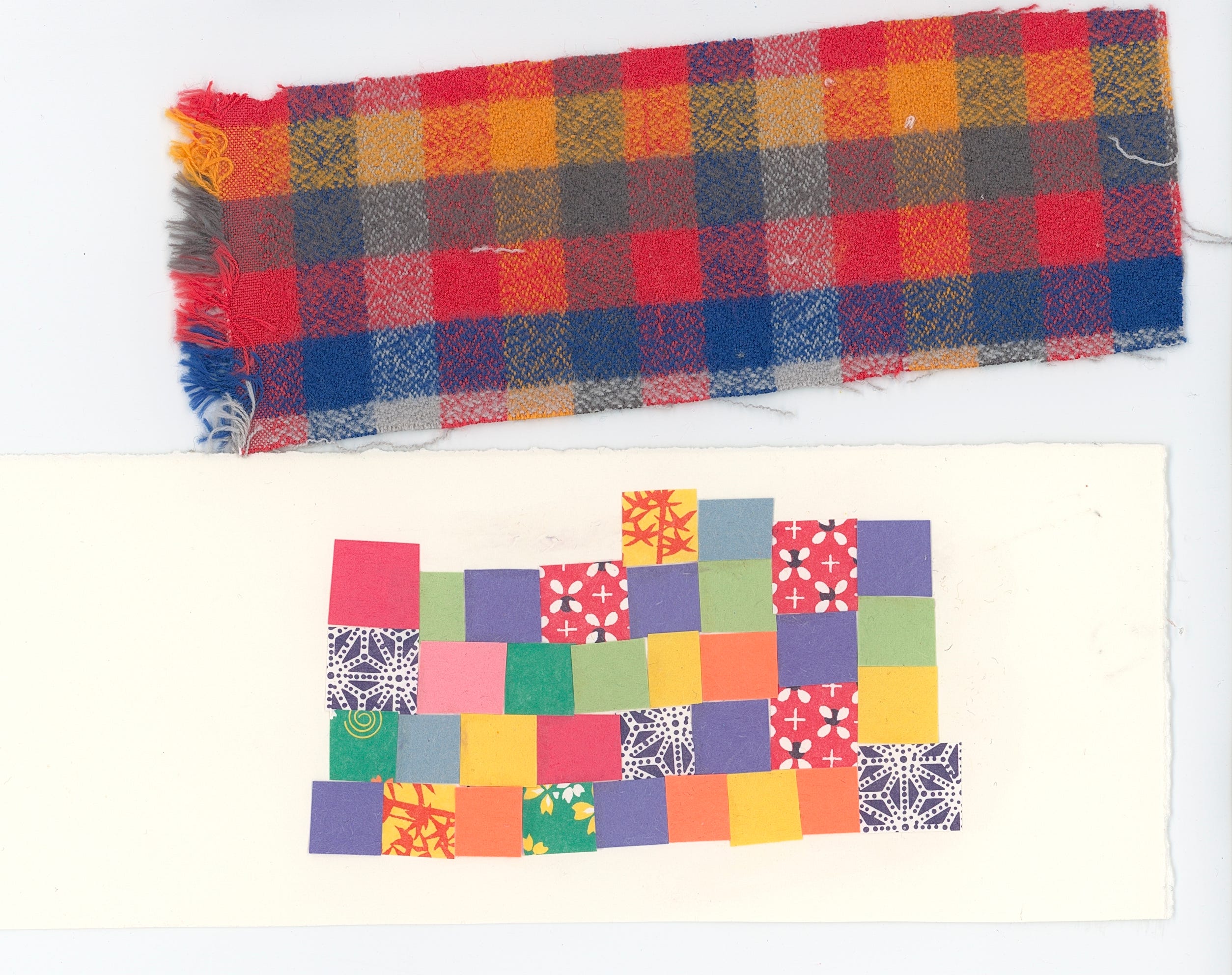
So I took that collaged patchwork and cut it out but it just didn’t look.. right? It didn’t give a cozy feeling which I wanted. UGH!
Then I said to myself, what if I went back to my original art and tried out color pencils again?
It came out cute but I just couldn’t get the emotion across the way I wanted to. There are a lot of ridiculous expressions in this book and I just couldn’t capture it with colored pencils.
In a last ditch effort, I tried outlining with pencil and then with a black colored pencil…
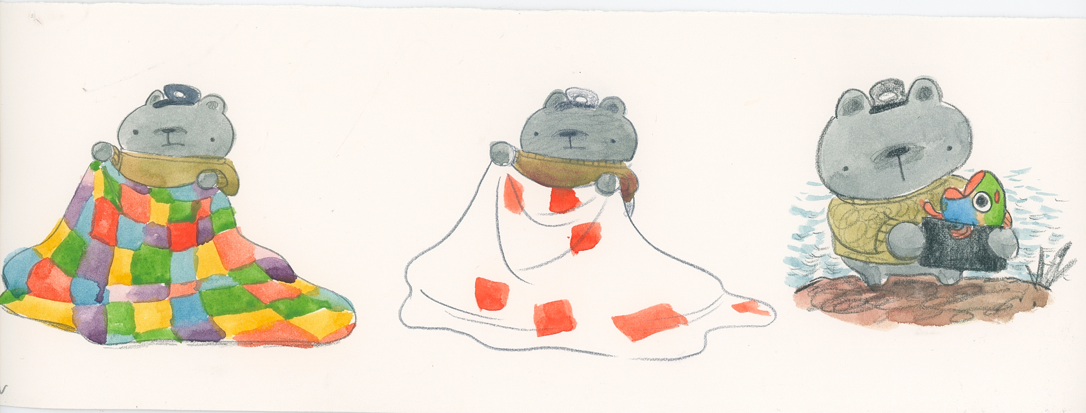
And wait.. it looks kind of cute?
Part Six: Is that it..?
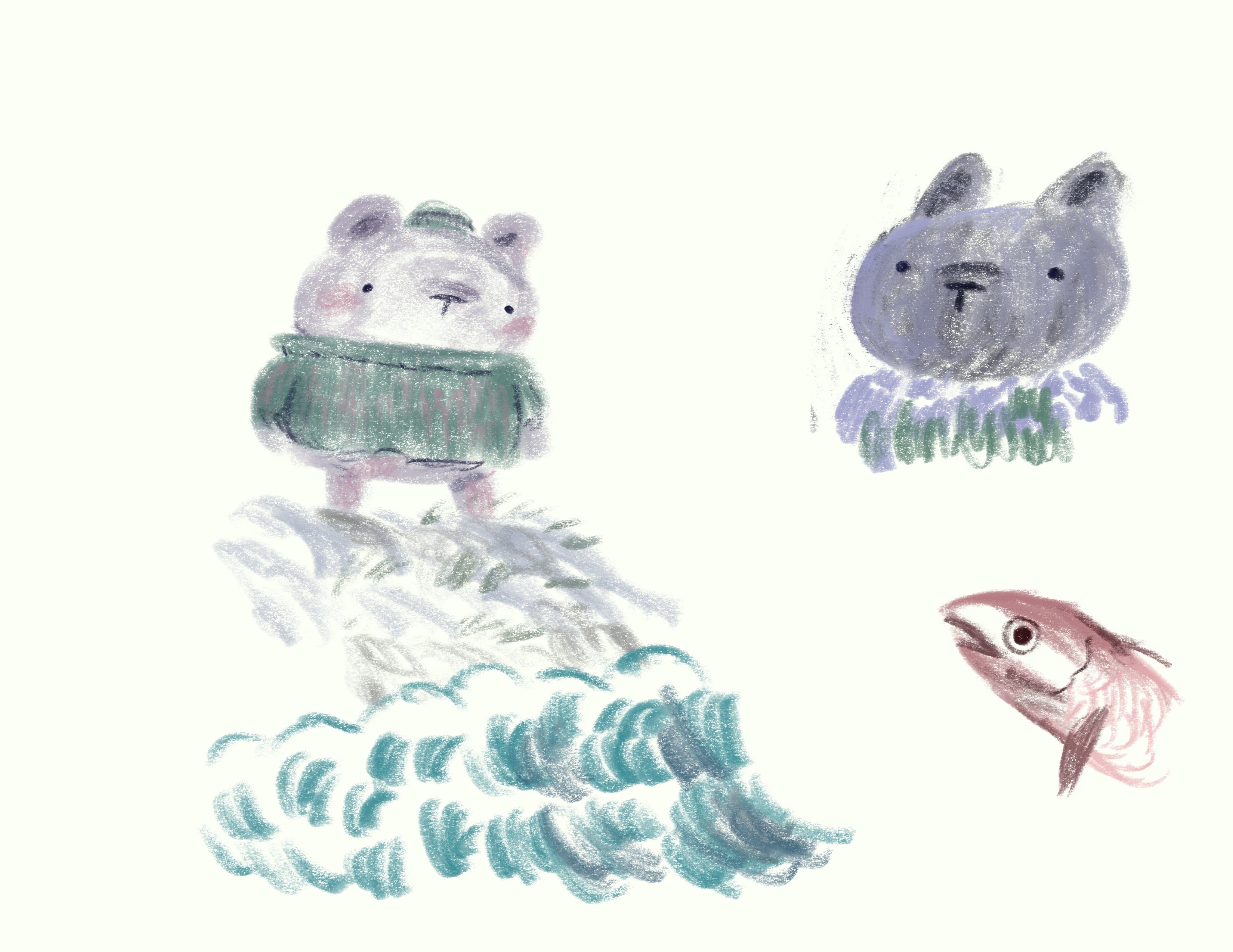
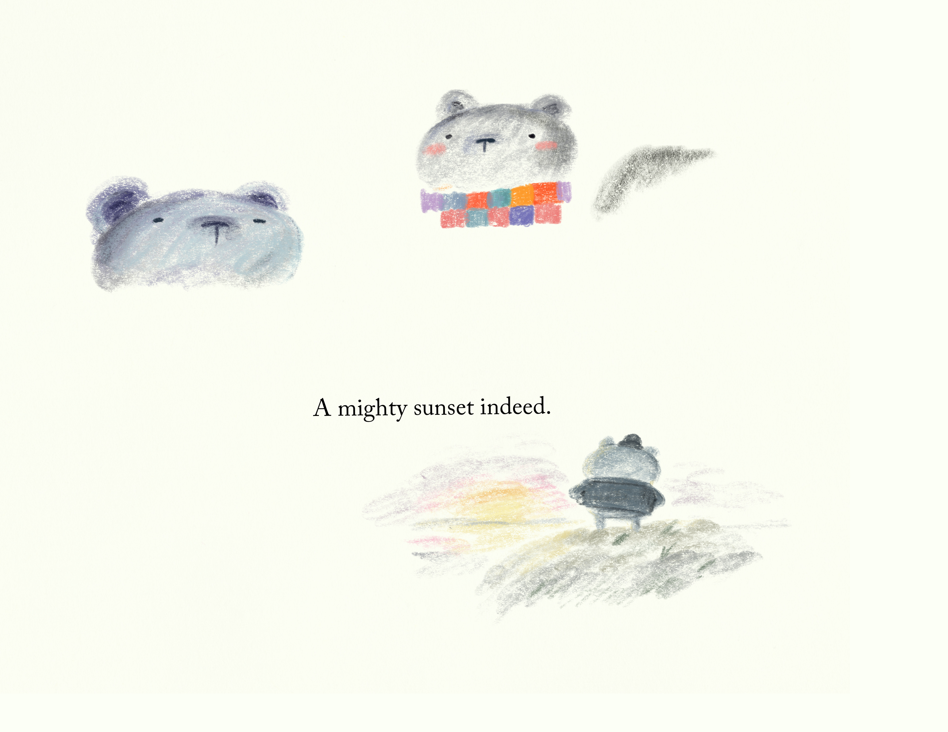
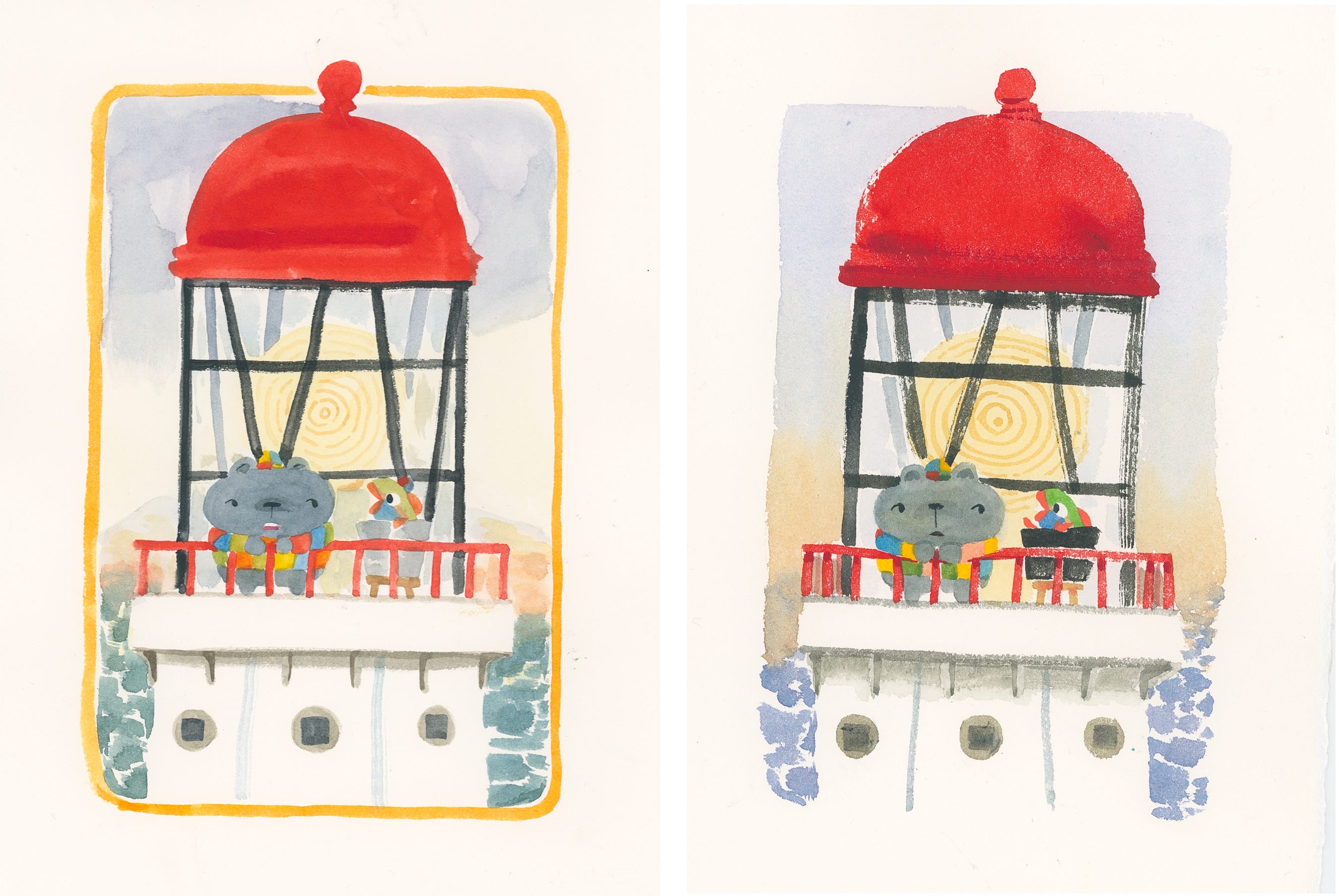
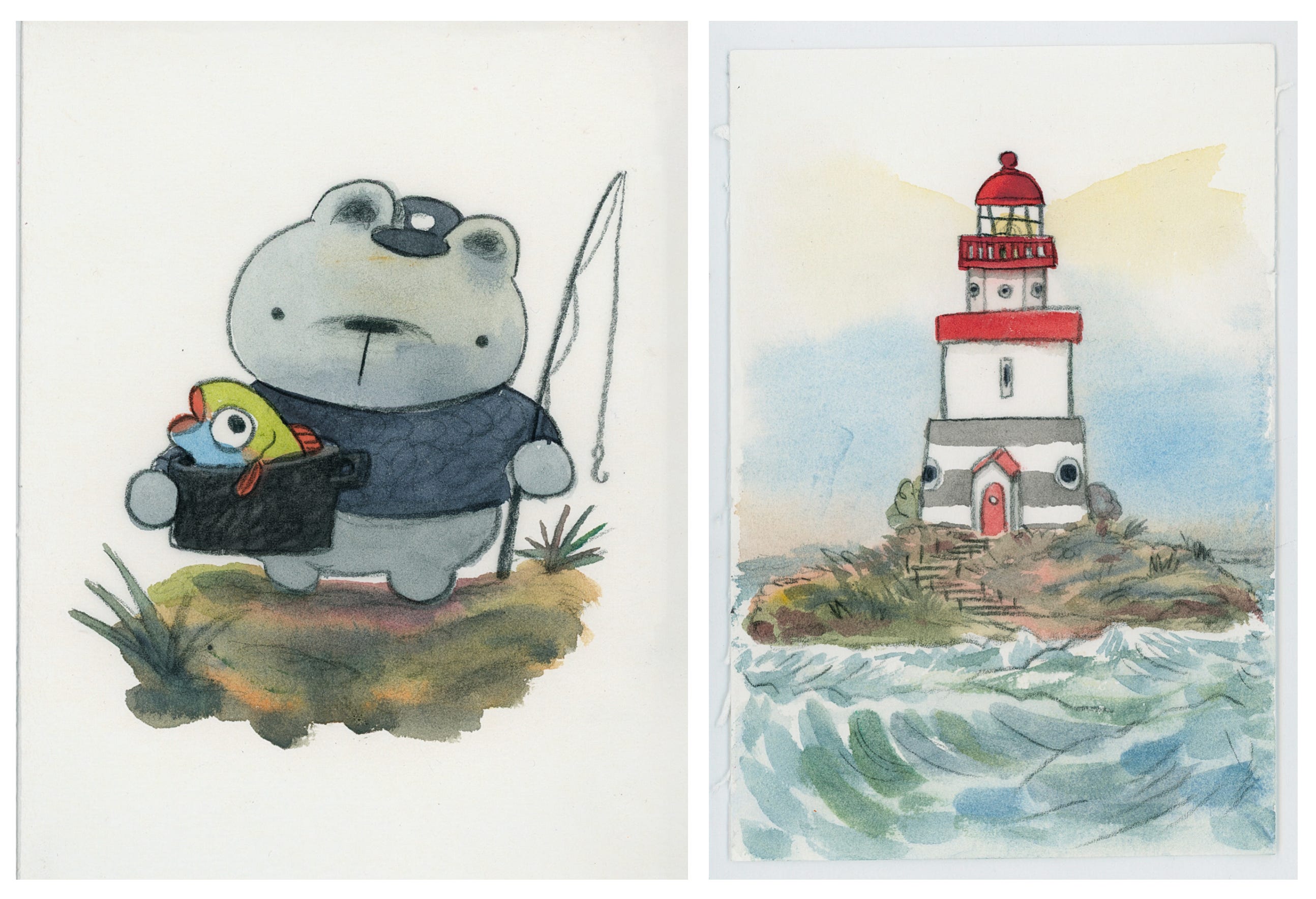
Taking the black colored pencil approach, I paired it with the loosey goosey watercolor and here’s what I got:
It came out cute!!! I really liked the way this looked and it finally felt like I was onto something. I showed my illustrator friends who love to help out and they liked the lines but thought the values were off.
So my genius friend Jess suggested I just add lines over an earlier painting I did.
What a smartie! I was originally going to entirely repaint and redraw a new piece like an idiot.
And here’s how that came out:
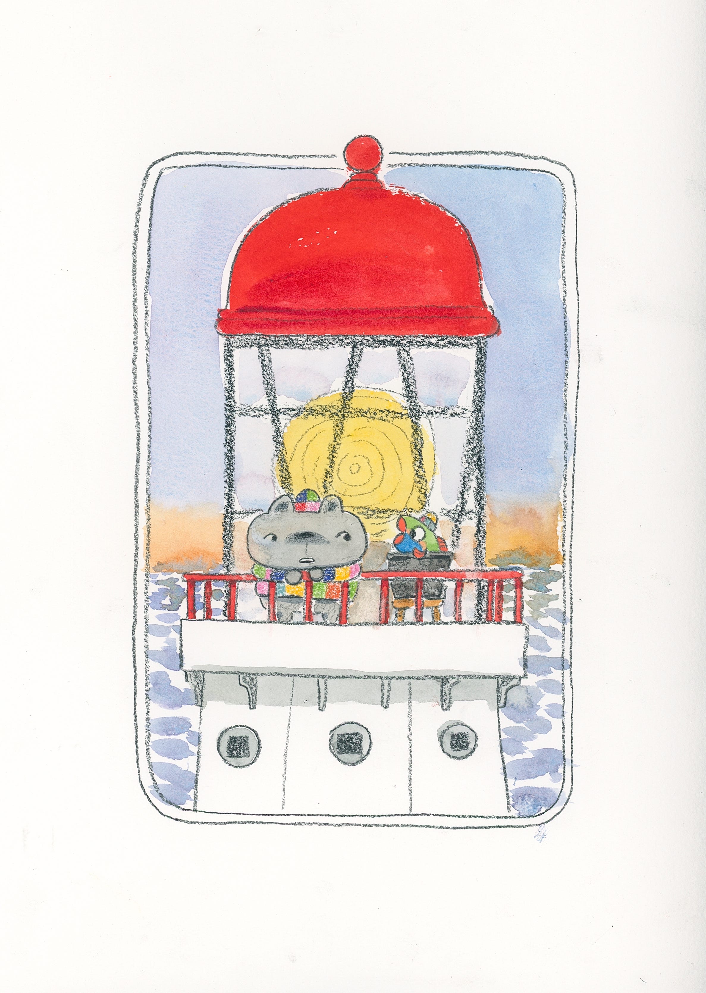
Taking that approach, I tried out the Richard Scarry technique of lining on vellum and painting underneath:
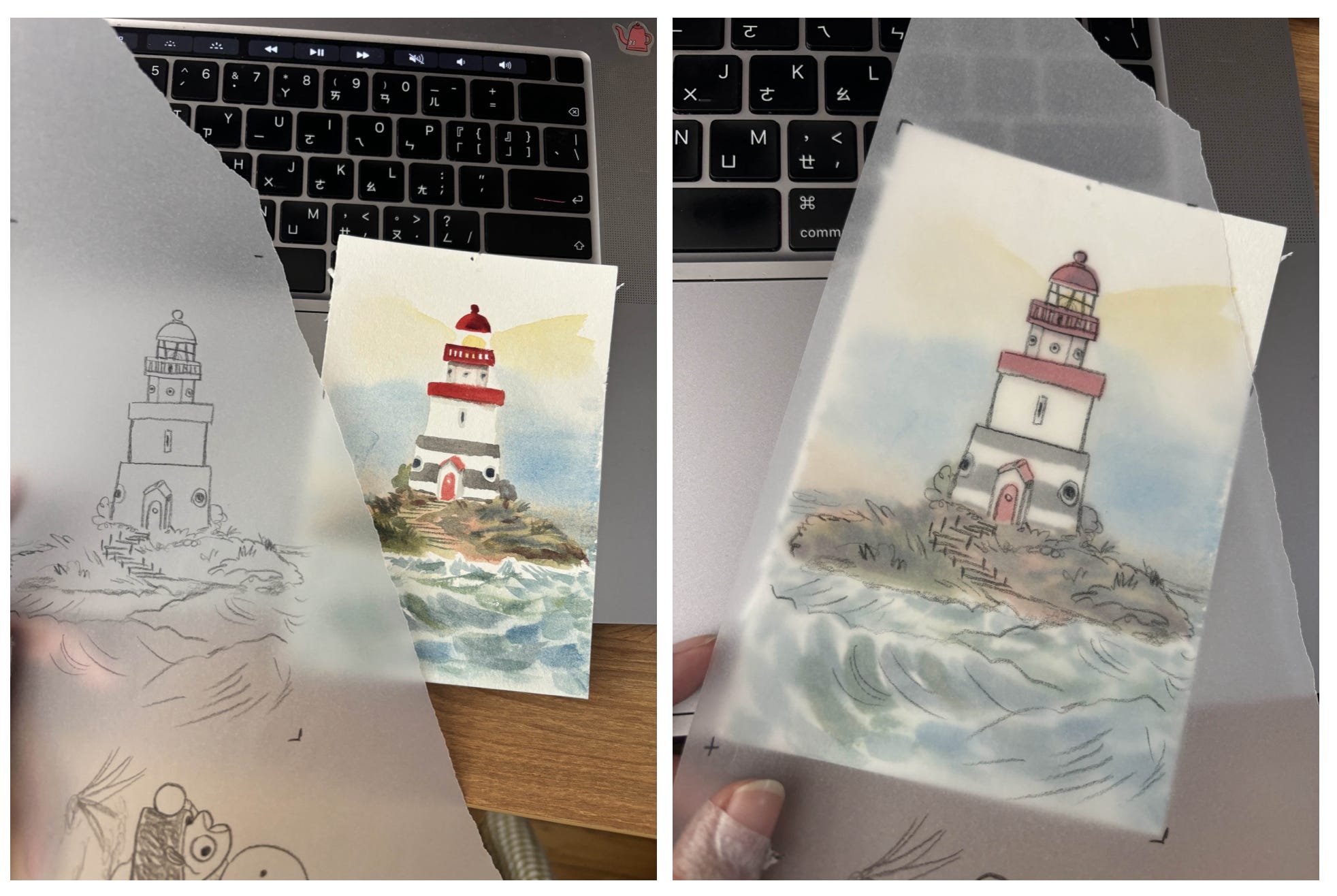
The vellum gives a really nice atmospheric vibe to it that feels just in line with the story of this book. It makes it feel like a foggy sea day! Then I scanned the elements separately and pieced it together on Photoshop:
Here’s another comparison of two different line styles side by side:
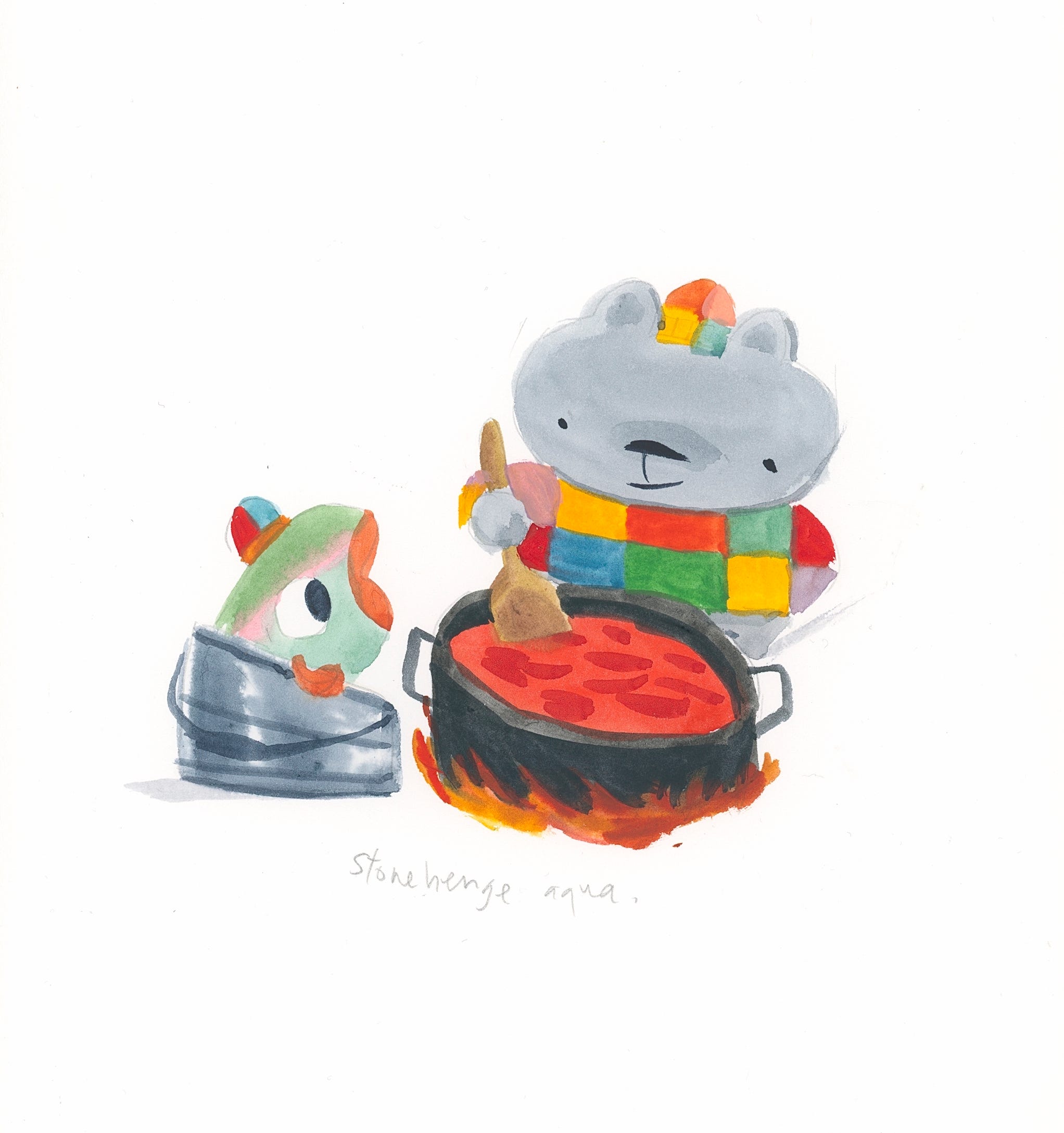
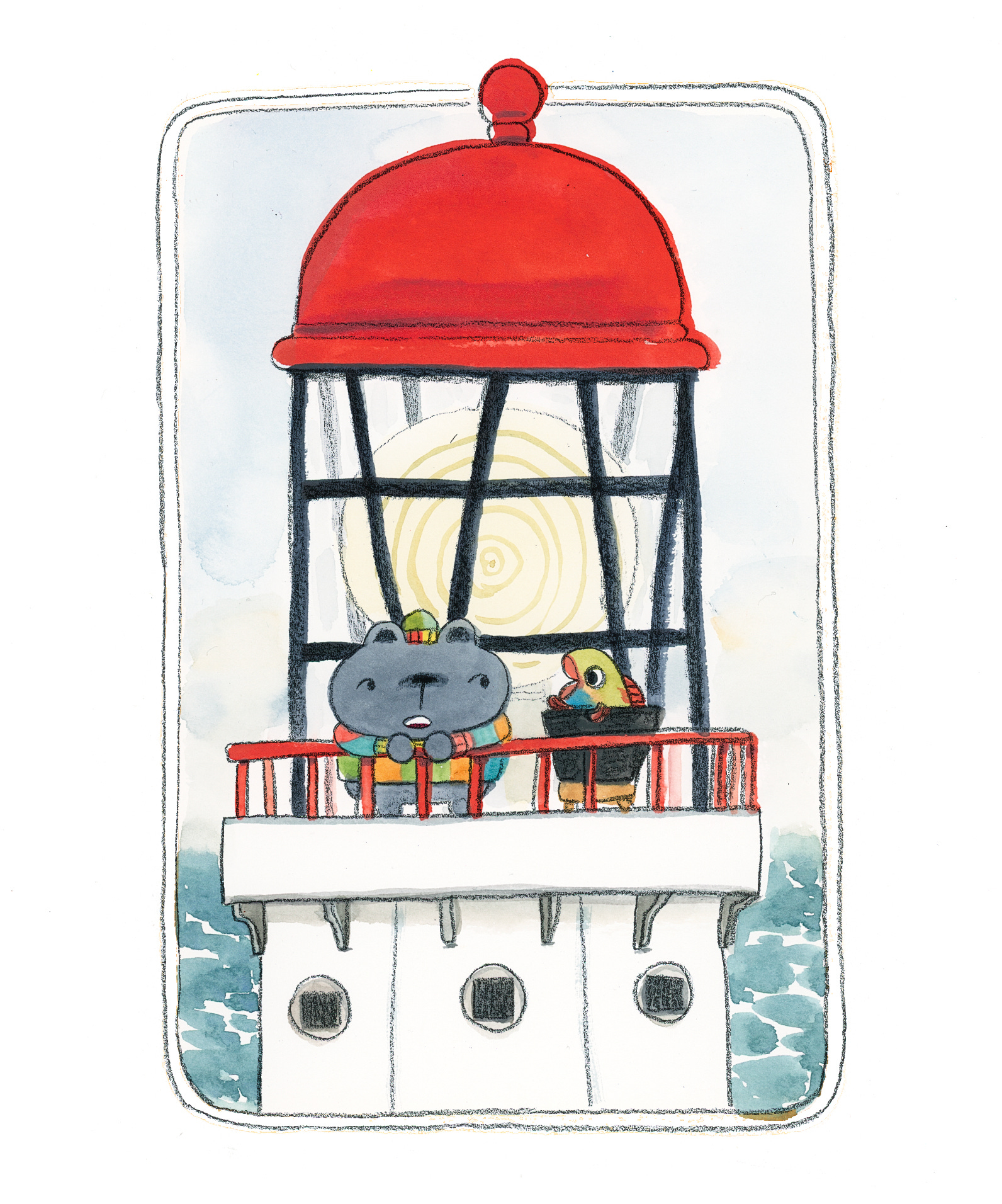
Taking all of that, I decided to test out an entire spread with this technique by painting the colors and lining the art separately:
And with some photoshop and scanning magic, this is what you get:
Part Seven: That’s it!
Having tried every method under the sun, I had finally settled on the perfect method for creating the art of this book!
And that marks the end of this very very long post.
Thank you very much for reading this.
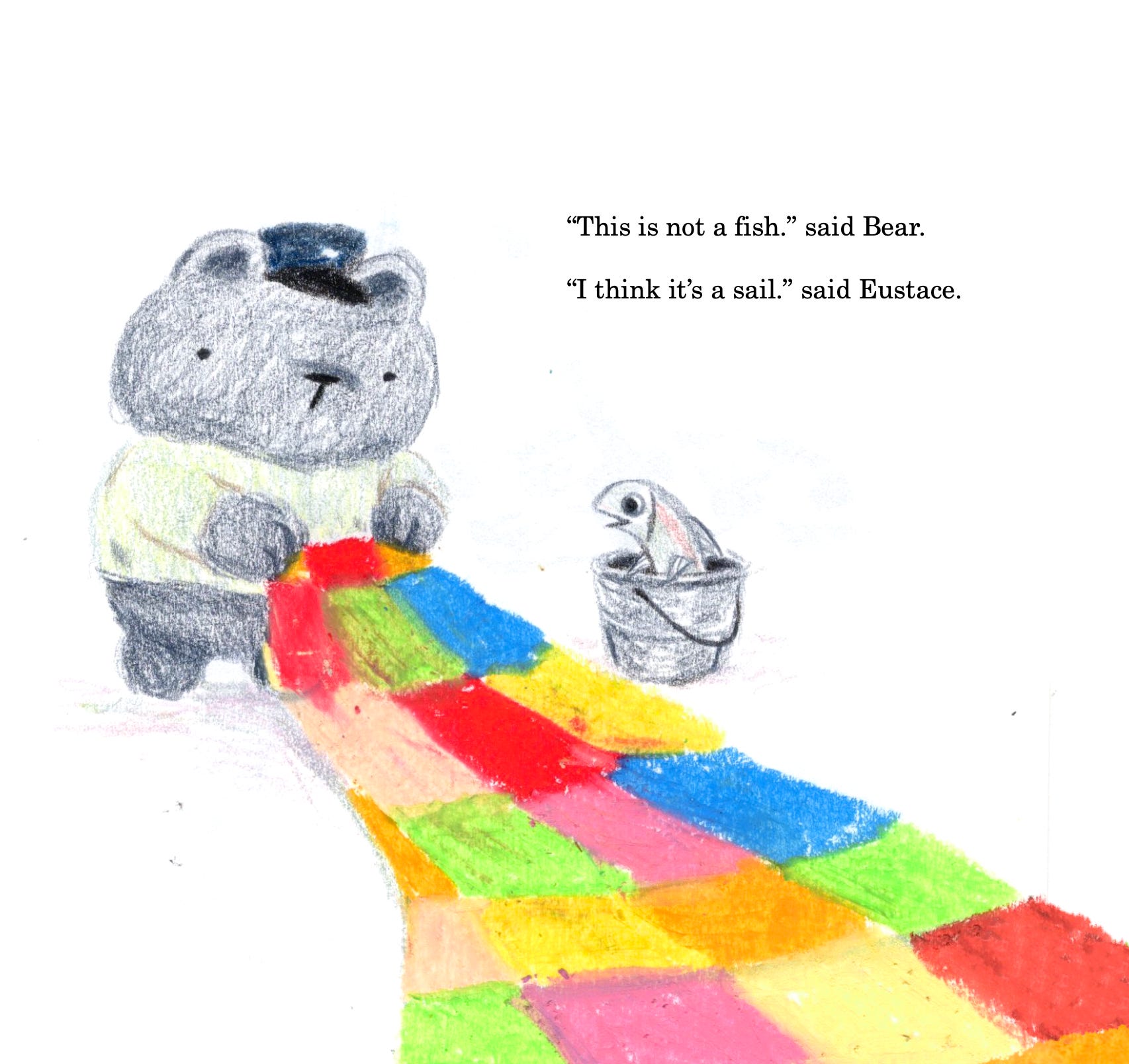
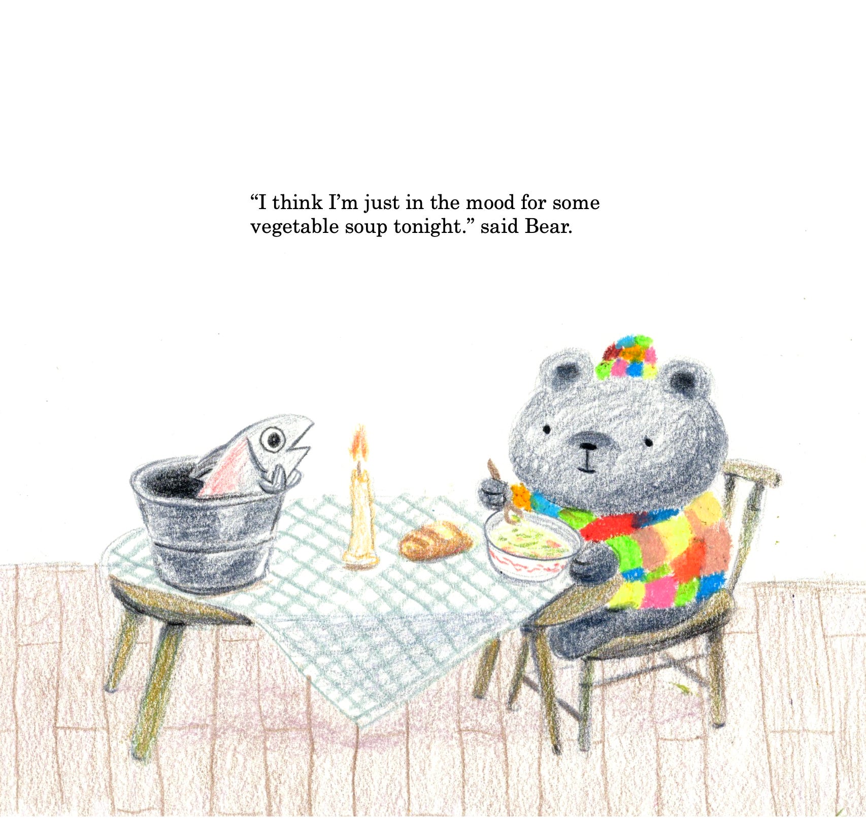
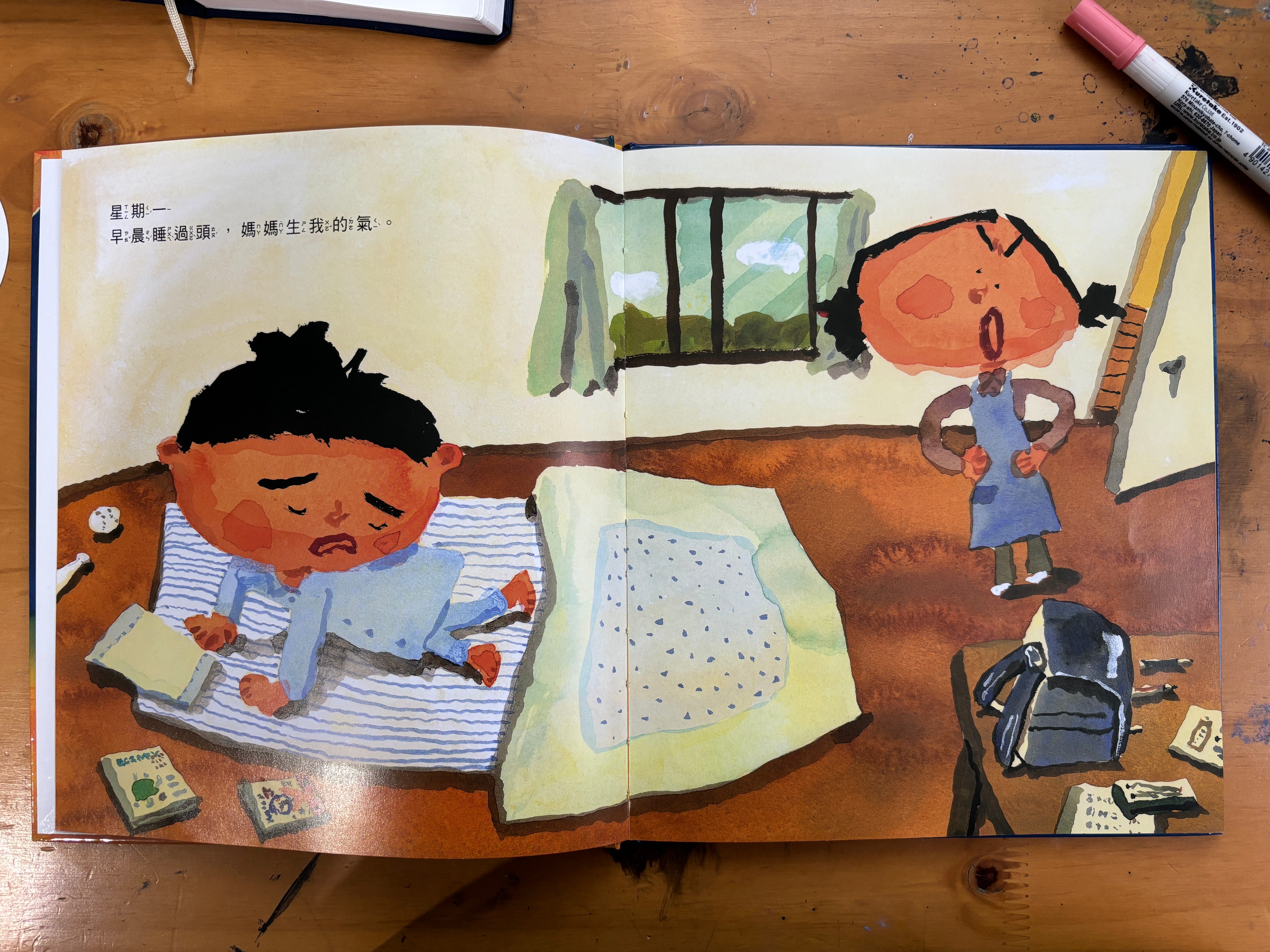
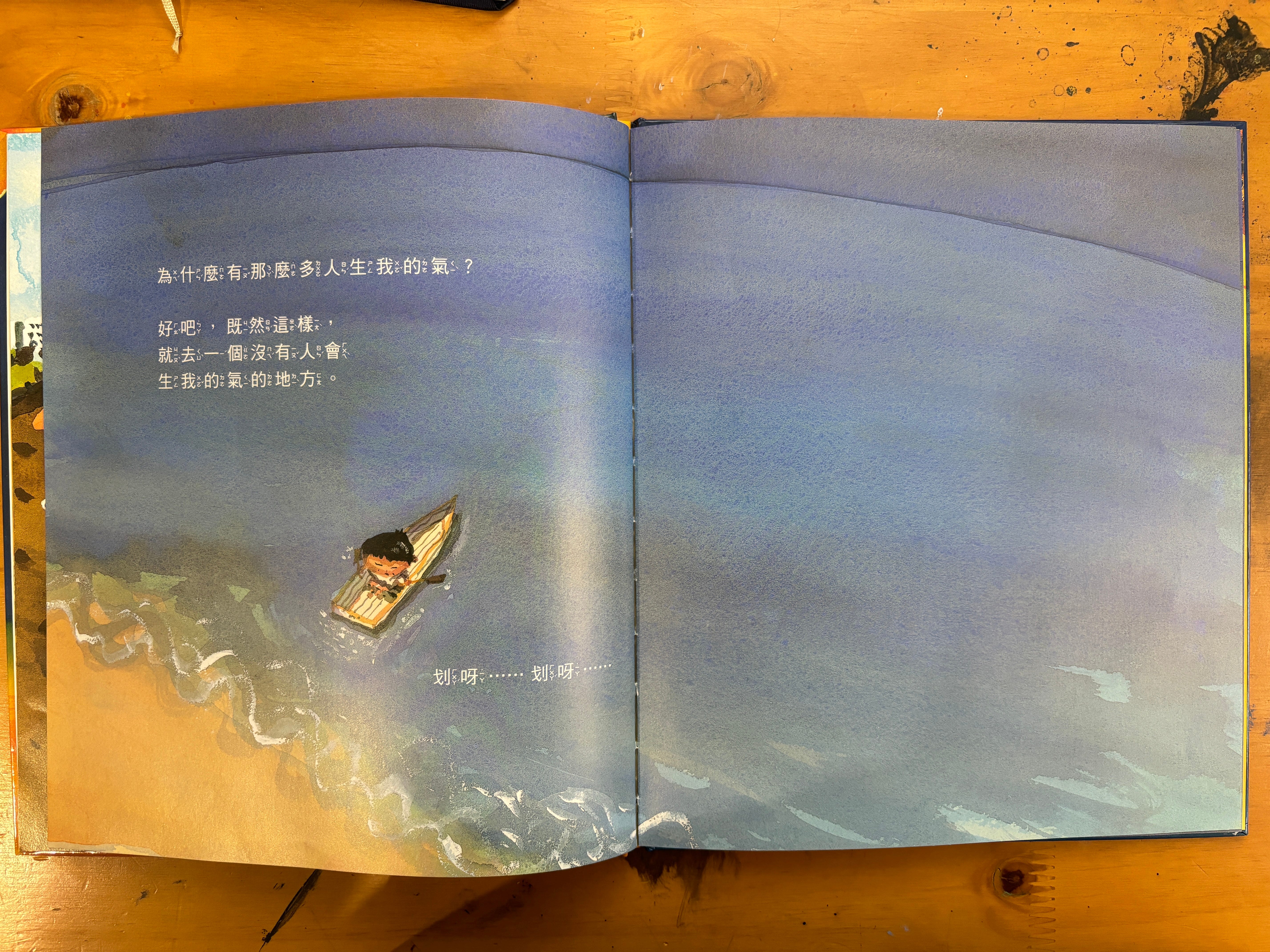
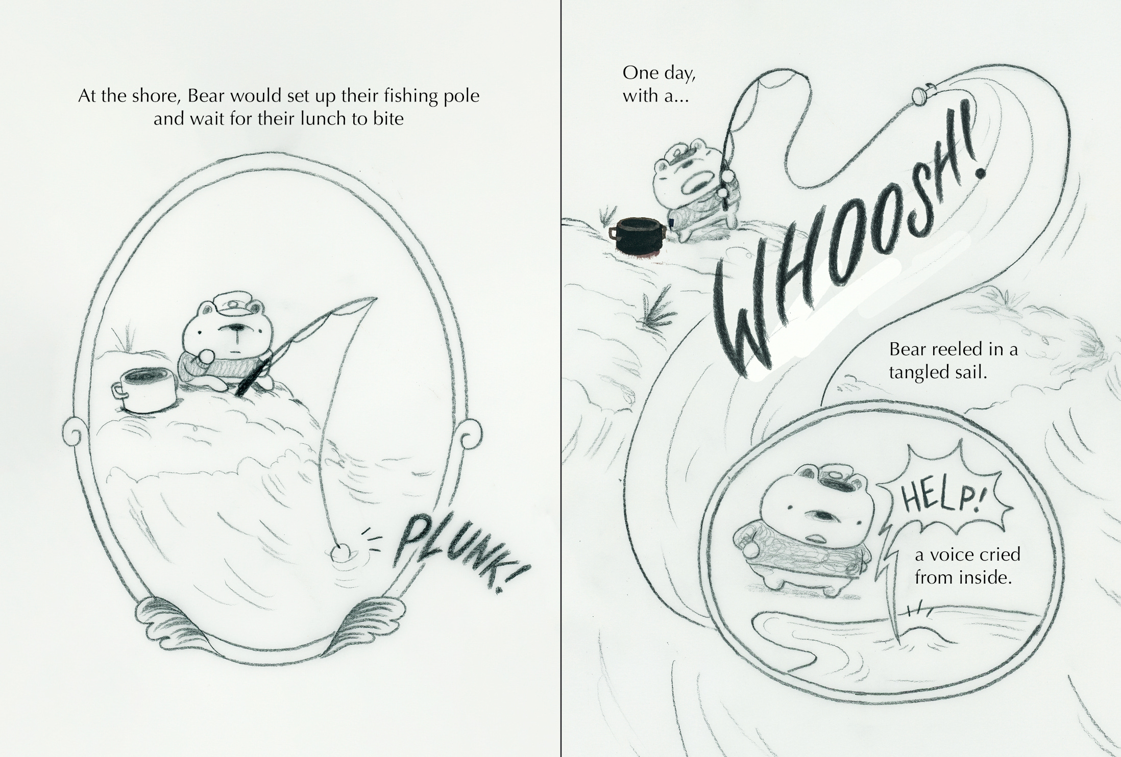
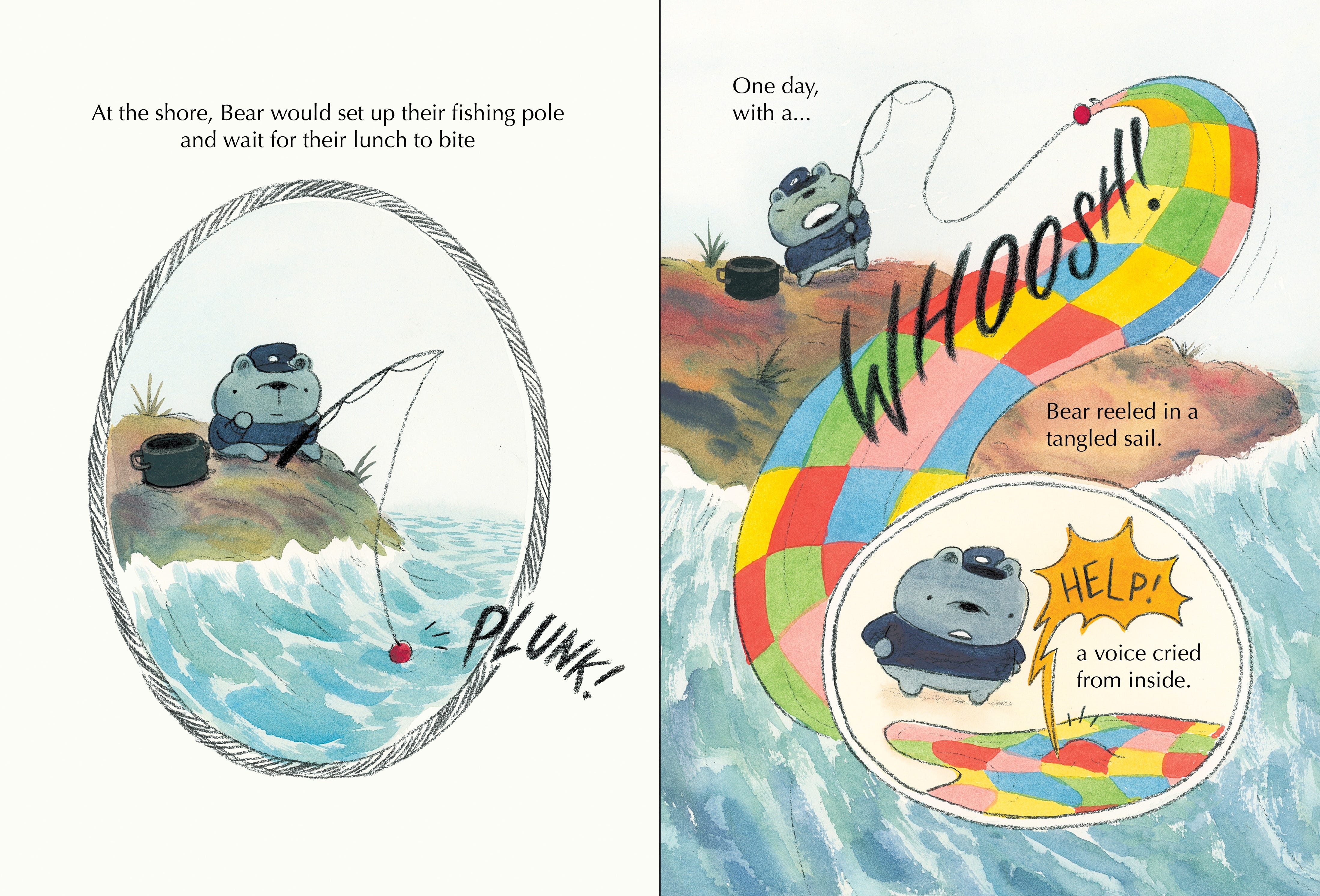
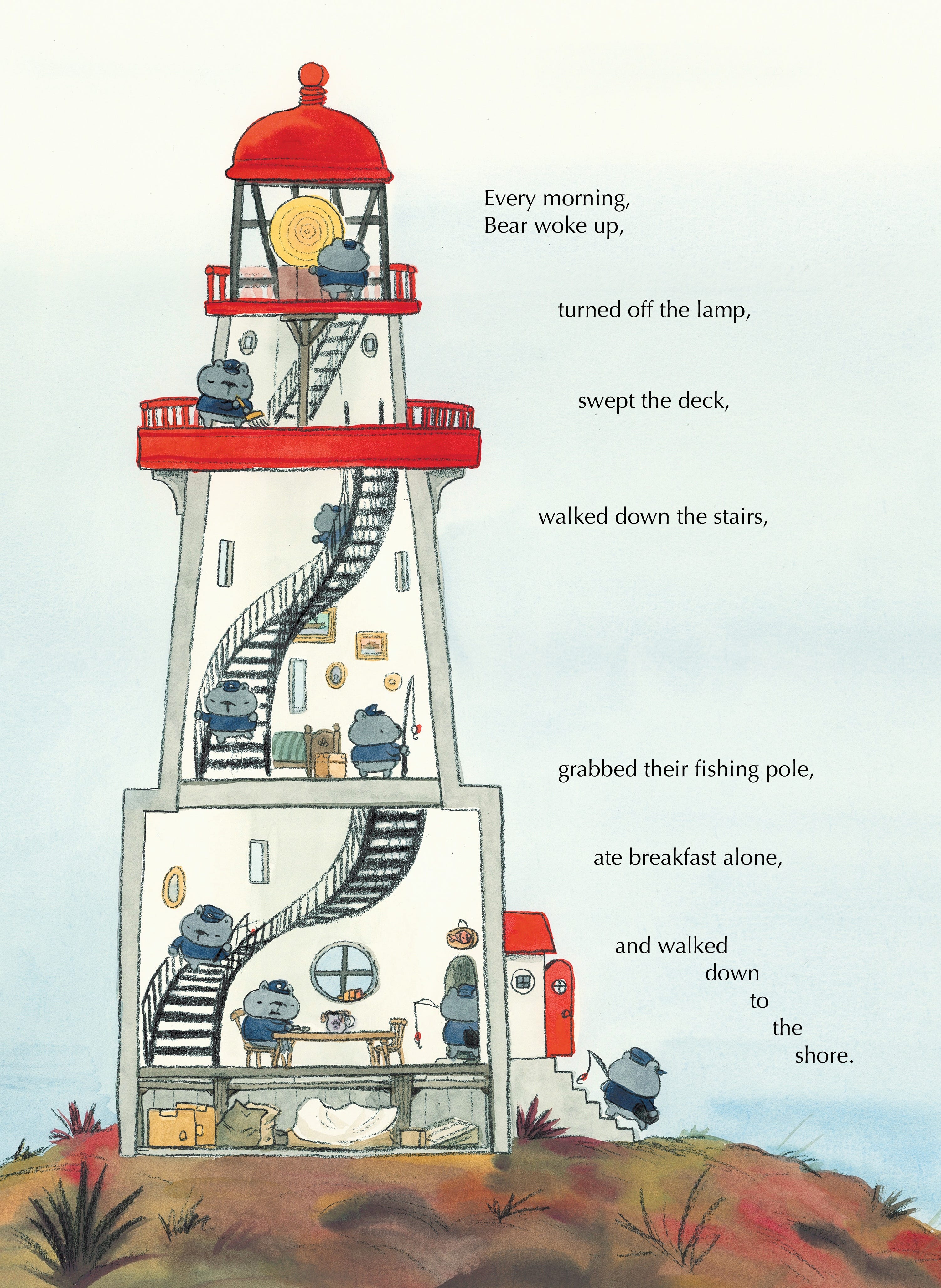
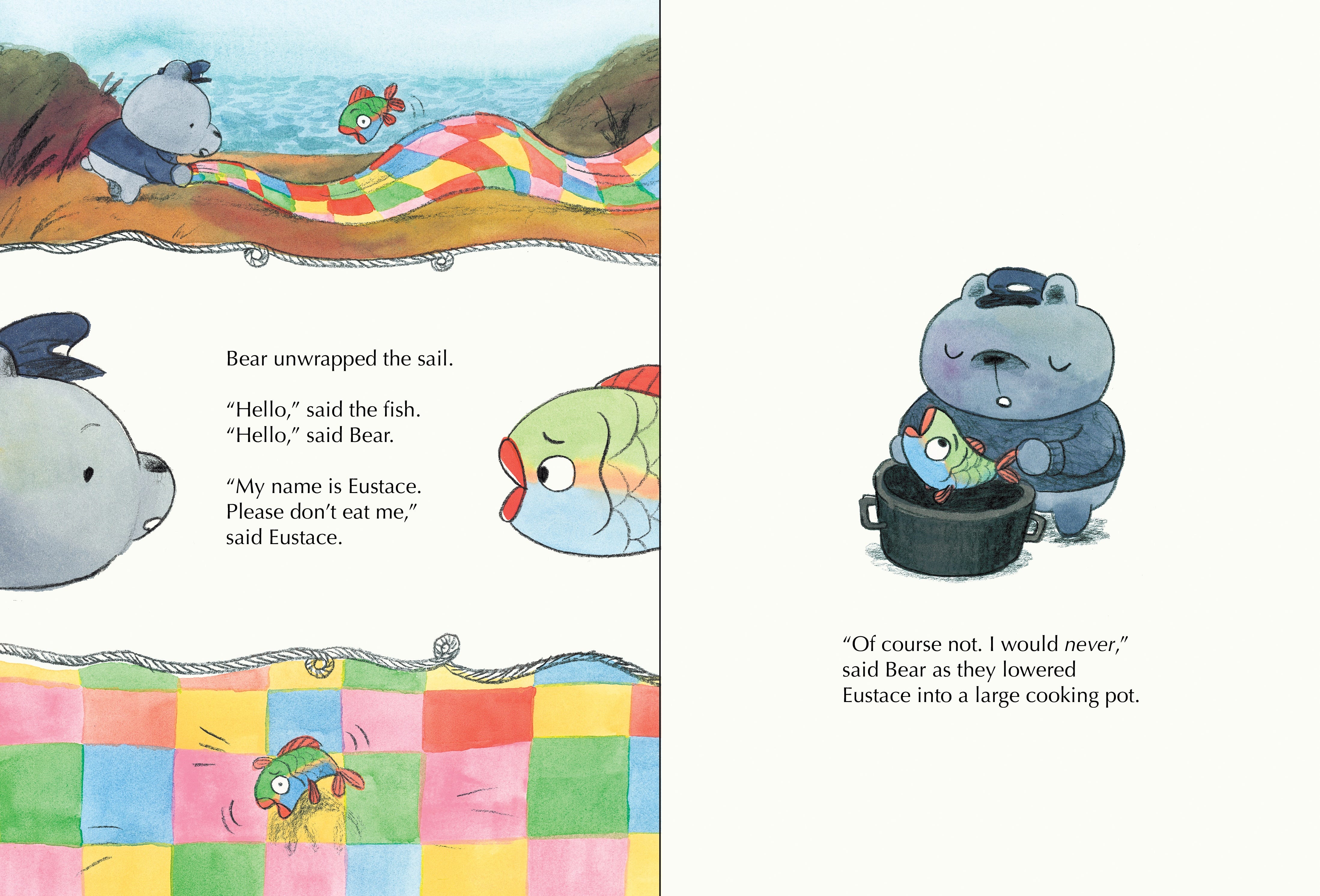
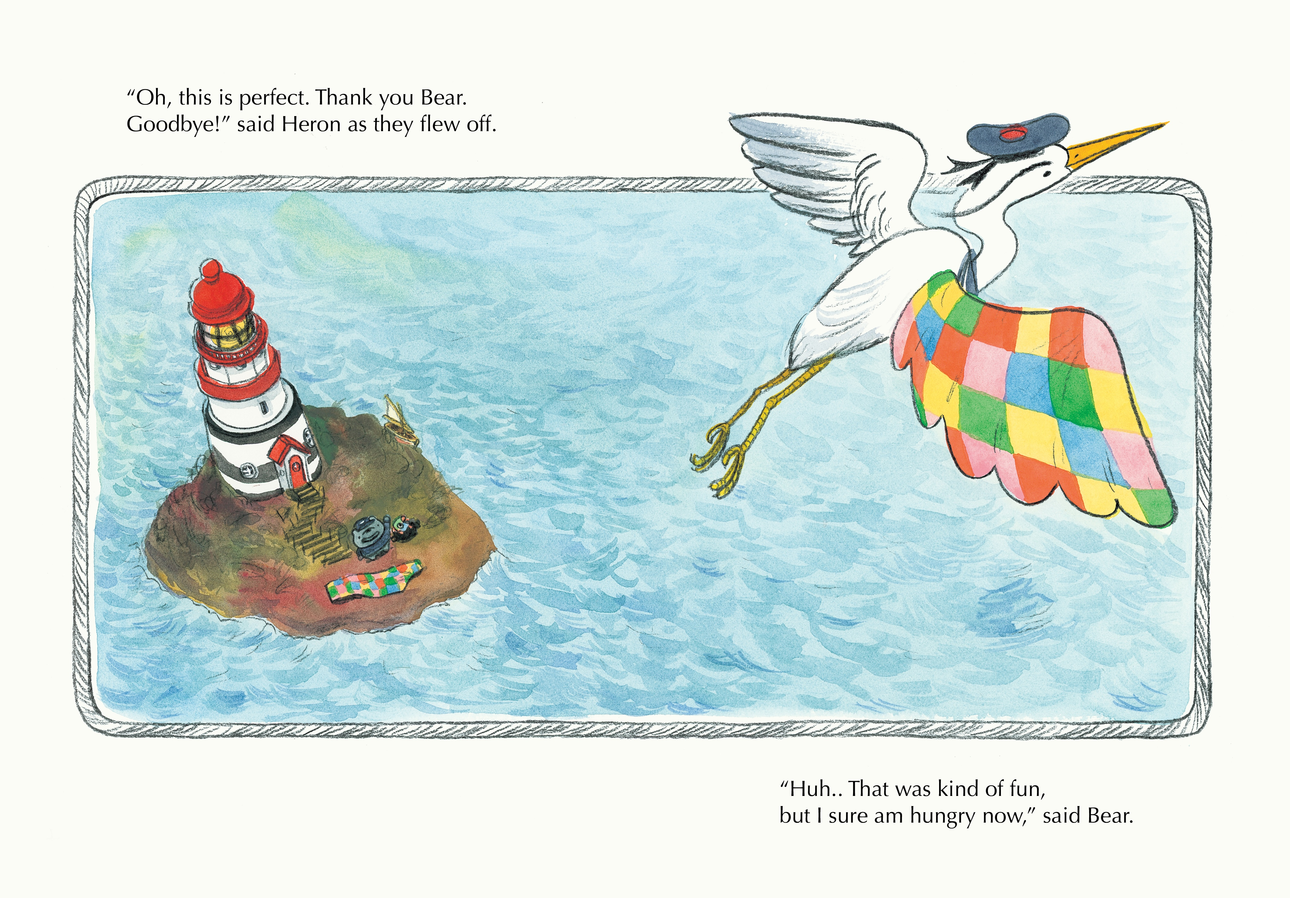
As a reward for making it to the end, here are some sneak peek pages from inside the book:
A brief reminder that if you preorder the book from BuyOlympia right now, you can receive a FREE print with it!

You can also preorder the book from any of the links below or from any place that sells books:


I’m also offering 1 year of free access to paid posts if you preorder the book from any bookstore and forward your preorder receipt to liantomato@gmail.com! Preorders are great and help to show my publisher that people actually like me. So please preorder if you can!
If you want to keep on reading (you little freak), you can find a previous post about how I designed the cover for this book here.
Or, read about all the hidden work behind my first picture book, Oh, Olive! here.
Kay, thanks, love you, bye!!!

Just want to say this is a beautiful post! I enjoyed the effort you put in to just get the paint, paper and feeling right. Hope your finger is much better now and congrats on the new book 🤩
Loved how the two separate ideas came together and the ending is perfect.